
If you are decorating your home, you probably have already gone through tons of advice. Rules passed down through generations and trends that explode on social media tell us what we should do to create a beautiful space. Unfortunately, sometimes these well-intentioned guidelines become crutches, leading to rooms that feel impersonal and a little too predictable. (In other words, you should design your home in a way that feels right for you!)
Your goal should be a home that reflects you, not a carbon copy of a catalog page. Reconsidering some common design habits can open up a world of possibilities, helping you craft a space that is both functional and full of personality. Here are 12 designs that you may need to think twice about.
1. Matching Furniture Sets
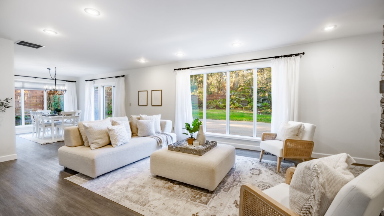
Image Credit: Shutterstock.
The allure of a matching furniture set is undeniable. It’s a simple, one-and-done solution that promises a coordinated living room or bedroom with zero guesswork. The sofa, loveseat, and armchair all come from the same family, sharing the same fabric, legs, and silhouette. While this approach guarantees harmony, it often comes at the cost of character.
When every major piece is identical, the room can feel flat, lacking the depth and visual interest that comes from a curated collection of furnishings. A home’s story is told through its layers, and a matching set tells a very short story.
A Better Approach:
- Mix, Don’t Match: Start with one main piece, like a comfortable sofa, and build around it. Select armchairs in a complementary color but a different style. Maybe add a leather recliner or a patterned chaise lounge.
- Vary Textures and Materials: If your sofa is a soft linen, consider chairs with wooden arms or a metal frame. Introduce a variety of textures through pillows, throws, and area rugs to add richness.
- Connect Through Color: Use a consistent color palette to tie disparate pieces together. A blue from a patterned chair can be picked up in a throw pillow on the sofa, creating a cohesive look without being identical.
2. Choosing Light Paint for Small Rooms
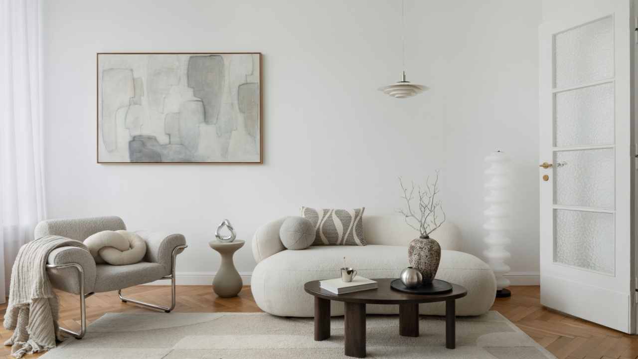
Image Credit: Shutterstock.
The age-old wisdom dictates that small rooms must be painted white or a very pale neutral to make them feel larger. The idea is that light colors recede, creating an illusion of spaciousness. This can certainly work, but it’s not the only strategy, and it sometimes results in a room that feels bland and undefined.
Try color drenching. This technique involves using a single deep, saturated color across walls, trim, and even the ceiling to create a cohesive, enveloping effect. Darker hues absorb light and blur visual boundaries, giving small rooms a sense of intentional intimacy rather than feeling cramped. Colors like deep navy, charcoal, or forest green work exceptionally well, transforming a compact den or powder room into a polished, jewel-box-like space.
A Better Approach:
- Lean into the Size: Use a dark, moody color to create a snug and enveloping atmosphere, perfect for a reading nook, office, or TV room.
- Create a Focal Point: A deep color on the walls makes art and decor pop. Metallic finishes, vibrant textiles, and warm wood tones stand out beautifully against a dark backdrop.
- Unify the Space: If you go dark, paint the trim and even the ceiling the same color. This blurs the room’s edges, which can paradoxically make it feel less confined by hiding the corners.
3. Perfectly Paired Wallpapers
Image Credit: Shutterstock.
Applying the same wallpaper in a hallway and having it continue into an adjoining living room, or using a coordinating pattern from the same collection, seems like a safe bet for a cohesive flow. It’s a professional design trick that establishes a clear visual connection between spaces. Besides, intricate wallpaper is a maintenance pain.
However, when done without nuance, it can make a home feel predictable and a bit one-dimensional. The journey from one room to another loses its sense of discovery. Instead of each room having its own identity within a larger story, they become chapters that all read the same. Thoughtfully layered design allows for subtle shifts in mood and style as you move through the home.
A Better Approach:
- Find a Common Thread: Instead of matching papers, choose patterns for adjoining rooms that share a single color. A floral in the entryway might share a blue with a geometric print in the living room.
- Play with Scale: Use a large-scale pattern in one space and a small-scale, more subtle pattern in the next. This creates interest while maintaining a connection.
- Complementary Styles: If your main room has a bold, graphic wallpaper, consider a textured grasscloth or a simple stripe for the connecting area. The contrast will highlight both.
4. Accent Walls by Default
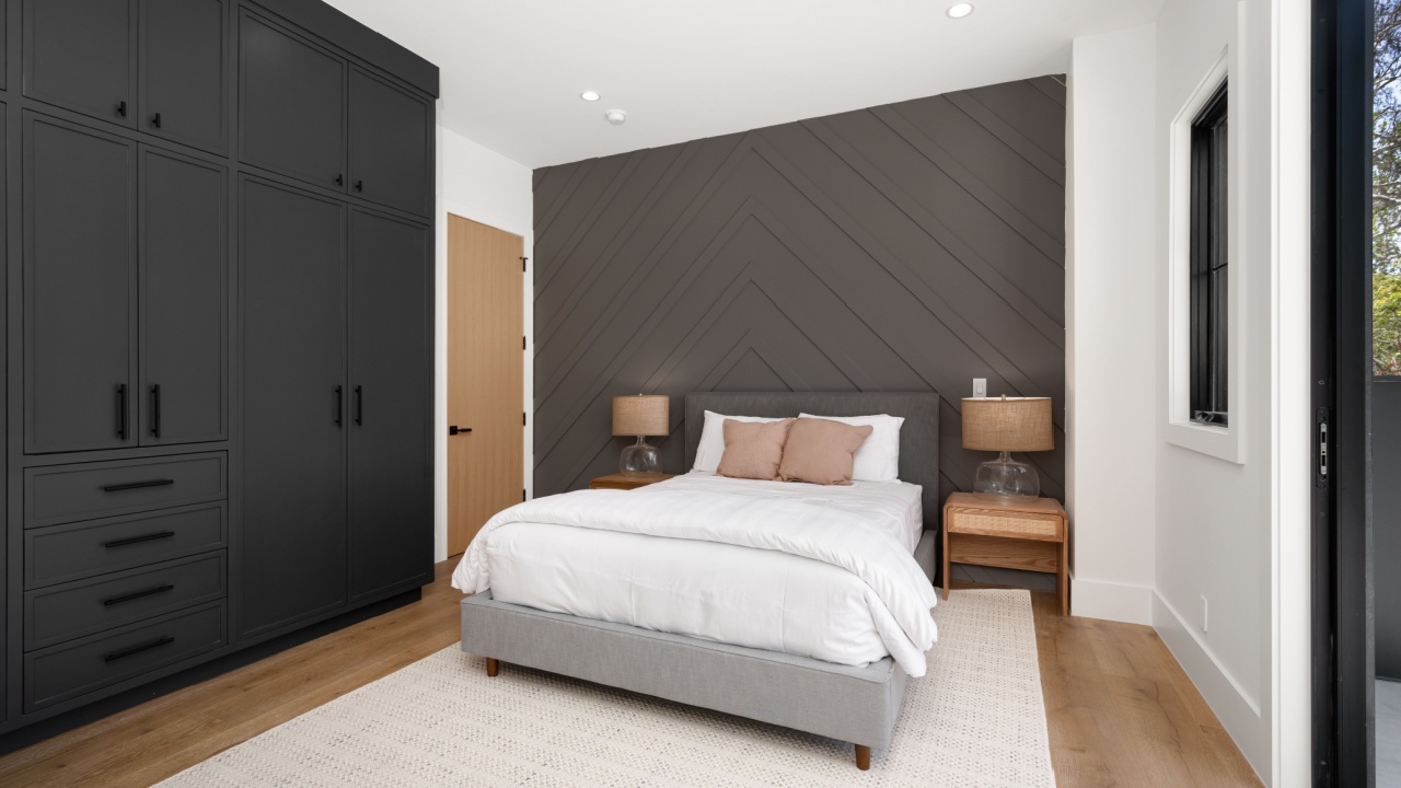
Image Credit: Shutterstock.
The accent wall has become a go-to move for anyone wanting to add a pop of color without committing to painting an entire room. It’s often seen as a quick and easy way to inject personality. The problem arises when that single, brightly painted wall is chosen without a clear purpose.
A random colored wall in an otherwise neutral room can look arbitrary and disjointed, throwing the space off balance. It can draw the eye to an architecturally insignificant feature, making the room feel lopsided. A successful accent wall should have a reason for being; it needs to highlight something worth noticing.
A Better Approach:
- Highlight Architecture: Use a different color or material to draw attention to a feature like a fireplace, a wall with built-in shelving, or the wall behind a headboard.
- Define a Zone: In an open-plan space, an accent wall can be used to visually separate a dining area from a living area or to carve out a small office nook.
- Go Beyond Paint: Consider using wallpaper, wood paneling, or a textured finish for your feature wall. This adds another layer of interest beyond just color.
5. Literal Themed Decor
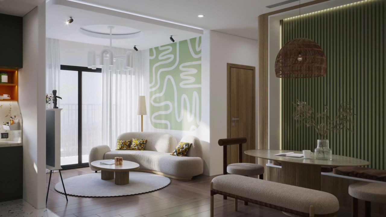
Image Credit: Deposit Photos.
Decorating with a theme, like nautical, coastal, or modern farmhouse, can provide a helpful roadmap. It gives you a built-in color palette and a set of motifs to work with. The danger is taking the theme too literally.
A beach house filled with seashell-print everything, fish netting, and signs that say “Life’s a Beach” can quickly feel more like a tourist shop than a relaxing retreat. A space that adheres too rigidly to one theme can lack authenticity and personal expression. Design a concept, not a theme.
A Better Approach:
- Evoke, Don’t Replicate: If you love a coastal feel, use a palette of sand, white, and seafoam green. Incorporate natural textures like jute, rattan, and light woods. A single piece of abstract art with ocean blues will feel more sophisticated than a painting of a lighthouse.
- Focus on the Feeling: What does “farmhouse” mean to you? Is it about comfort, utility, or a connection to nature? Use those feelings as your guide, incorporating vintage pieces, durable fabrics, and handmade objects.
- Mix in the Unexpected: Add personal items that don’t fit the theme. A modern lamp in a rustic room or a vintage rug in a minimalist space adds tension and personality.
6. Over-Matching and Over-Symmetry
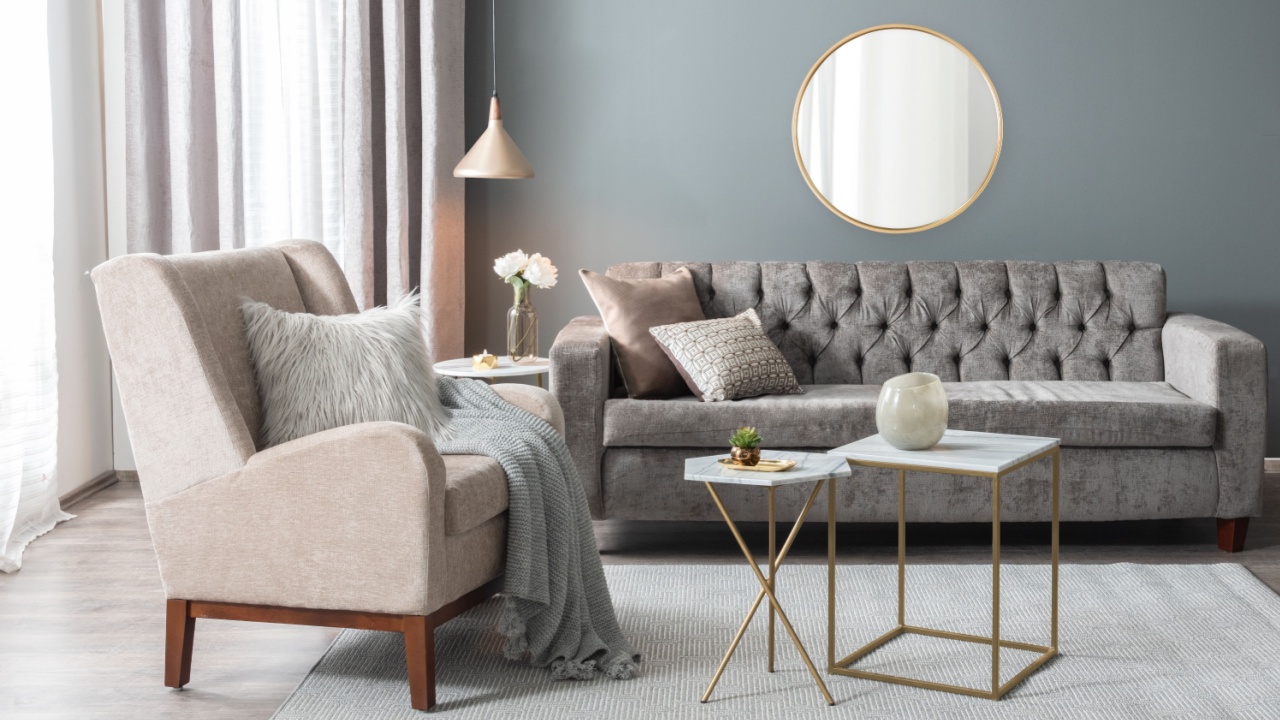
Image Credit: Shutterstock.
Symmetry is a powerful tool in design. A pair of lamps flanking a sofa or two chairs facing each other creates a sense of order, calm, and formality. It’s balanced and pleasing to the eye. But too much of a good thing can lead to a room that feels rigid, sterile, and uninspired.
When every pillow is perfectly karate-chopped and every item on a shelf has a mirror-image partner, the space can feel more like a hotel lobby than a comfortable home. Similarly, over-matching every element, from the curtains to the cushions to the rug, strips the room of its vitality. A bit of asymmetry and imperfection is what makes a space feel human and approachable.
A Better Approach:
- Aim for Balance, Not Symmetry: Instead of two identical chairs, try one chair and a small bench. Balance a large sofa on one side of the room with two smaller armchairs on the other.
- Vary Your Accessories: On a mantle or bookshelf, group objects of different heights, shapes, and textures together. Create small vignettes instead of lining things up in pairs.
- Mix Your Patterns: Don’t be afraid to use a floral pillow next to a striped one. As long as they share a common color, the mix will feel intentional and dynamic.
7. Following Old Design Rules Too Rigidly

Image Credit: bmphotographer / Shutterstock.
Many of us have internalized a set of design “rules” over the years: never paint a ceiling a dark color, all the wood finishes in a room must match, and your sofa must go against the longest wall. These guidelines were often created to solve specific problems and can be helpful starting points.
However, following them without question can stifle creativity and prevent you from making choices that truly suit your space and lifestyle. Some of the most interesting and beautiful rooms are the ones that bravely break the rules. Design should be a personal journey, not a test you have to pass.
A Better Approach:
- Question Everything: Before you follow a rule, ask yourself why it exists and if it applies to your specific situation. Does your small living room actually feel better with the sofa floating in the middle?
- Experiment in Small Ways: If you’re nervous, try breaking a “rule” in a low-stakes area like a powder room or guest bedroom. Paint the ceiling a surprising color or mix metals with abandon.
- Trust Your Instincts: If you love a particular combination that defies conventional wisdom, go for it. Your home should make you happy, and that is the only rule that truly matters.
8. Chasing Trends Instead of Personal Style
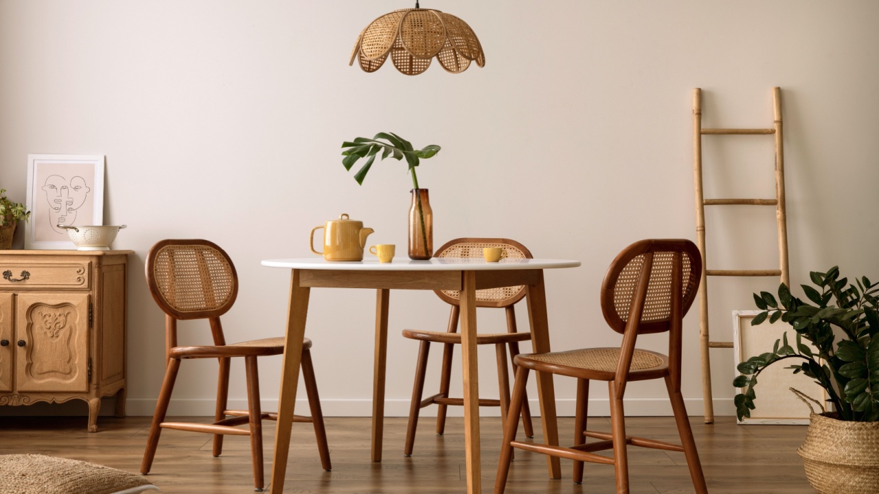
Image Credit: Shutterstock.
It’s easy to get swept up in the latest design trends. One moment it’s all about boucle fabric and arched mirrors, the next it’s checkered rugs and lime-washed walls. While incorporating current styles can keep your home feeling fresh, designing your entire space around what’s popular right now is a recipe for quick regret.
Trends, by their nature, have a short lifespan. A room that looks perfectly “in” today can feel dated in just a few years, prompting another expensive update. A more sustainable and satisfying approach is first to identify your own personal style and use trends as accents, not as the foundation.
A Better Approach:
- Invest in Timeless Staples: Spend your budget on classic, well-made foundational pieces like a sofa, dining table, and bed frame that won’t go out of style.
- Incorporate Trends with Accessories: Bring in trendy colors, patterns, and materials through smaller, less expensive items like pillows, throws, art, and decor objects. These are easy to swap out when you’re ready for a change.
- Analyze the Trend: Before you buy that trendy item, ask yourself what you actually like about it. Is it the color? The texture? The shape? You might be able to find a more timeless piece that captures the same essence.
9. Putting Function Last

Image Credit: Shutterstock.
A room can be breathtakingly beautiful, with perfectly coordinated colors and high-end furniture, but if it doesn’t work for the people who live in it, it’s a failure. A stunning living room with a delicate, pale sofa is impractical for a family with young children and a dog.
A kitchen with miles of open shelving looks great in photos, but can be a nightmare for someone who isn’t obsessively neat. When aesthetics are prioritized over practicality, you end up with spaces that are uncomfortable or difficult to maintain. Good design is a marriage of form and function; it should support and enhance your daily life, not complicate it.
A Better Approach:
- Analyze Your Lifestyle First: Before you choose a single piece of furniture, consider how you and your family will use the space. Who will be in the room? What activities will take place there?
- Choose Durable Materials: Opt for performance fabrics, sturdy wood finishes, and easy-to-clean surfaces in high-traffic areas.
- Plan Your Storage: Think through what you need to store in each room and incorporate adequate, accessible storage solutions from the beginning. A beautiful room is one that can stay tidy.
10. Overusing Primary Colors
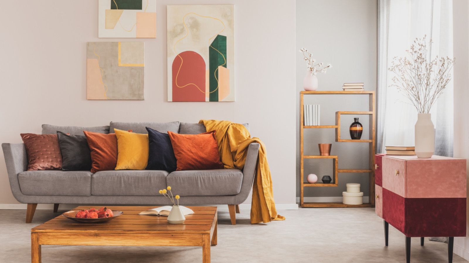
Image Credit: Deposit Photos.
Red, yellow, and blue are vibrant, energetic colors that can bring life to a room. They are foundational hues that command attention. However, when used in large quantities and in their purest forms, they can quickly become overwhelming.
A space dominated by bright primary colors can feel chaotic, loud, or even reminiscent of a children’s playroom rather than a sophisticated adult living space. The power of these colors lies in their strategic use. A small dose can make a big impact, but a heavy hand can overpower the senses and detract from a room’s intended atmosphere.
A Better Approach:
- Use Them as Accents: A splash of primary red in a throw pillow, a single yellow armchair, or a piece of art featuring bold blue can energize a neutral room without dominating it.
- Explore Sophisticated Shades: Instead of pure fire-engine red, consider a deeper burgundy or terra-cotta. Swap bright yellow for a richer mustard or ochre. A navy or teal can provide the depth of blue with more nuance.
- Balance with Neutrals: If you do want to use a large piece in a primary color, like a red sofa, be sure to surround it with plenty of calming neutrals like gray, beige, and white to give the eye a place to rest.
11. Overdecorating with Accessories

Image Credit: Shutterstock.
A common cliché is filling every surface, such as shelves, coffee tables, mantels, and countertops, with décor objects. The assumption is that more items equal a more stylish space, but it often results in visual clutter, making the room feel chaotic rather than curated. Experts say that over-accessorizing can detract from key pieces and architectural features. It will also make your room feel smaller and cluttered.
A Better Approach:
- Edit ruthlessly: Choose a few standout objects rather than filling every space. Let key pieces breathe.
- Group intentionally: Arrange smaller items in clusters of 3–5 for visual interest without overwhelming the eye.
- Vary scale and height: Mix tall, medium, and low objects to create depth while maintaining simplicity.
12. Ignoring a Room’s Bones

Image Credit: Shutterstock.
Sometimes, the biggest design mistake is ignoring the room itself. We impose a style or layout without considering the home’s existing architecture, light, or proportions. Trying to force a dark, cozy library feel in a sun-drenched room with floor-to-ceiling windows is fighting a losing battle.
Similarly, placing minimalist furniture in a room with intricate, historic molding can create a disconnect. The most successful designs work in harmony with the space’s inherent characteristics, highlighting its strengths and cleverly disguising its weaknesses.
A Better Approach:
- Assess the Architecture: Take note of the room’s unique features. Do you have beautiful windows, high ceilings, or interesting built-ins? Make those the stars of the show.
- Study the Light: Observe how the natural light moves through the room during the day. This will help you decide on paint colors and where to place furniture for different activities.
- Work With What You Have: If you have an awkward nook, turn it into a feature with a built-in bench or a small desk. If your ceilings are low, use vertical stripes or low-profile furniture to create an illusion of height.
Follow Your Gut
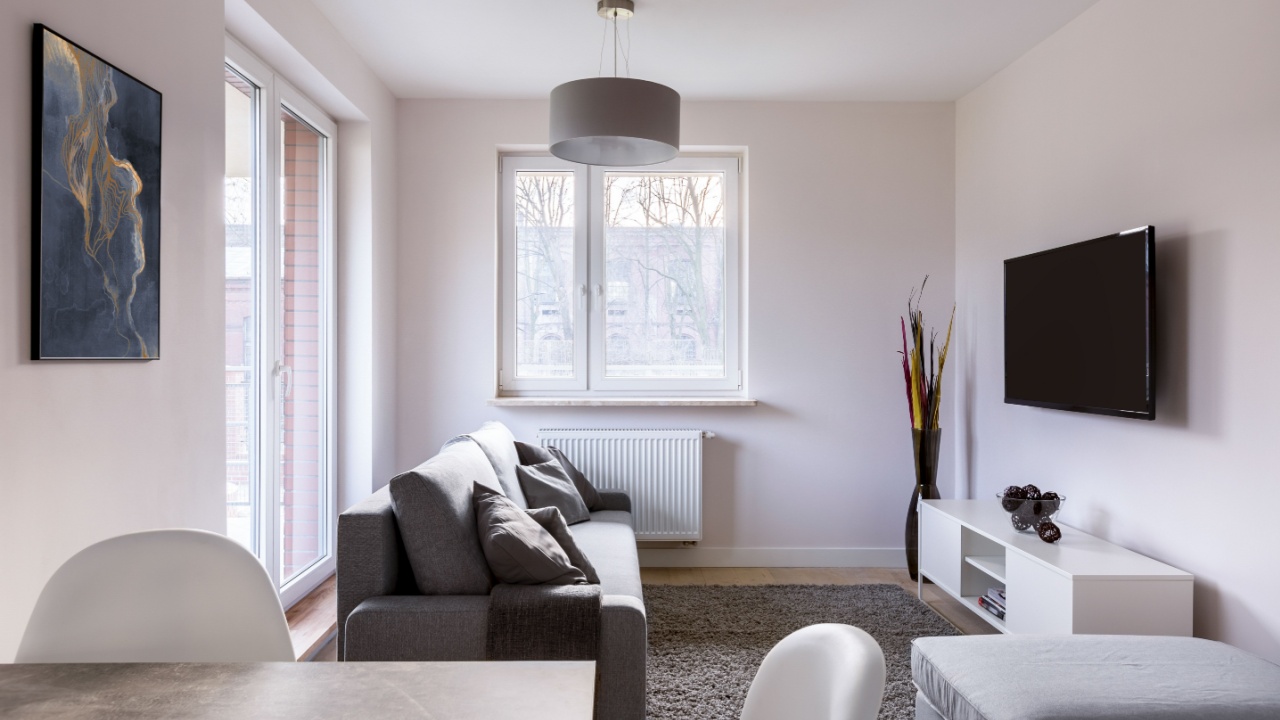
Image Credit: Shutterstock.
Your home is your sanctuary, and creating it should be a joyful process of discovery, not a rigid exercise in rule-following. Purge your home of anything that resembles these “cliches.” Instead, look around your space with fresh eyes.
Pick one room that doesn’t quite feel right. Does the furniture feel impersonal? Does the accent wall feel random? Consider one small adjustment based on these ideas. Maybe you swap two matching end tables for two different ones, or you find a piece of art you love to serve as the inspiration for a new, more personal color palette.