Bedding trends shift quietly. A color that once felt calm or stylish can start to feel flat, heavy, or strangely out of place without anyone noticing the moment it changed. Designers pay close attention to this shift because the bed sets the tone for the entire room.
When the color no longer supports rest, warmth, or visual balance, the space suffers. These five bedding colors are falling out of favor, not because they are wrong (if you love them, carry on!), but because bedrooms now call for softness, depth, and ease that these shades no longer deliver.
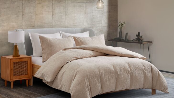
1. Gray and White Bedding Sets
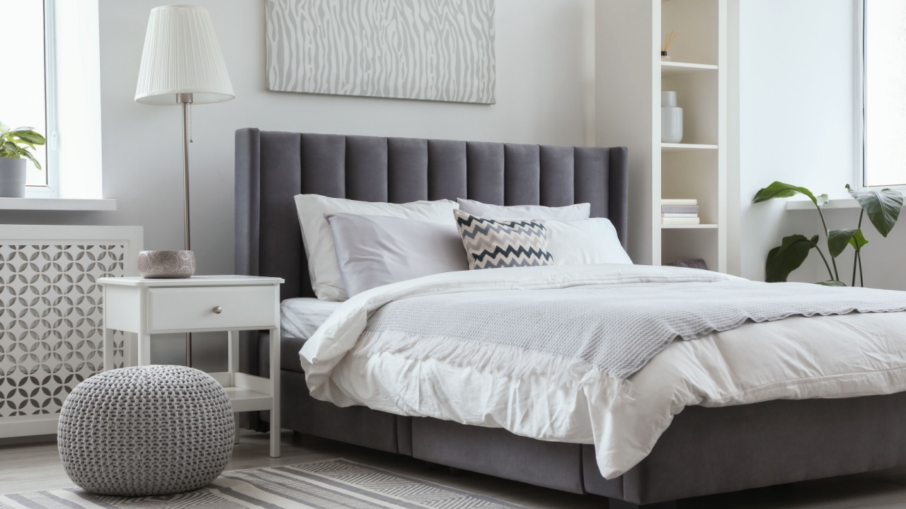
Image Credit: Shutterstock.
These two simple shades have dominated bedrooms for years, but many designers now see them as uninspired. Gray in particular can read flat and cold on a bed, lacking the warmth people look for in a restful space.
Plain white sheets carry a similar problem. They can feel sterile when used across all bedding pieces, especially under a bold comforter or in rooms that need softness. Both shades were beloved for their minimalism and pairing with modern furniture. Now the wider trend is toward warmth and depth.
Better alternatives:
Muted creams, warm beiges, or linen tones feel bright without clinical sharpness. Light, warm hues reflect light and make bedrooms feel larger and calmer.
2. Matching, Monochrome Sets
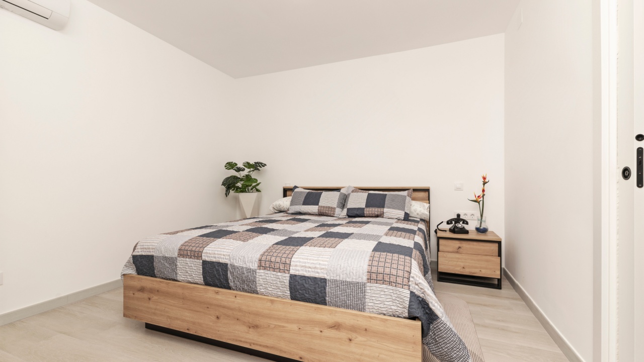
Image Credit: Shutterstock.
Uniform bedding in the same color from sheet to duvet has stopped being fashionable. Designers note that strict matching can look too “catalogue perfect” and lacks personality. Bedrooms are now styled more like living spaces rather than hotel rooms. Mixing colors and textures lets you layer visual interest without overwhelming the room.
What works instead:
Pair solid sheets with a patterned duvet, or contrast colors on pillows and throws. Complementary tones create cohesion while letting each piece breathe.
3. Deep Earth Tones Like Navy and Heavy Browns

Image Credit: Shutterstock.
Deep navy, brick, and similarly rich earth tones were once powerful choices. Now they can feel too heavy or traditional, especially in smaller rooms that need light. A full navy set, in particular, can soak up light and make a space feel smaller.
The current decor movement leans toward colors that feel relaxed and open. Heavy colors can anchor a room, but they can also make it feel closed in if used all over the bedding.
Easier choices:
Softer blues like periwinkle or dusty teal, and warm mid-tone neutrals like clay or sage, tend to lift a bed’s appearance while still feeling grounded.
4. Very Busy and Pattern-Heavy Bedding

Image Credit: Shutterstock.
Bedding with extremely dense patterns or cluttered prints can overwhelm a space. Designers recommend simpler graphics because they allow other design elements in a room to shine. Too many active forms on the bed compete with other decor and make it harder to build a balanced scheme.
Smarter picks:
Use patterns at a smaller scale or as accent pieces, such as on pillows or a throw, while keeping the larger bedding surfaces calmer.
5. Cool Pastels Used Alone
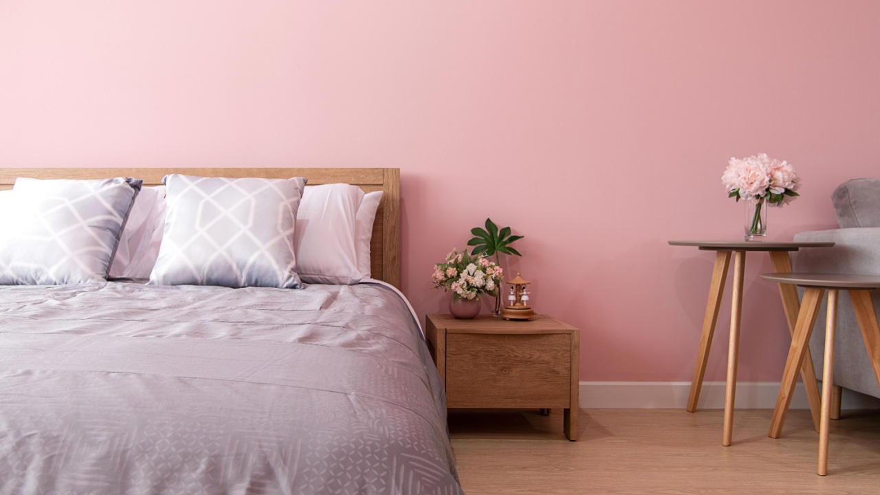
Image Credit: Shutterstock.
Soft pastels like baby blue or pale pink used across all bedding are losing ground because they can feel juvenile or lack the depth modern rooms need. Pastels work well as accents, but when used everywhere, they flatten the space and make it harder to layer other tones.
Better tweaks:
Pair pastels with warmer neutrals or earth-toned accents to give the color maturity and balance.
When the Bed Sets the Mood
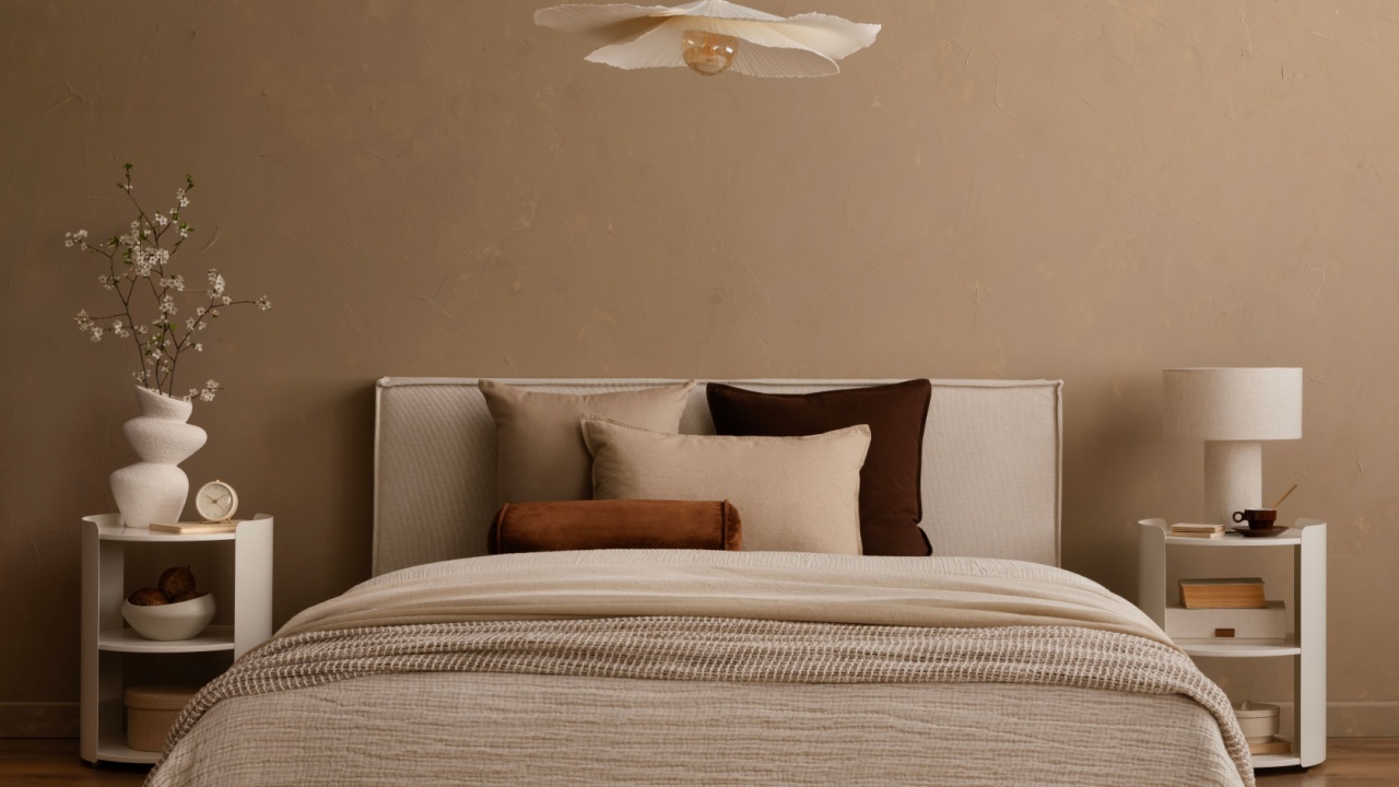
Image Credit: Shutterstock.
These color directions give a clear sense of what designers think is fading from bedroom style. Many of these are about balance, light, and livability rather than strict trend chasing.
If replacing bedding isn’t urgent, consider small adjustments like layering warm tones, mixing textures, and introducing subtle patterns. That kind of thoughtful refresh will keep a bedroom feeling current without starting from scratch.