Scrolling through design inspiration can feel like light-bulb moments one moment and an attempted visual assault the next. Some trends brighten a home and make daily life feel smoother. Others seem determined to test your patience and your salvation. Other times, a room can look stunning in photos, yet create small frustrations once it becomes part of everyday living.
This list explores popular design choices that spark strong reactions. Many gained attention because they look stylish from a distance. Then real life steps in. Messes appear. You get a dog. Families grow. What seemed exciting in a showroom can feel complicated at home.
Every home tells a story. The ideas in this list are here to help you notice what supports daily routines and what might be creating small annoyances. If a design trend isn’t improving comfort or usability, you have full permission to adjust it so your home actually works for the life happening inside it.
Here are some of the most talked-about design trends that prompt strong opinions from homeowners everywhere.
1. The All-Gray-Everything Look
Image Credit: Shutterstock.
This trend paints the town gray: gray walls, gray floors, gray furniture, and even gray-painted brick (sometimes). The idea is to create a modern, neutral backdrop that feels sophisticated and calm. For a while, it seemed like the entire design world was dipped in a bucket of cement-colored paint.
The main complaint is that a sea of gray feels dull, sterile, and unwelcoming. It can make a home feel less like a personal sanctuary and more like a corporate office waiting room. Injecting personality back into a gray room often requires more than just a few colorful throw pillows.
- Try This Instead: If you like neutral tones, consider warmer options like beige, cream, or taupe. These colors provide a similar blank canvas without feeling cold. You can also use gray as an accent color. A single gray feature wall or gray cabinetry can look sharp without overwhelming the space.
2. Open Floor Plans
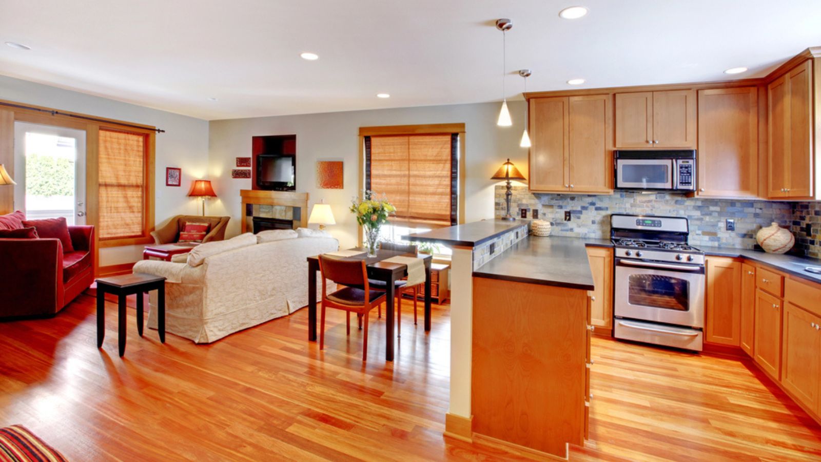
Image Credit: Depositphotos.com.
The open floor plan removes walls between the kitchen, living room, and dining area to create one large, multifunctional space. The goal is to make a home feel more spacious, airy, and sociable. It’s been a dominant feature in home design for decades.
However, it creates a complete lack of separation. Cooking smells from the kitchen waft directly into your living space. The noise from the dishwasher clashes with your favorite TV show and wakes the dog sleeping in the corner. And there is absolutely nowhere to hide clutter. If one area is messy, the entire floor looks like a disaster zone. For many, the constant noise and visual chaos are enough to make them wish for walls.
- Try This Instead: You can create separation without building walls. Use large area rugs to define different zones. Arrange furniture in distinct groupings to create visual boundaries. Bookshelves or decorative screens can also act as stylish room dividers, offering a sense of separation while maintaining an open feel.
3. TVs Mounted Above the Fireplace
Image Credit: Shutterstock.
Placing the television above the fireplace has become a go-to solution for many homeowners. It creates a single focal point in the room, saving wall space and combining two popular gathering spots.
This one is a triple threat of bad ideas. First, the viewing angle is terrible. Cranking your neck up to watch a movie is uncomfortable and can lead to strain. Second, heat is the mortal enemy of electronics. The warmth rising from a fireplace can shorten your TV’s lifespan. Finally, it often makes the room’s layout awkward, forcing all furniture to face one wall.
- Try This Instead: Place the TV on a separate media console at eye level when you’re seated. This is better for your neck and your electronics. If space is tight, consider mounting the TV on an adjacent wall. This allows you to arrange your furniture more flexibly and enjoy both the fireplace and the television without sacrificing comfort.
4. Garage-Forward Houses

Image Credit: Shutterstock.
This architectural style places the garage at the very front of the house, making the garage door the most prominent feature from the street. This design is common in many suburban developments because it is often a practical way to fit a house and a two-car garage on a narrow lot.
Critics argue that it completely ruins curb appeal. Instead of a welcoming porch or charming windows, visitors are greeted by a massive, impersonal garage door. It can make a home feel like a storage unit for cars rather than a place for people.
- Try This Instead: If you’re stuck with a front-facing garage, you can improve its appearance. Invest in an attractive garage door with windows or interesting hardware. Paint it a color that complements your home’s exterior. Flank the garage with large, beautiful planters or climbing vines to soften its appearance and draw the eye elsewhere.
5. Books Turned Backward

Image Credit: Shutterstock.
This is a purely aesthetic choice where books are placed on shelves with their spines facing the wall and the pages facing out. This creates a uniform, neutral look, as all the book pages are a similar off-white color. It’s a trick used by some interior stylists to reduce visual clutter. Some other sources claim it’s a copyright issue, especially if your bookshelf will be public.
For book lovers, this is a cardinal sin. How are you supposed to find the book you want to read? It turns a functional library into a meaningless, beige-toned art installation. It suggests that the books are there for decoration, not for reading, which feels disingenuous to many.
- Try This Instead: If you want a more uniform look for your shelves, organize your books by color. A rainbow-ordered bookshelf can be a stunning and organized feature. You can also use decorative bookends and space out your books with small plants or objects to break up the visual density.
6. All-White Kitchens
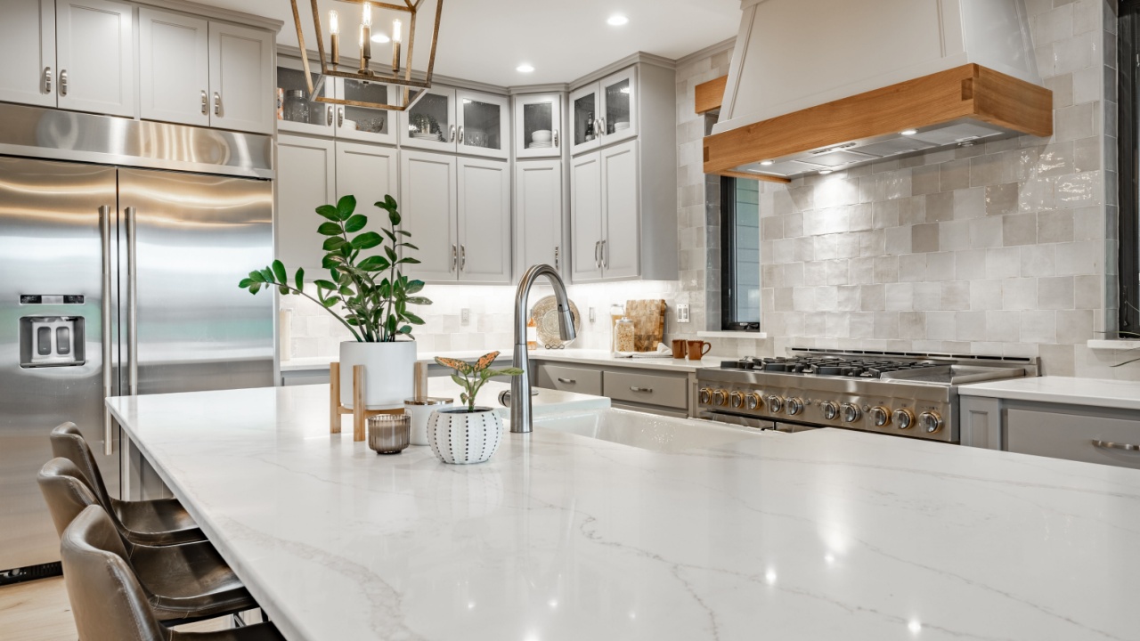
Image Credit: Shutterstock.
The all-white kitchen features white cabinets, white countertops, a white backsplash, and sometimes even white appliances. This look is meant to be timeless, bright, and clean. It can make a small kitchen appear larger and provides a versatile backdrop for any decor style.
While it looks great in magazines, the reality can be a nightmare. All-white surfaces show every single crumb, smudge, and splash. It’s a high-maintenance choice that requires constant cleaning to look its best. For those who actually want to be cooking in it, an all-white kitchen can feel sterile and impractical.
- Try This Instead: Introduce some contrast. Pair white cabinets with a darker countertop, or add a colorful backsplash to inject some personality. Wood accents, like a butcher block island or open shelving, can bring warmth into the space. Two-toned cabinets, with a different color for the lower and upper units, are another great way to add visual interest.
7. Plastic Patio Furniture
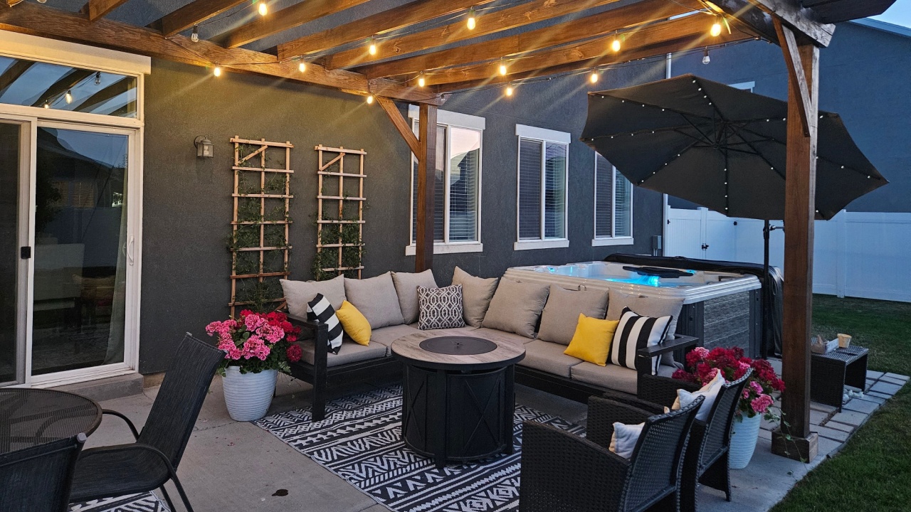
Image Credit: Shutterstock.
Inexpensive, lightweight, and stackable, plastic Adirondack chairs and patio sets are a fairly common sight in backyards everywhere. They are a budget-friendly option for furnishing an outdoor space and come in a wide variety of colors.
The main complaint is that it often looks cheap and feels flimsy. It can fade and become brittle in the sun, and lightweight pieces can be blown around in a storm. For many, it lacks the substance and style of wood, wicker, or metal furniture, making an outdoor space feel less inviting.
- Try This Instead: If your budget is tight, look for secondhand wood or metal furniture that you can refinish. A fresh coat of paint can work wonders. If you do opt for plastic, choose high-quality, heavy-duty resin furniture that mimics the look of wood or wicker. These options are more durable and have a more substantial appearance.
8. Clear Glass Shower Enclosures
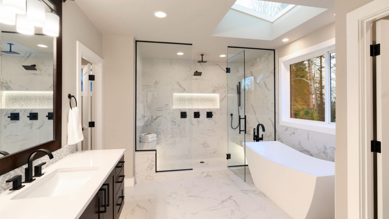
Image Credit: Shutterstock.
The frameless, clear glass shower doors create a sleek, modern look in a bathroom. They allow light to flow through the space and can make a small bathroom feel larger by not visually dividing the room.
Maintaining these enclosures is not as easy. Clear glass shows every single water spot, soap scum deposit, and streak. Keeping it pristine requires squeegeeing the glass after every single shower, a chore that many people quickly tire of. The lack of privacy is another common complaint.
- Try This Instead: Frosted or textured glass provides the same modern feel without the high-maintenance cleaning routine. It offers privacy while still allowing light to pass through. Another option is a simple, high-quality shower curtain. It’s easy to clean or replace, and allows you to add a pop of color or pattern to your bathroom.
9. Over-the-Range Microwaves

Image Credit: Depositphotos.com.
This design combines a microwave and a range hood into one unit that sits directly above the stove. It’s a space-saving solution that is very common in smaller kitchens, as it frees up valuable counter space.
The problem is twofold. First, it can be a safety hazard. Reaching up over a hot stove to get a steaming dish out of the microwave is risky, especially for shorter individuals or children. Spills are almost inevitable. Second, the ventilation function on these units is often subpar compared to a dedicated range hood, failing to effectively remove smoke and cooking odors.
- Try This Instead: If you have the space, a countertop microwave is the simplest alternative. To save counter space, you could place it on a dedicated shelf or in a cabinet pantry. For ventilation, installing a proper, ducted range hood will always be more effective at clearing the air in your kitchen.
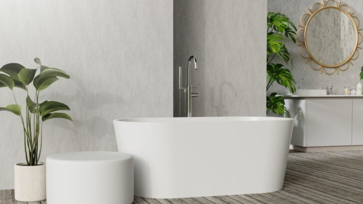
10. Freestanding Tubs
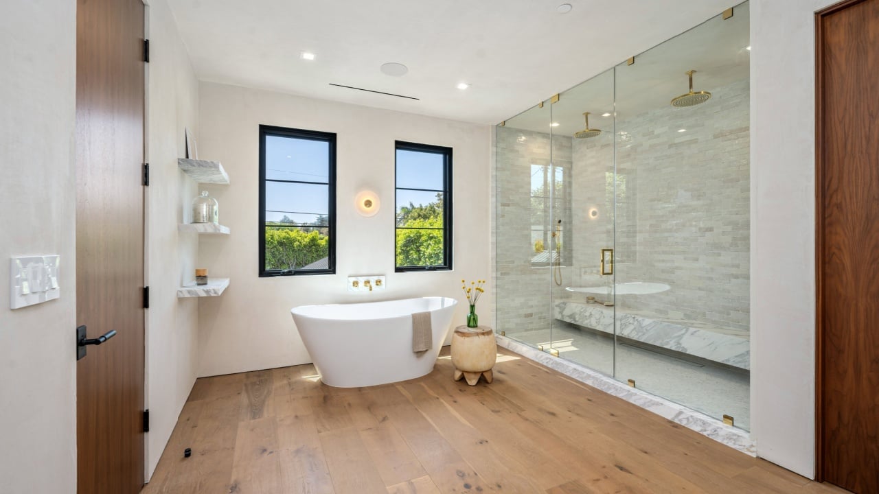
Image Credit: Shutterstock.
A freestanding tub is a beautiful statement piece that can make a bathroom feel luxurious, like a personal spa. Unlike built-in tubs, they can be placed anywhere in the room, offering more layout flexibility.
Getting in and out can be awkward, and water inevitably drips all over the floor. Cleaning around and behind the tub is a difficult task. And there is nowhere to put your shampoo, soap, or a glass of wine without adding a separate table or caddy.
- Try This Instead: An undermount tub set into a tiled or stone deck offers a similar sleek look with much more practicality. You get a convenient ledge for all your bathing essentials and an easier-to-clean setup. If you love the look of a freestanding tub, consider one that is flat against a wall on one side to minimize cleaning headaches.
11. Fake Shutters
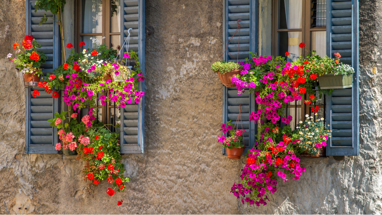
Image Credit: Shutterstock.
These are decorative plastic shutters attached to the exterior of a house, usually positioned on either side of the windows. They are meant to give the appearance of classic, functional shutters that could protect windows if they were operable. The goal is to add charm and a traditional architectural detail that makes the facade feel a bit more styled and complete.
The issue arises when they are obviously non-functional and incorrectly sized. Real, operational shutters should be sized to completely cover the window when closed. Many fake shutters are comically narrow for the windows they adorn, instantly signaling that they are purely for show. For design purists, it’s an architectural lie that cheapens the look of a house.
- Try This Instead: If you want shutters, invest in properly sized, functional ones made from wood or a high-quality composite. If that’s not in the budget, a better option is to remove the fake shutters altogether. A clean facade is better than one with poorly executed decorations. Instead, focus on beautiful window trim or planter boxes to add character.
12. Unvented Range Hoods
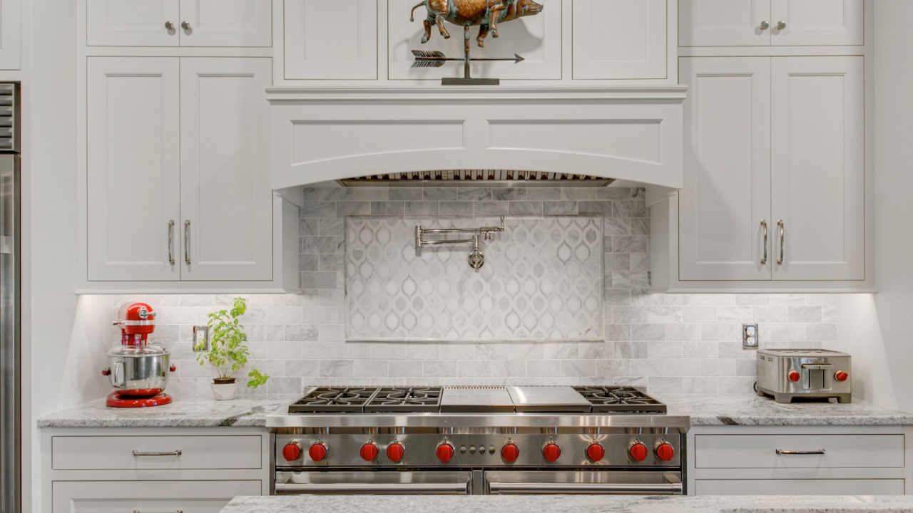
Image Credit: Shutterstock.
An unvented, or ductless, range hood looks like a regular range hood but doesn’t actually vent air outside. Instead, it sucks air through a filter (usually charcoal) and recirculates it back into the kitchen. They are easier and cheaper to install than ducted hoods.
The problem is that they are largely ineffective. While the filter may trap some grease and odors, it does nothing to remove heat, steam, and airborne pollutants from your kitchen. It basically just moves the greasy, hot air around. For anyone who cooks regularly, this is a frustrating and pointless appliance.
- Try This Instead: Whenever possible, install a range hood that is ducted to the outside. This is the most effective way to maintain good air quality in your kitchen. If ducting is truly not an option, open a window and use a fan to direct air outside while you cook.
13. Horizontal Electrical Outlets
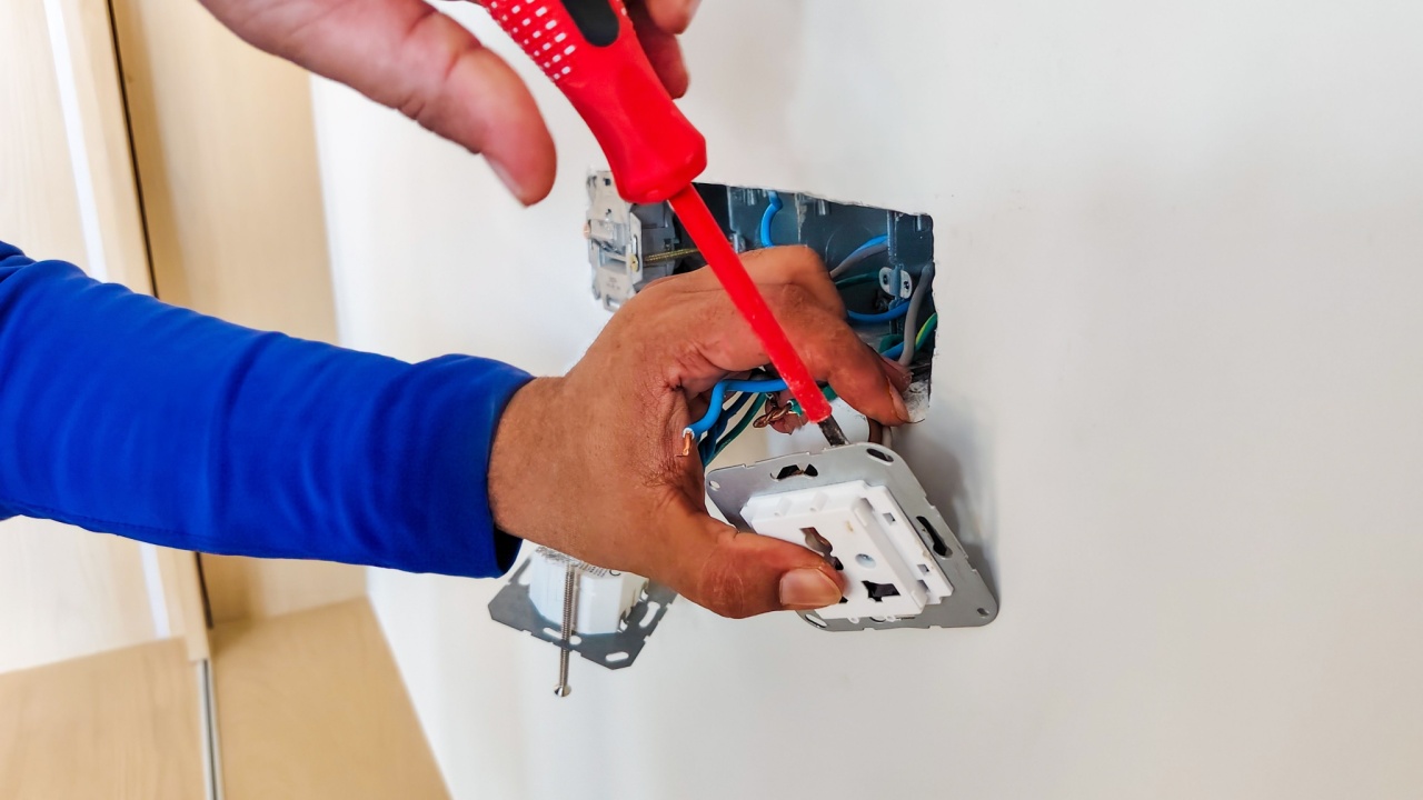
Image Credit: Shutterstock.
Instead of the standard vertical orientation, this trend places electrical outlets horizontally, often along the baseboards or on a kitchen backsplash. The intent is to create a more subtle, streamlined look that blends in with the lines of the room.
Functionally, it can be a pain. Plugs, especially larger ones, can be difficult to insert and are more easily knocked out by a vacuum cleaner or a stray foot. For outlets on a kitchen backsplash, a horizontal orientation can make it hard to plug in multiple items at once, as the cords can get tangled.
- Try This Instead: Stick with standard vertical outlets. They are the standard for a reason: they are functional and secure. If you want a more seamless look, you can buy outlet covers that are paintable to match your wall color. Pop-up outlets that sit flush with the countertop are another option for a clean look in the kitchen.
14. Tiny Bedrooms in Huge Houses
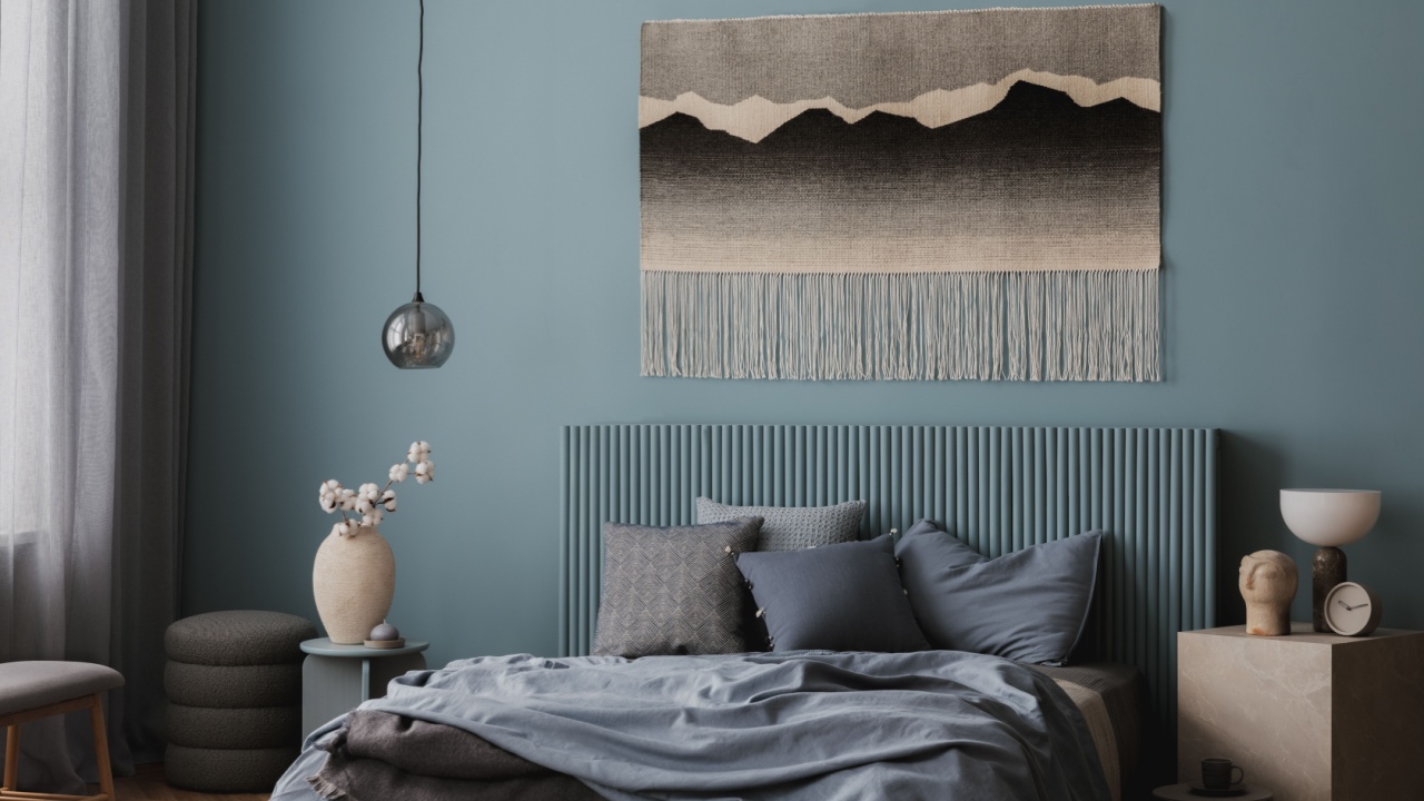
Image Credit: Shutterstock.
This refers to newly built, large homes that feature grand entryways, massive open-concept living areas, and huge primary suites, but then have secondary bedrooms that are barely big enough for a bed and a dresser.
The issue is a poor allocation of space. All the square footage is dedicated to the “wow” factor spaces, leaving the functional, everyday rooms feeling cramped and impractical. It’s especially frustrating for families with children or for those who need a home office. A small bedroom offers little flexibility as needs change.
- Try This Instead: When designing or buying a home, prioritize balanced room sizes. A slightly smaller great room might be a worthy trade-off for bedrooms that are actually comfortable and usable. Good design is about how a space functions for the people living in it every day, not just how it looks on a real estate listing.
What to Do Next

Image Credit: Shutterstock.
Your home should be a reflection of you, not a slave to passing trends. The next time you are planning a project, consider both form and function. Before you jump on the latest design bandwagon, ask yourself if it truly works for your lifestyle. A beautiful home is one that you love to live in, even if it breaks a few design “rules.”
Take a look around your own home and garden. Are there any trends you adopted that you now regret? It’s never too late to make a change. Pick one small thing that bothers you and make a plan to update it. Your home should be your sanctuary, not a source of daily irritation.
Read more
12 80s Design Trends Making a Quiet Comeback
6 Viral Home Design Trends That Are Actually Giant Money Pits