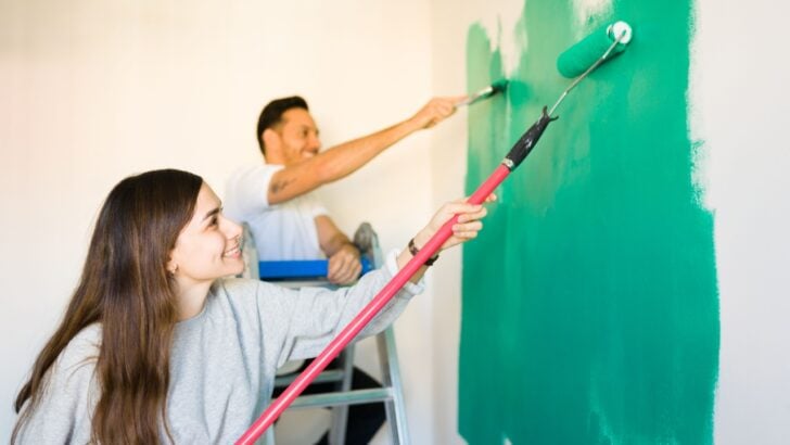
Nostalgia often influences the way people decorate their living spaces today. Homeowners frequently look back to their own childhood homes and memories to find inspiration for their upcoming renovation projects.
Certain shades from past decades are currently experiencing a massive revival in popularity. You might recognize some familiar hues returning to modern interior design.
Paint trends cycle through phases just like fashion styles do. People crave environments that feel deeply personal and rooted in history. Richer tones provide a sense of comfort that stark modern minimalist designs often lack.
Historical colors often possess complex undertones that shift beautifully in different lighting. This article details seven returning paint shades you might want to try. Let us dive into the gorgeous shades currently dominating the design world.
1. Deep Plum
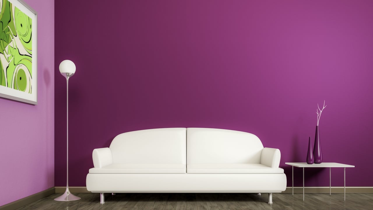
Image Credit: Shutterstock.
Deep plum offers a rich jewel tone that completely transforms a dull room. This dark purple variation brings immense warmth to large and small spaces alike.
The rich color creates a luxurious atmosphere reminiscent of Victorian sitting rooms. Homeowners love how this opulent shade commands attention without overwhelming the eye.
You can easily incorporate deep plum into your dining room or home office. The dark tone pairs exceptionally well with brass hardware and natural wood furniture.
Painting the trim the same shade as the walls amplifies the historic aesthetic. Try using this color in rooms that receive plenty of natural sunlight.
2. Rosemary Green

Image Credit: Shutterstock.
Sherwin-Williams produced an incredible moody green named Rosemary that looks spectacular. This deep hue brings quiet sophistication to both modern and traditional interiors.
The color captures the essence of natural foliage while maintaining a refined appearance. Designers frequently use this shade to ground bright rooms with a darker contrast.
Rosemary green looks fantastic painted across custom kitchen cabinetry or built-in bookshelves. The shade completely revitalizes outdated wooden pieces when applied as furniture paint.
You should pair this green with cream accents to keep the room bright. Metallic fixtures like polished nickel pop beautifully against the dark green background.
3. Soft Blues
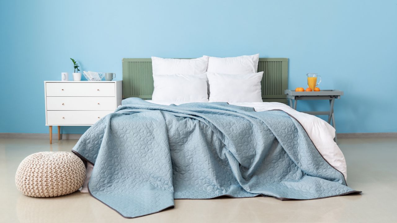
Image Credit: Shutterstock.
Gentile blue shades easily evoke fond memories of relaxed coastal interiors. These calming tones create peaceful environments suitable for rest and daily relaxation.
Many historic properties feature variations of pale blue in their original color palettes. The gentle hue provides an ideal backdrop for displaying artwork and antique collections.
Pale blue walls contrast perfectly against dark hardwood floors and rich textiles. You can paint bedroom ceilings a soft blue to imitate a clear sky.
The shade works wonderfully in bathrooms, especially when paired with classic white subway tile. Natural linen fabrics look exceptionally beautiful positioned next to light blue walls.
4. Emerald Green
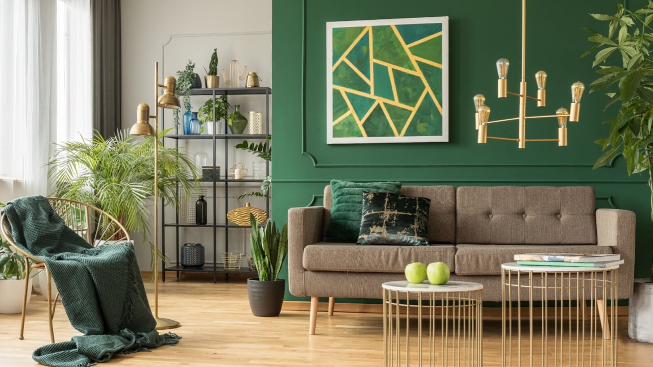
Image Credit: Shutterstock.
Emerald green serves as a vibrant jewel tone demanding immediate attention. The intense hue dominated Art Deco designs and is now experiencing a massive revival.
This bold color brings an undeniable sense of luxury to everyday living spaces. Homeowners choose emerald to make strong statements in otherwise plain architectural areas.
Painting a small powder room emerald green creates an incredible jewel box effect. You might also use this shade on a single accent wall behind your bed.
The vibrant tone looks best paired with warm metallics like gold or brass. Layering emerald with velvet textures enhances the luxurious aesthetic significantly.
5. Warm Whites
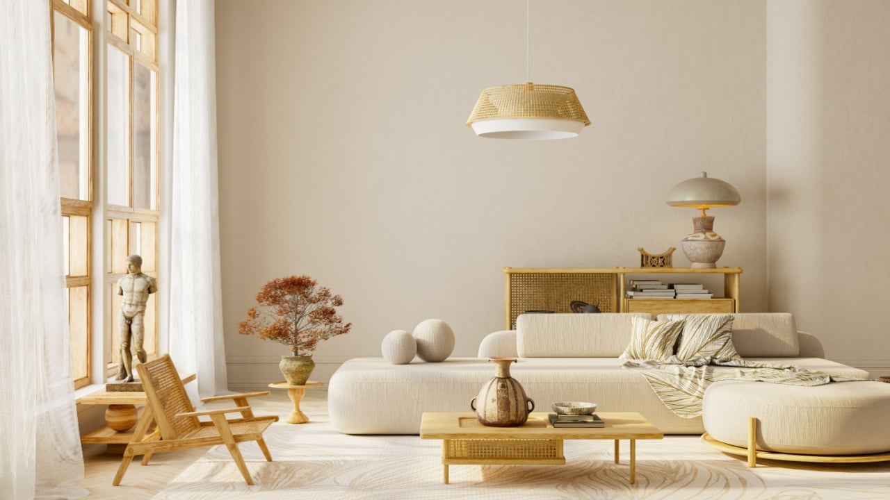
Image Credit: Shutterstock.
Warm white paint provides a timeless alternative to sterile bright white options. These soft shades contain subtle yellow or pink undertones that soften a room.
Older homes almost exclusively featured warm whites rather than modern bright white variations. The gentle color balances stronger returning shades while keeping the spaces feeling incredibly open.
You should use warm whites to paint large open living rooms and hallways. The soft color beautifully unifies different design elements across a large floor plan.
These shades look especially inviting when illuminated by warm incandescent light bulbs. Natural wood tones blend seamlessly with the soft undertones found in warm whites.
6. Forest Green
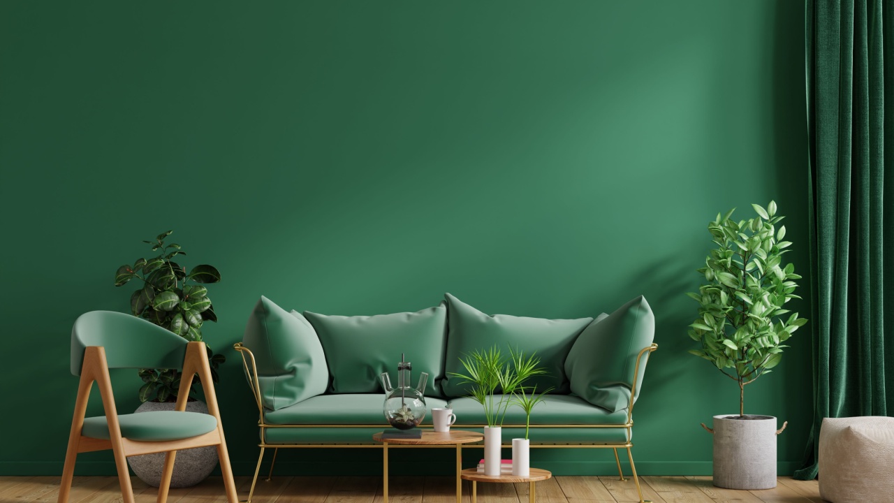
Image Credit: Shutterstock.
Forest green remains a deeply moody shade that naturally grounds a room. The dark color draws heavy inspiration from mid-century modern design principles.
It brings the outdoors inside while maintaining a highly tailored and sophisticated appearance. Many design enthusiasts favor forest green as an alternative to dark navy blue.
This dark shade works wonders when applied to lower kitchen cabinets or islands.
You can successfully pair forest green with light marble countertops for a beautiful contrast. The rich tone also makes standard interior doors look far more expensive. Add warm wooden cutting boards and copper pots to complete the desired aesthetic.
7. Saybrook Sage
Image Credit: Shutterstock.
Benjamin Moore offers Saybrook Sage as a quiet and earthy olive tone. This muted green perfectly straddles the line between a neutral and a bold color.
The subtle shade frequently appeared in historic homes throughout the early twentieth century. It possesses an understated elegance that quietly enhances the surrounding decor.
Saybrook Sage looks exceptionally beautiful in spaces flooded with morning sunlight. You might paint your entryway this gentle shade to welcome guests properly.
The color complements bright white trim and traditional wainscoting perfectly. Try decorating with terracotta pots and woven baskets to highlight the earthy undertones.
Painting the Past into the Present
Image Credit: Deposit Photos.
Historical paint shades offer incredible opportunities to completely revitalize your living space. Older color palettes bring layers of personality back into standard modern interiors. Some paint colors will even boost your home’s resale value.
Returning trends prioritize comfort and rich character over cold and stark minimalism. Embracing these older shades helps create homes that feel highly curated and unique.
You now have several gorgeous historic paint options ready for your next project. Testing a few small paint samples will help you find the absolute perfect match.