Colors are more than just the light spectrum being redirected in different hues; they each have deeper meanings. Moreover, many colors represent ideas and feelings, and some even affect human behavior.
Of course, this means that paint is one of the few upgrades that can genuinely shift buyer perception in minutes. Walk into a home with the right palette, and it feels bigger, cleaner, and move-in ready, even if nothing else has changed. That emotional response often translates directly into stronger offers.
In fact, color regularly delivers one of the highest returns of any home improvement, adding measurable value at resale, according to an Angi post. Of course, it depends on certain factors, like targeting specific zones of your property.
The trick isn’t just painting; it’s choosing tones that appeal to the widest possible pool of buyers. The question is which paint colors should we choose to boost our home’s value?
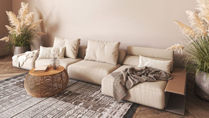
1. Combine Two Neutrals for Warm Greige
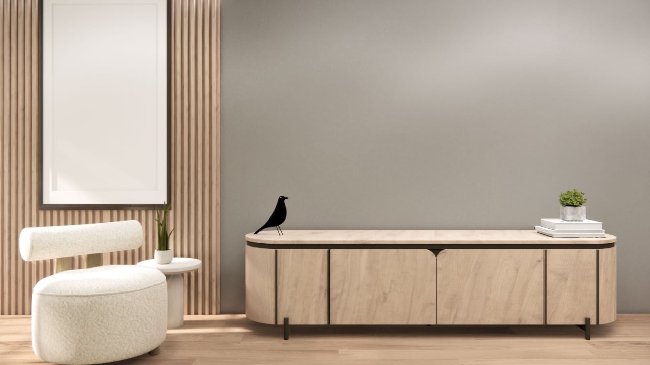
Image Credit: Shutterstock.
Greige has quietly become the MVP of real estate interiors. It bridges the gap between cool gray and warm beige, making spaces feel modern without turning cold or sterile. Combining two neutrals “is basically like creating a ‘super neutral’,” writes Bridget Mallon of Apartment Therapy.
It’s a top-performing neutral because it adapts to both natural and artificial light. That flexibility helps rooms feel cohesive throughout the day: something buyers subconsciously notice during viewings. A griege living room will help you sell your home.
2. Ditch the Bright for Soft White in Your Kitchen
 Image Credit: Shutterstock.
While crisp white sounds like a safe bet, overly bright shades can feel clinical. Softer whites, like creamy or off-white tones, create warmth while still making spaces feel clean and open. The sweet spot is a white that reflects light without stripping the room of personality.
Some experts believe overly stark whites can actually reduce appeal in some rooms, especially kitchens. It’s the opinion of interior designer Victoria Holly, interviewed on the Martha Stewart platform. “White kitchens are not completely out — they still have a place,” she says. “Similar to the wedding dress effect, you always want a warmer white to make things look richer.”
3. Light Gray Takes Things Beyond Neutral
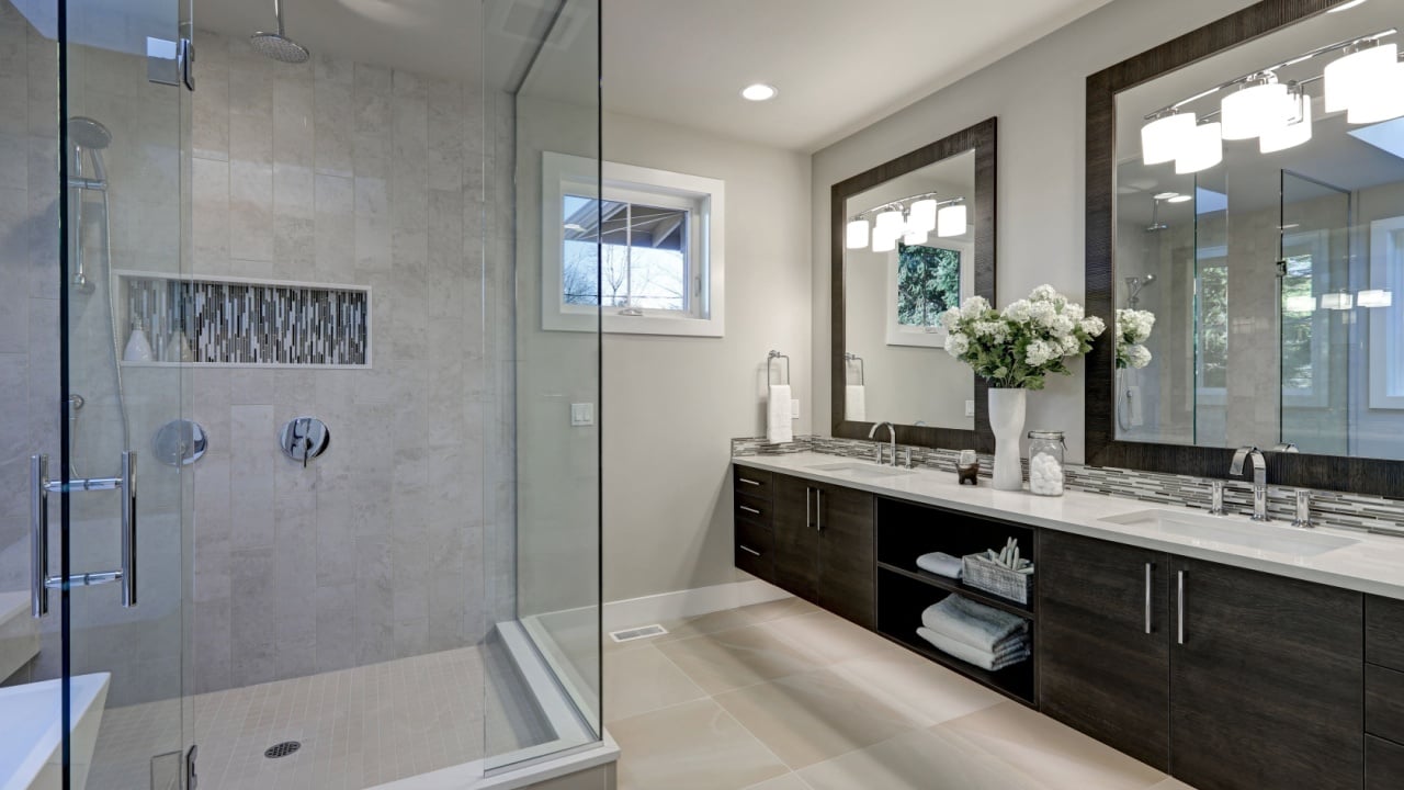 Image Credit: Shutterstock.
Light gray continues to dominate because it offers a blank canvas that still feels intentional. It’s neutral, but with enough depth to suggest a recently updated home. Subtle gray tones help create an “airy feel” that works across design styles.
For buyers, that translates to fewer mental renovations — and fewer objections. “When it comes to paint selection, undertone is incredibly important. Light gray paint can lean cool or warm,” states a Havenly Hideaway guide. “For a more modern look, select cooler, contemporary light gray paint colors to create a sleek, artful environment.”
4. Navy Blue for Bedrooms and Accent Walls
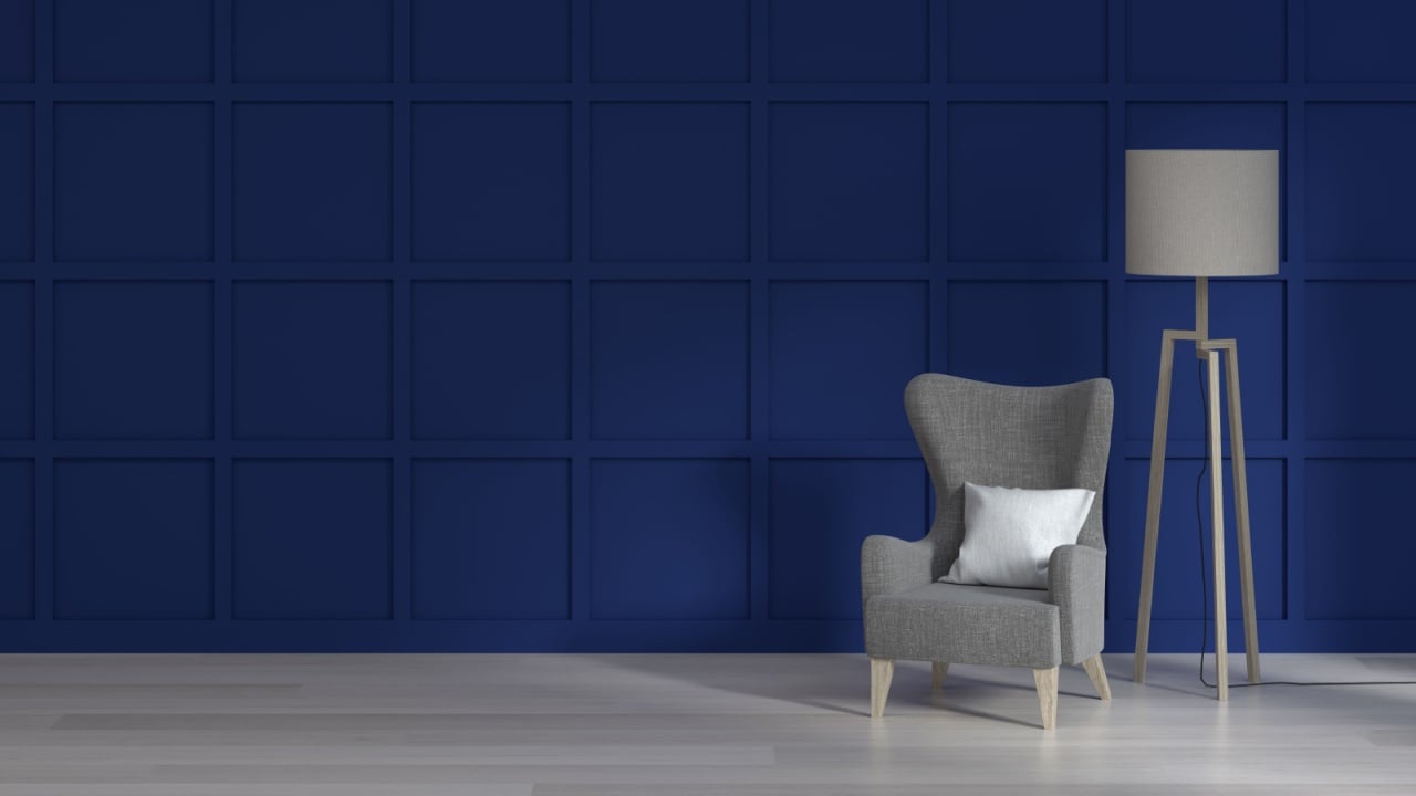
Image Credit: Shutterstock.
Navy blue has emerged as a surprisingly strong value driver, especially in bedrooms. It adds depth and sophistication without overwhelming the space. Buyer preference studies show that darker blues can increase perceived value by creating a calm, upscale environment.
“Zillow research found that buyers liked blue for the bedroom more than any other color,” reads the Zillow paint color study. “They were willing to offer the most for a navy blue bedroom, too, meaning the color could boost a sale price by an estimated $1,815.” Therefore, navy blue is a clear winner for the upstairs part of the house tour.
5. Pale Blue for Bathrooms That Sell Faster
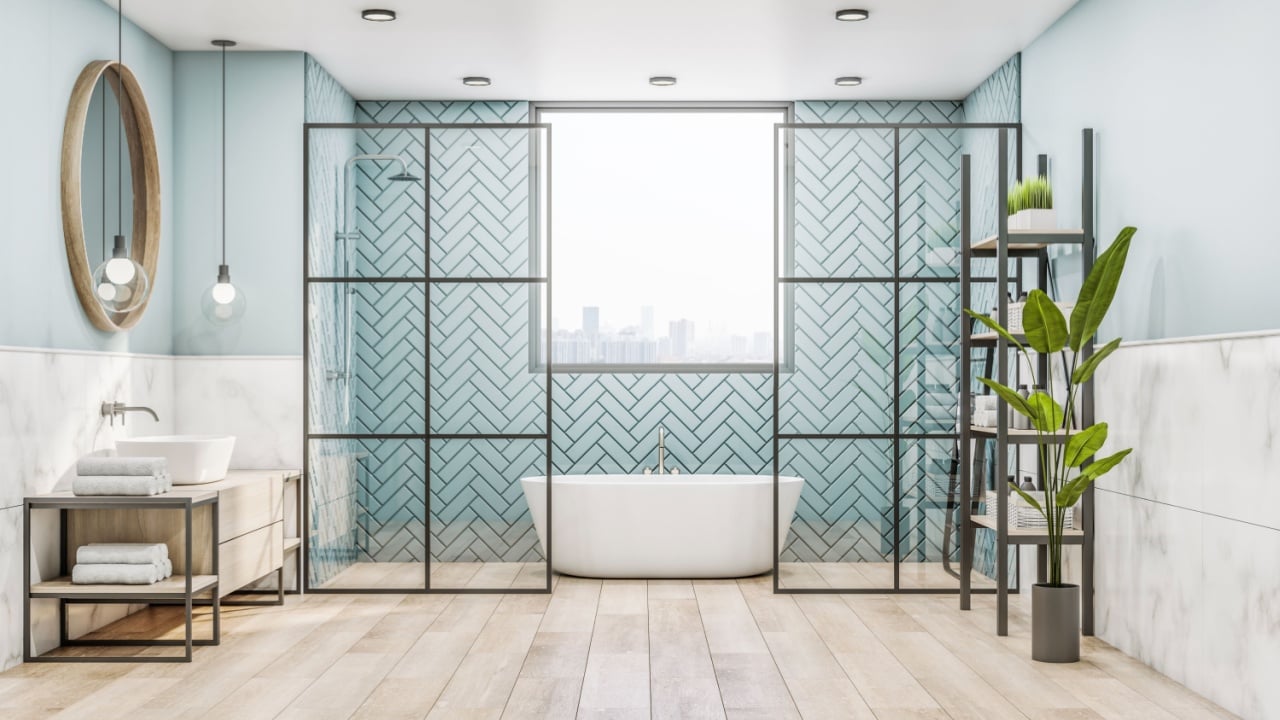
Image Credit: Shutterstock.
Bathrooms painted in soft, pale blue tones consistently outperform expectations. The color evokes cleanliness, calm, and a spa-like atmosphere. Buyers associate the color with relaxation: it makes them associate this feeling directly with your property.
“Studies consistently show that buyers find light blue bathrooms especially appealing,” advises the Bridge to Bow Property Group. “This preference can translate into higher offers and faster sales.” If this is to be believed, feeling blue never looked so good. While we can’t be certain, perhaps the reminder of water is behind all these connections.
6. Olive Green for Modern Kitchens
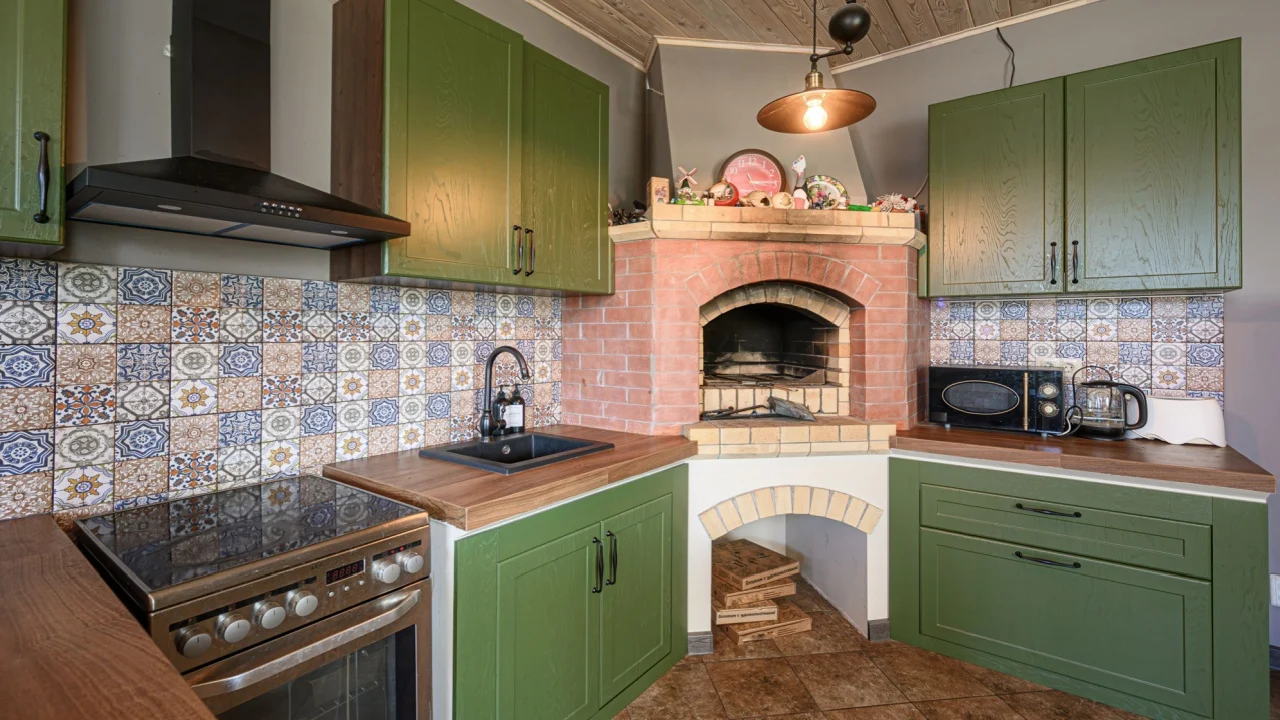 Image Credit: Shutterstock.
If pale blues are the savior of the bedroom, olive green has the same advantage for kitchens. Green kitchens may have had their moment, but olive tones are now leading the pack. They feel grounded, natural, and aligned with “organic modern” trends.
Southern Living champions the nature-inspired green look. Olive green, in particular, adds warmth without overpowering the room, making it a safer “statement” choice. “You’ll be surprised how easy a dark green kitchen is to live with,” writes Cameron Beall.
7. Warm Taupe To Help Imagination
 Image Credit: Shutterstock.
Taupe sits comfortably between gray and brown, offering a grounded, earthy feel that appeals to a broad range of buyers. It’s especially effective in living rooms and transitional spaces. The Spruce outlines a remarkable 17 taupe hues for different uses, citing how “Benjamin Moore’s Edgecomb Gray” is a classic choice.
Warm neutrals help buyers imagine their own furniture and décor in that space on open house day. That visualization is key to reducing friction during the decision-making process.
8. Charcoal Gray for Contrast and Depth
- Image Credit: Shutterstock.
“Rich, moody colors like charcoal gray in kitchens and living rooms can increase a home’s sale price by up to $2,500 and $1,700,” reads a New Life Painting guide. Used strategically, charcoal gray can work inside or outside, and it signals modern design without overwhelming buyers.
Design trend reports suggest darker neutrals are gaining traction because they feel contemporary and intentional. When balanced with lighter elements, charcoal creates a high-end look buyers associate with newer homes. It also doesn’t hurt that it can withstand wear and tear from the elements better than brighter hues.
9. Muted Yellow for Kitchen Warmth Without Risk
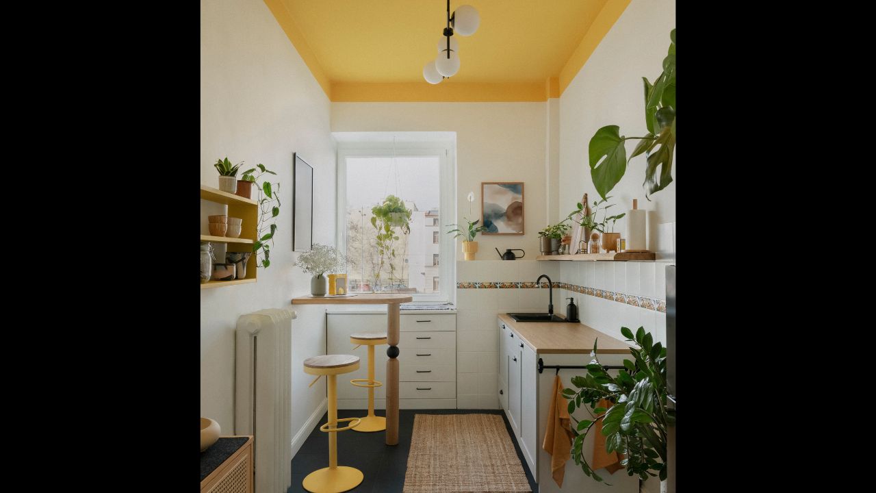
Image Credit: Shutterstock.
Yellow can be risky, but muted, wheat-like tones strike the right balance. They bring soft, warm energy without feeling loud or dated. Real estate firm Carpenter-Kessel-Compass agrees with this concept, stating how “a cheerful yellow kitchen can feel more welcoming and energetic.”
The key is restraint, and the objective should be warmth, not brightness. When used sparingly, yellow can support the purpose of certain spaces in the home, boosting its economic appeal.
10. Forest Green Brings an Exterior Boost
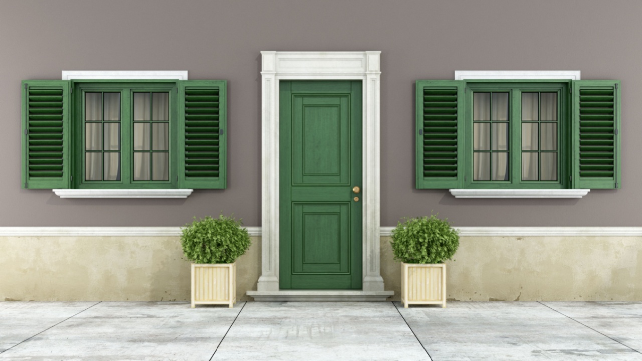
Image Credit: Shutterstock.
Forest green may sound like a charming Maine town, but it is another dark hue that could help sell your home. It works particularly well on exteriors or as a front door color, bringing strong connections to stability, nature, and a sense of understated luxury.
“While forest green still reflects these soothing qualities, its dark tone adds a sense of drama, making it perfect for moody, sophisticated spaces,” says Emily Moorman for Homes & Gardens. It’s a color that can work indoors and outdoors, feeling both classic and current: a cheat code in real estate.
11. Slate Blue for Curb Appeal
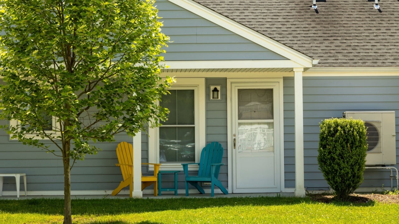
Image Credit: Shutterstock.
Slate blue is one of those colors that quietly does everything right. It’s distinctive enough to stand out but neutral enough to avoid alienating buyers. In fact, many new builds now come with blue slate shingles or roofing, bringing a smart curb appeal.
Blue-toned exteriors and doors can significantly boost perceived value and buyer interest. It’s especially effective for first impressions, where decisions are often made in seconds. One version of this is Evening Blue, from James Hardie Building Products Inc., the company’s self-proclaimed 2025 Color of the Year.
12. Soft Beige Is a Safe Bet That Still Works
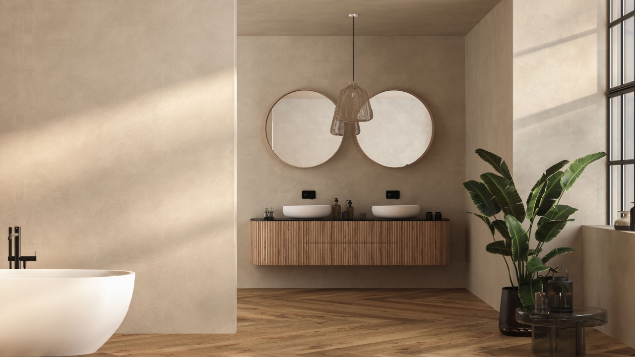
Image Credit: Shutterstock.
Beige is a word some use to describe anything comfortable, unspectacular, or safe, and while it may not excite designers, it still wins in real estate. A well-chosen soft beige feels warm, neutral, and universally acceptable.
Design firm Elevate Paint Pros stresses how “warm beige tones create a cozy, traditional feeling that appeals to … those looking for a move-in ready home.” Updated beige tones, not least those with subtle undertones, can transcend the dated look of early-2000s interiors. For buyers, that means fewer reasons to negotiate or walk away.
Read More
12 Warning Signs Your Plumbing Needs Replacing Immediately
13 Everyday Items You’re Keeping for No Good Reason That Collect Dust