What makes a room look expensive? Sometimes it’s the accessories, sometimes it’s the color. Paint does that faster than almost any other design choice, and it sets the mood the second you walk in.
The shade on your walls can make trim look sharper, ceilings look taller, and everyday furniture look more polished. Some colors reflect light in a soft, rich way, while others add depth, making a room feel layered and finished.
Expensive-looking color does not always mean dark or bold. A warm white, a muted green, or a deep blue can all lift a space when the tone is right, and the finish feels smooth.
Here are eight paint colors that can make a home feel fancy and expensive, with practical ideas for using each one well.
1. Soft Creamy White
Image Credit: Shutterstock.
Soft creamy white gives a room a polished look without the harsh feel of a stark white wall. Interior designers often lean on warmer whites because they reflect light gently and make trim, wood floors, and natural fabrics look richer.
This type of white also helps older homes feel updated while keeping their original charm intact.
To get this look right, choose a white with warm undertones instead of one that leans icy or gray. Test it in morning and evening light first, since the same shade can shift a lot during the day.
A matte or eggshell finish on the walls paired with a satin trim can make the room feel more finished without doing too much.
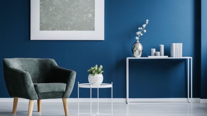
2. Navy Blue
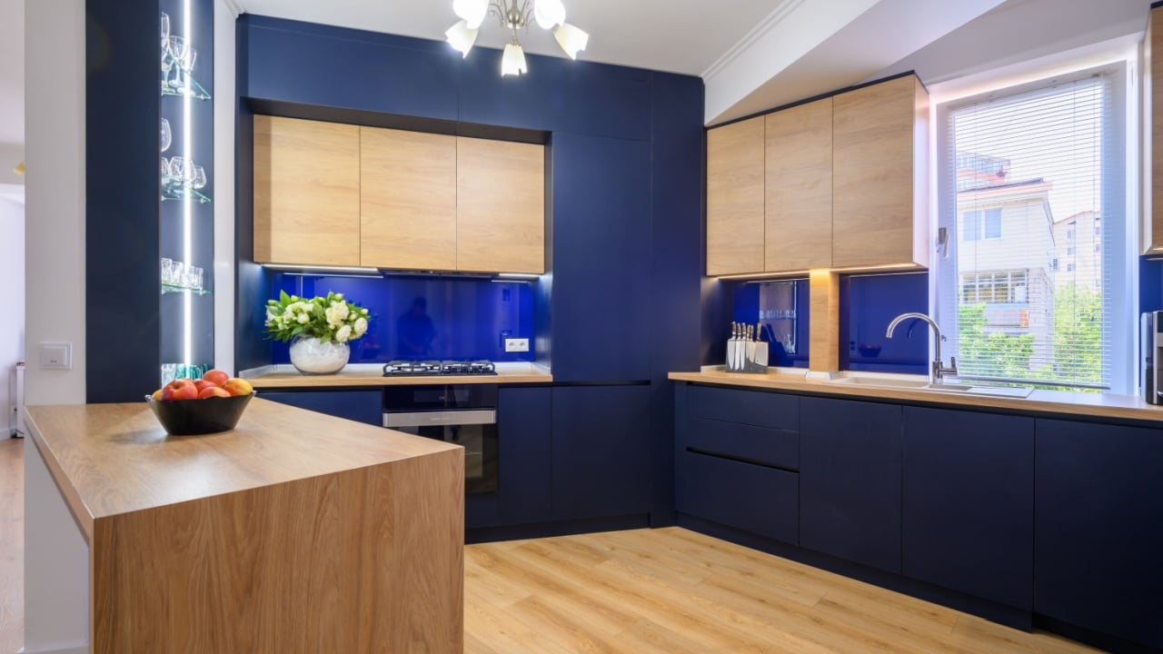
Image Credit: Shutterstock.
Navy blue gives instant depth and structure to a room, which is why it often shows up in high-end living rooms, kitchens, dining rooms, and cabinetry. It reads as rich and grounded, and it pairs well with brass, marble, warm wood, and cream textiles.
In many homes, navy adds the weight that makes a room feel designed instead of pieced together.
Use navy where you want a strong visual anchor, such as a dining room, built-ins, or lower kitchen cabinets. Balance it with lighter walls, soft lighting, and a few warm materials so the room does not feel heavy.
If full navy walls seem like too much, try it on millwork or a single bank of cabinets for a refined look.
3. Emerald Green
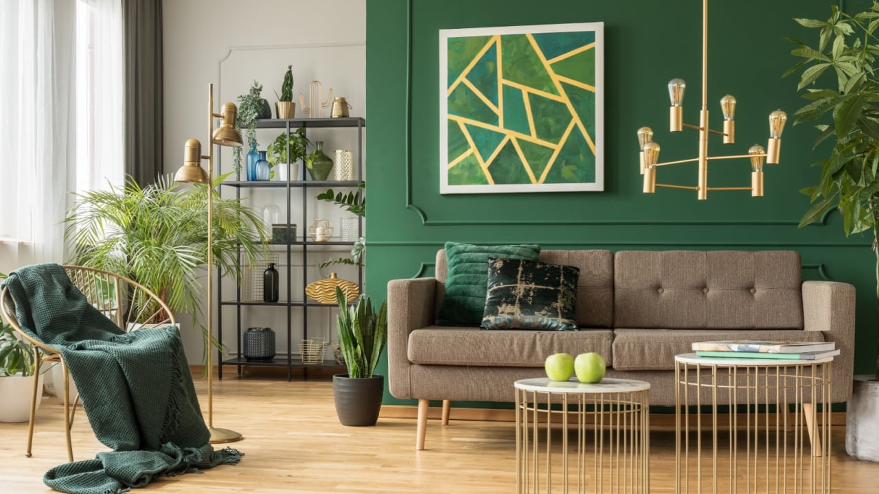
Image Credit: Shutterstock.
Emerald green feels lush, layered, and bold in a way that reads upscale when used with care. Jewel tones have long been linked with formal interiors, and emerald stands out for its depth and richness.
It can make a dining room, library, or powder room feel custom, especially when paired with ivory, walnut, or dark navy accents.
This color looks best when the room has enough light or a strong purpose, since it brings a lot of presence.
Use it where you want color to feel intentional rather than casual, and keep nearby finishes simple so the green stays in focus. Brass hardware, framed art, and warm wood tones can help it feel rich instead of loud.
4. Olive Green
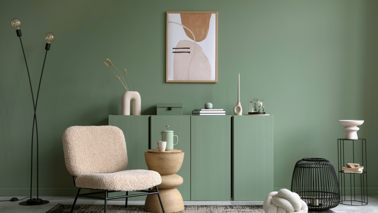
Image Credit: Shutterstock.
Olive green brings an earthy, refined look that feels settled and mature. It has more depth than a pale sage, yet it stays softer than many darker greens, which helps a room feel elevated without looking severe.
Designers often use olive on walls, cabinetry, and even trim because it works well with white, camel, black, and aged brass.
For a polished result, pair olive green with natural textures such as linen, leather, jute, or wood. It suits living rooms, offices, and bedrooms where you want warmth and visual depth.
If you want a fresh update without painting every wall, an olive on a vanity, island, or built-in can still give that expensive feel.
5. Gentle Blue
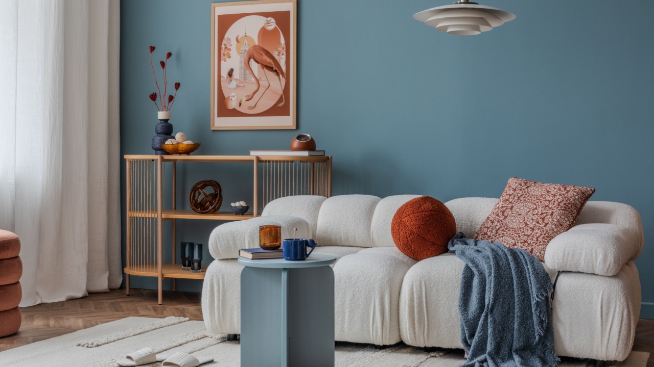
Image Credit: Shutterstock.
Gentle blue can make a room feel calm, refined, and quietly polished. Soft blues have long been used in bedrooms and sitting rooms because they bring color without visual noise, and they often flatter both natural and artificial light.
When the undertone is muted rather than bright, the shade feels grown-up and elegant.
Look for dusty or gray-blue tones instead of baby blue if you want a more elevated result. These shades pair well with warm whites, pale wood, antique brass, and soft beige fabrics.
A gentle blue works especially well in bedrooms, bathrooms, and guest rooms where a light touch still feels finished.
6. Deep Purple
Deep purple can give a room a rich, tailored look that feels far more expensive than basic beige or gray. Used well, shades like aubergine and plum create depth similar to navy or charcoal, though with more personality.
This color has a long history in formal interiors, and it still feels striking when paired with gold, dark wood, or creamy neutrals.
The easiest way to use deep purple is in a smaller room or a space meant for evening use, such as a dining room, library, or powder room. Good lighting matters here, since dim light can make the color fall flat if the undertone is muddy.
Keep surrounding decor edited so the walls look intentional and rich rather than busy.
7. Oxblood
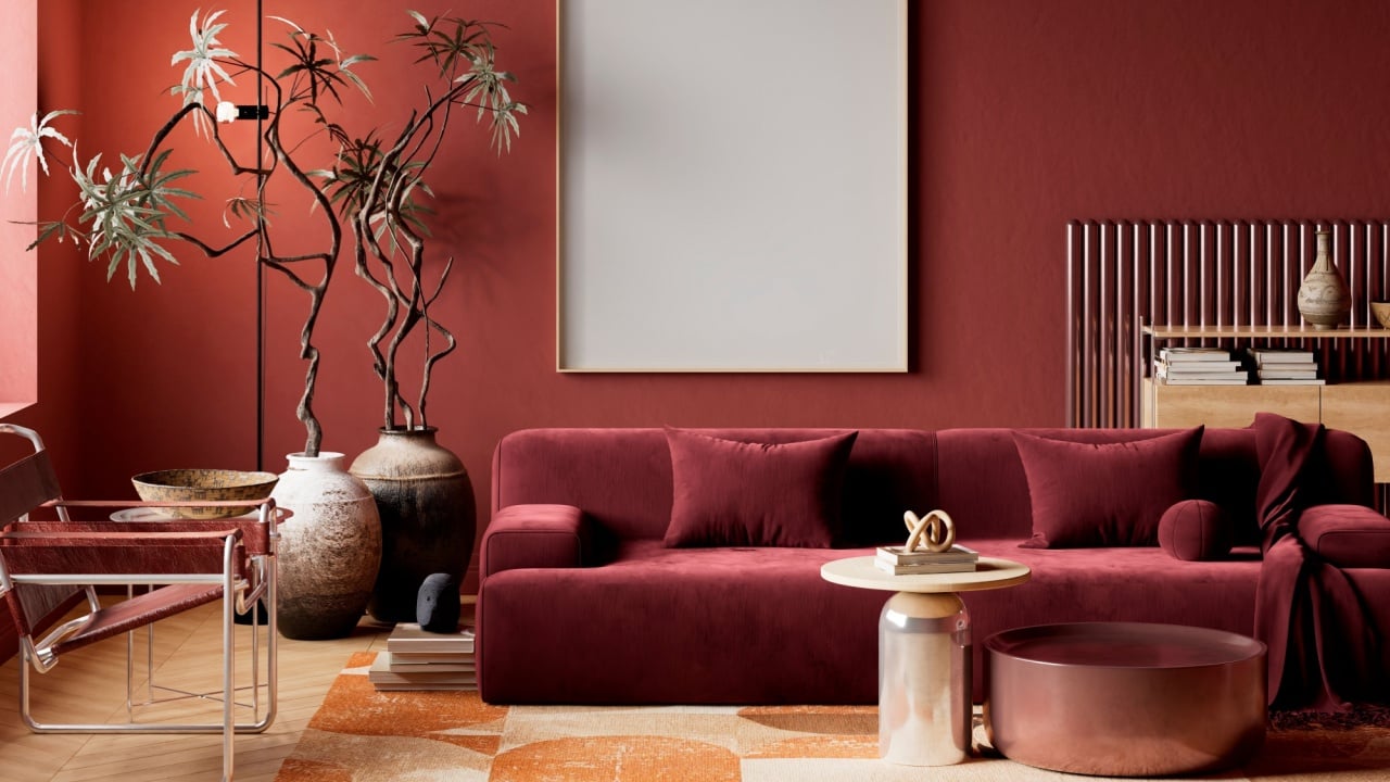
Image Credit: Shutterstock.
Oxblood is a deep red with brown undertones that gives walls a moody, refined look. It feels more sophisticated than a bright burgundy because it has weight and warmth without looking flashy.
In formal rooms, this shade can make millwork, artwork, and vintage furniture stand out in a way that feels collected and expensive.
This color works best when used with purpose, since it is bold and full of character. Try it in a dining room, study, or on a single accent wall where it can create depth without closing in the whole space.
Pair it with warm metals, dark wood, and soft cream accents to keep the room balanced.
8. Sunny Yellow
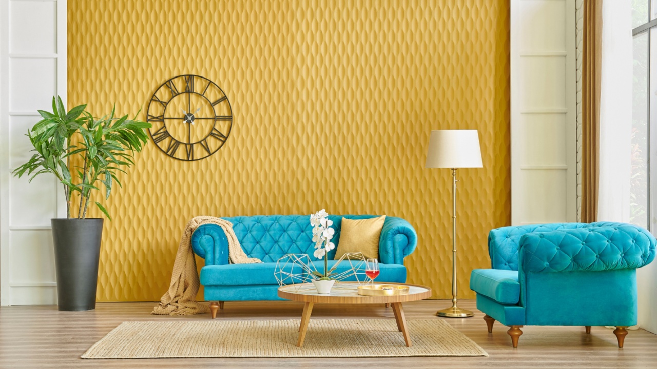
Image Credit: Shutterstock.
Sunny yellow may seem unexpected on a list like this, yet the right shade can make a home feel bright, elegant, and well-cared-for. The trick is choosing a muted golden yellow or buttery tone instead of a loud primary shade.
In the right setting, yellow adds warmth that makes white trim, natural wood, and traditional details look richer.
Use sunny yellow in kitchens, breakfast rooms, or entryways where natural light can soften it.
Balance it with quiet neutrals, simple finishes, and a few darker accents so the room feels polished. When yellow is slightly softened, it can read cheerful and refined at the same time.
Give Your House a Richer Look

Image Credit: Shutterstock.
Paint changes the way a room reads before you add art, lighting, or new furniture. The right shade can make a plain space feel layered, thoughtful, and far more polished.
If you want your home to feel fancy and expensive, these eight colors offer a strong place to begin, each with its own style and strength.
Read More:
What Your Front Door Color Says About You
How the Exterior Color of Your Home Affects Your Power Bills