Designing a living room that feels sophisticated and inviting requires more than just buying nice furniture. It involves a careful curation of accessories and a keen eye for scale.
Often, specific decorative choices can unintentionally lower the aesthetic quality of a space, making it appear cluttered or inexpensive rather than polished. This guide identifies seven common styling missteps designers recommend avoiding and offers practical solutions to help elevate the look of your home.
Note: If you enjoy your home exactly the way it is, disregard this advice. It is meant for anyone who can’t quite put their finger on what’s missing or needs to be adjusted.
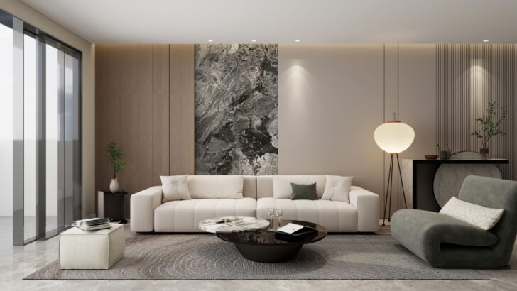
1. A Rug That’s Too Small
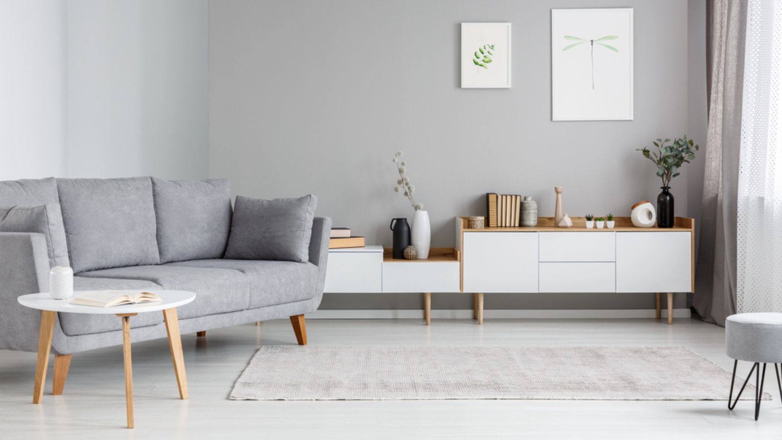
Image Credit: Deposit Photos.
A rug that is diminutive in size often creates a disjointed visual effect. When a rug floats in the center of the room without touching the furniture, it creates an awkward island that separates the seating area rather than unifying it.
This visual gap shrinks the perceived size of the room and makes the furniture arrangement feel temporary or unfinished. A properly sized rug anchors the conversation area and defines the zone within the larger open space.
The Fix: Position the rug so that at least the front legs of the sofa and chairs rest upon it to ground the arrangement.
2. Artwork That’s Too Small
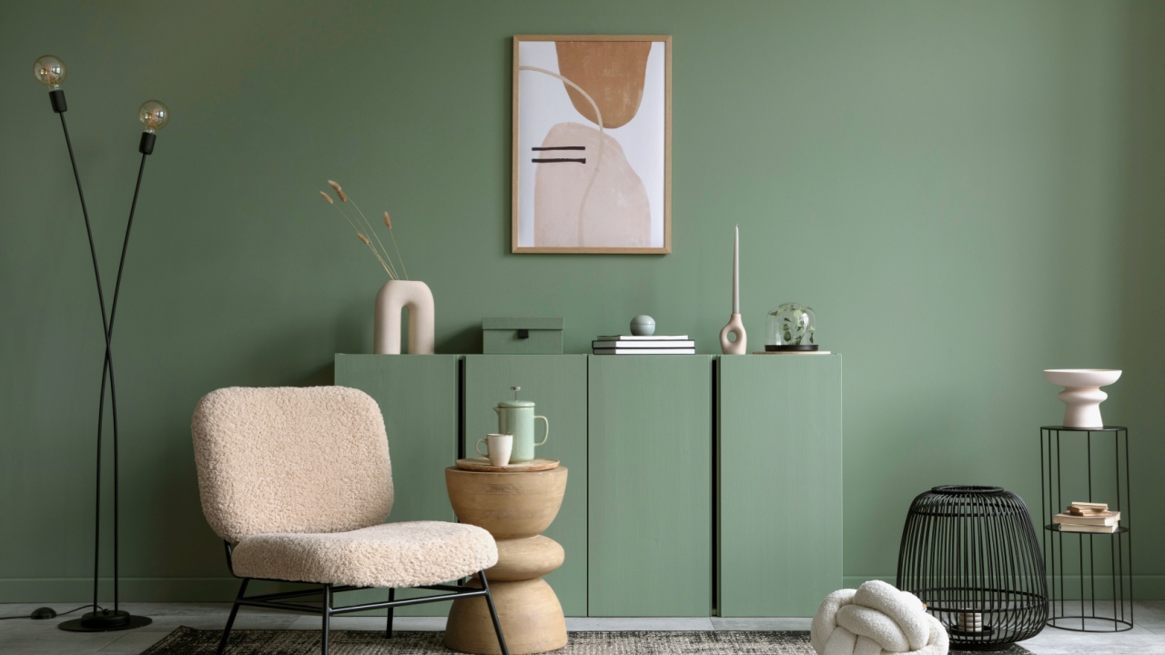
Image Credit: Shutterstock.
Hanging a small frame on a large expanse of wall throws off the balance of the entire room. It tends to look like an afterthought rather than a deliberate design choice. Attempting to compensate for the small size by surrounding it with unrelated smaller pieces often results in visual clutter rather than a curated gallery.
The scale of the art should communicate with the furniture below it, typically spanning two-thirds the width of the sofa or console table it hangs above.
The Fix: Select a large statement piece or group smaller works together to fill the visual field appropriately.
3. Disorganized Family Photos
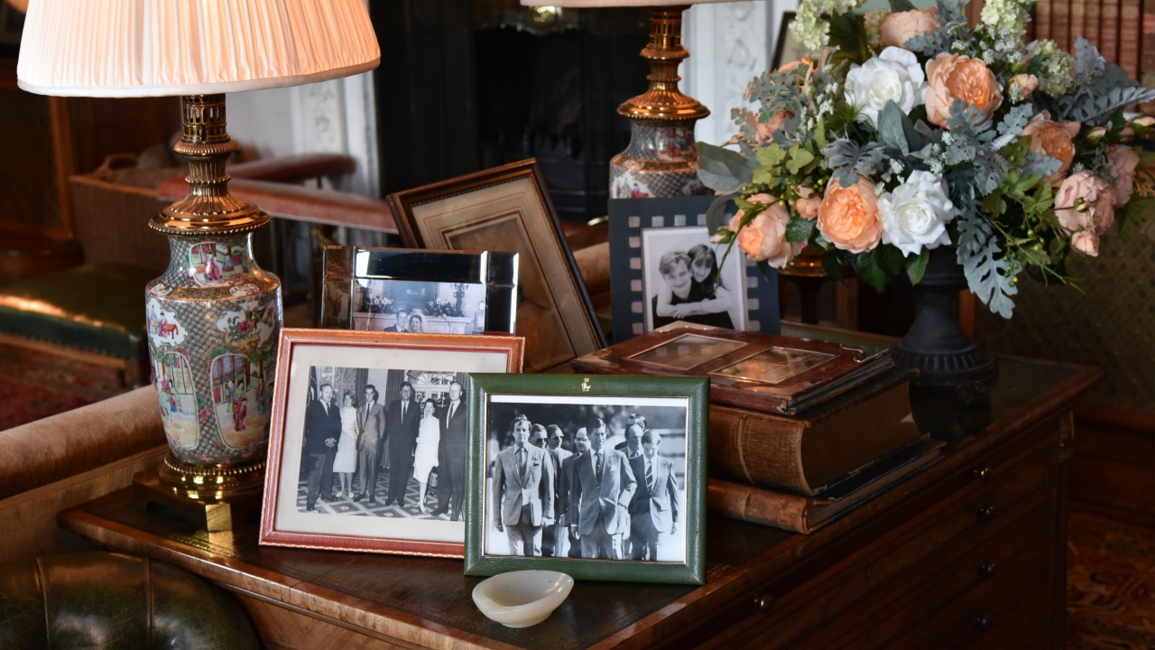
Image Credit: 1000 Words / Shutterstock.
Displaying memories can make a home feel warm and inviting, but having mismatched frames scattered everywhere can look cluttered. Formal portraits can feel a bit stiff compared to the energy of candid shots.
When photos aren’t organized, it can throw off the whole vibe of a room. Taking a more thoughtful approach lets you celebrate those moments while keeping the space stylish and put-together.
The Fix: Create a cohesive gallery wall using matching frames and opt for candid black-and-white shots for an artistic touch.
4. An Overhead Light as the Only Source of Lighting
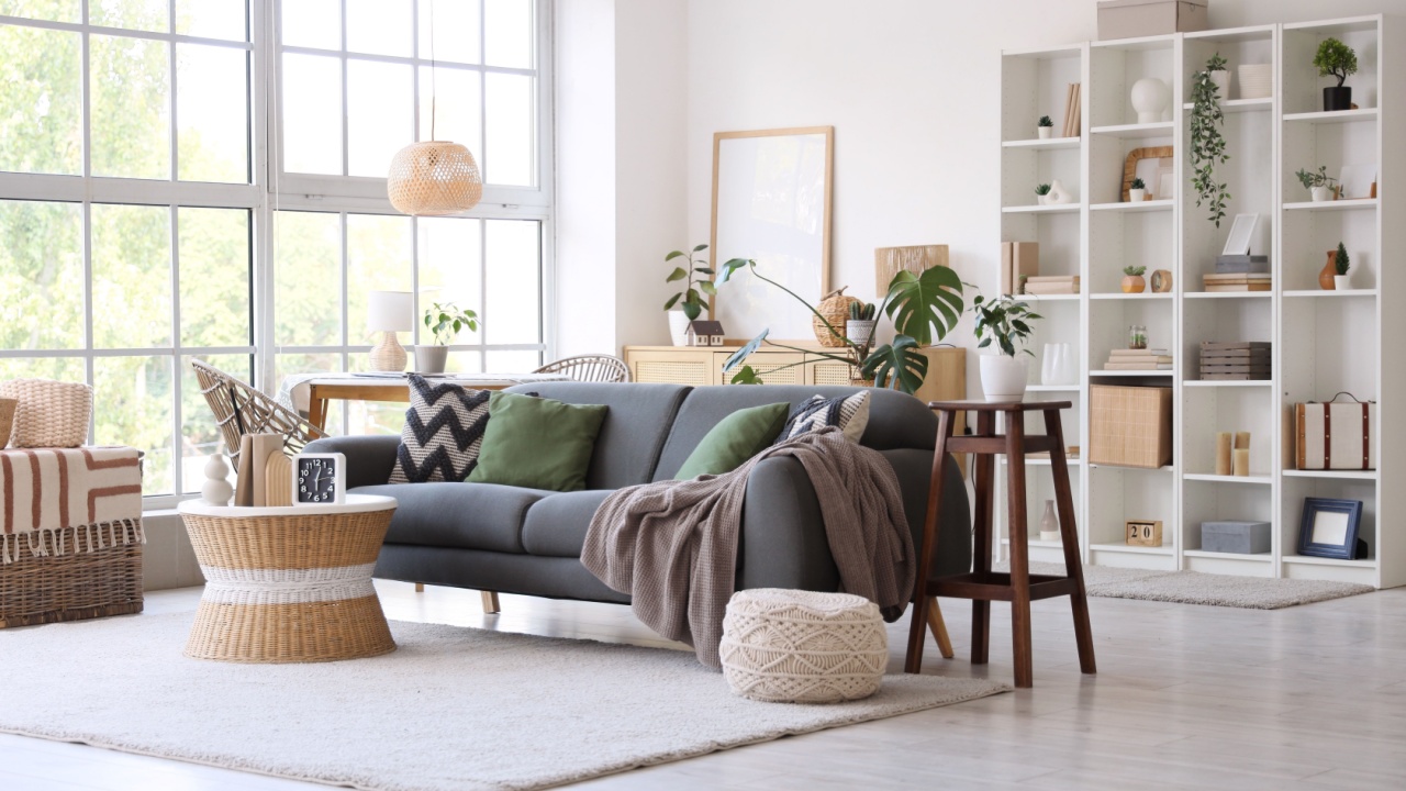
Image Credit: Shutterstock.
Relying on a single ceiling fixture creates harsh shadows and flattens the dimensions of a room. This type of illumination is rarely flattering and fails to create a welcoming atmosphere in the evening.
It serves a functional purpose but offers zero ambiance. A well-lit room requires layers of light at different heights to create warmth and functionality for different tasks.
The Fix: Layer the lighting scheme by adding floor lamps and table lamps to create pockets of warm illumination.
5. An Excess of Accessories
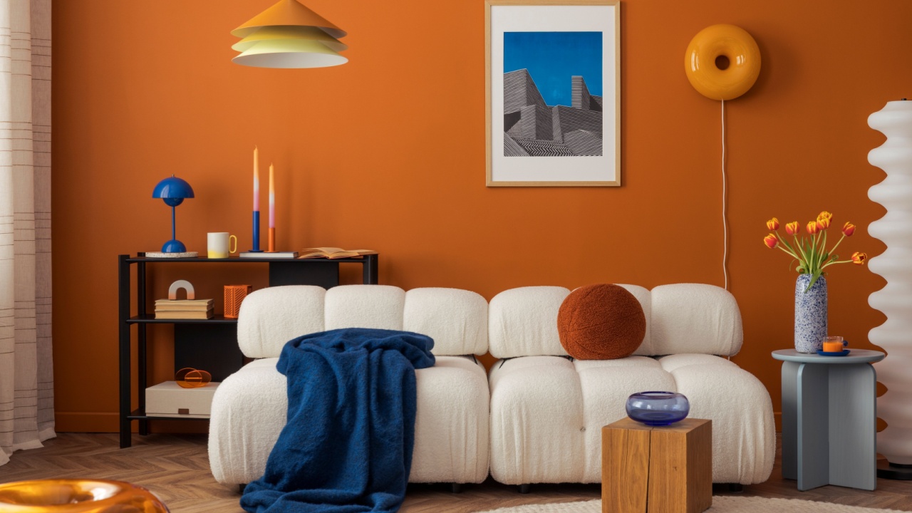
Image Credit: Shutterstock.
There is a fine line between eclectic and chaotic. Filling every shelf and table with decorative objects leaves the eye with nowhere to rest. Mixing too many design styles, such as farmhouse with glam and mid-century, can strip a room of its identity.
A sophisticated room feels edited and intentional, where every object has a clear place and purpose within the design.
The Fix: Practice the art of editing by removing items until the remaining pieces feel intentional and harmonious.
6. Faux Plants
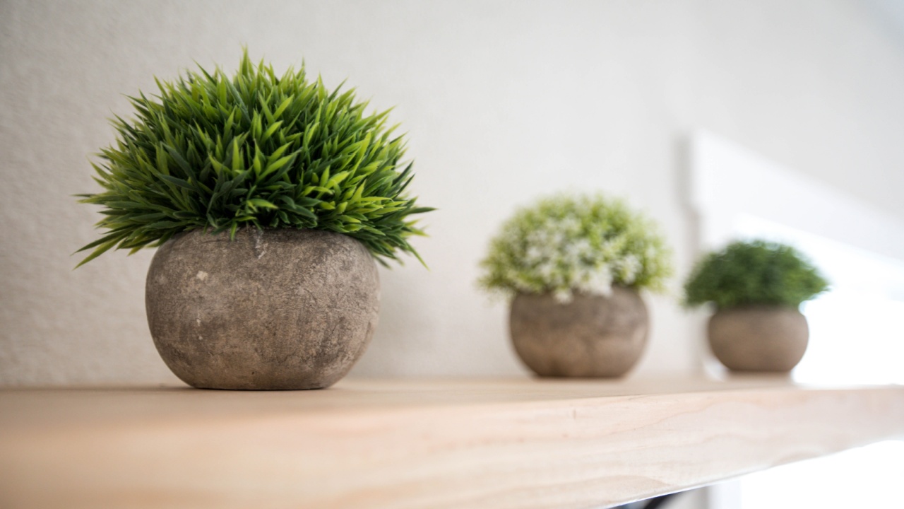
Image Credit: Shutterstock.
Artificial greenery often catches the eye for the wrong reasons. Even high-end versions usually reveal their synthetic nature upon closer inspection. They collect dust and lack the vitality that organic elements bring to an interior. The texture and movement of real plants are difficult to replicate with plastic or silk.
The Fix: Incorporate natural elements like dried branches, driftwood, or preserved moss for a maintenance-free organic look.
The Art of Editing Your Space
Image Credit: Shutterstock.
Refining a living space requires a critical eye and a willingness to let go of items that no longer serve the design. Removing these specific elements creates room for a more sophisticated and authentic environment.