Have you walked into a room and felt that sense of calm and correctness where everything just seems to fit? It’s a feeling that’s hard to put into words, but you know it when you see it.
This article explores the small details that signal a well-considered living space, thanks to its classic, put-together use of design. What are the indicators of excellent style? Is it the foundation of a room’s color palette or the final placement of a lamp?
This guide will help you spot these elements and understand why they work so well.
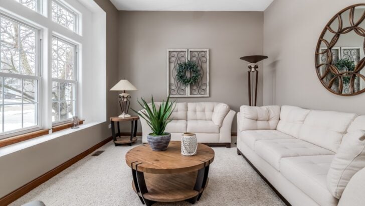
1. Neutral Base Layers
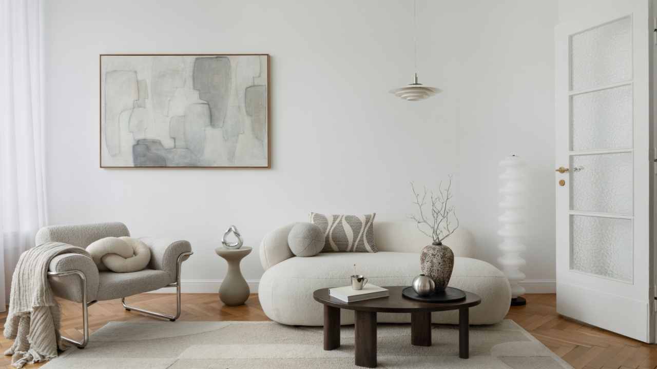
Image Credit: Shutterstock.
A room built on a neutral foundation is like a perfectly prepped canvas. Colors like beige, gray, white, and warm wood tones create a serene and flexible backdrop. This approach allows the room’s architecture and the items within it to stand out. It’s a deliberate choice that communicates confidence in simplicity.
Using neutrals for your largest surfaces, such as walls, sofas, and large furniture, creates visual consistency. This doesn’t mean the room is boring. Instead, it becomes a sophisticated stage for showcasing personality through art, textiles, and other decor. This choice demonstrates an understanding of longevity in design, creating a space that won’t feel dated in a few years.
2. Real or Realistic Greenery

Image Credit: Shutterstock.
Bringing plants into a home connects the space to the natural world. It can be a living fiddle-leaf fig in a sunny corner or a high-quality faux olive tree; greenery adds life and texture. The presence of plants suggests a nurturing and attentive homeowner. It shows a commitment to creating an environment that feels fresh and vibrant.
The key is quality. A thriving, well-cared-for plant is a beautiful living sculpture. If a green thumb isn’t your strong suit, today’s artificial plants can be remarkably convincing. Choosing realistic fakes over dusty, plastic-looking ones indicates a discerning eye for detail. Greenery, real or not, softens hard lines and introduces an organic element that makes a room feel complete.
3. Centered and Balanced Artwork

Image Credit: Shutterstock.
How art is hung speaks volumes. Placing artwork so it is centered and balanced in relation to furniture or architectural features creates a sense of order and intention. For example, hanging a picture above a sofa with its center point at eye level, and its width being about two-thirds that of the sofa, creates a pleasing visual anchor.
A gallery wall might look spontaneous, but the best ones are carefully planned, with consistent spacing and a common element tying the pieces together. This mindful placement of art shows that every piece was chosen and positioned with purpose, turning a simple wall into a thoughtful composition.
4. Matching Hardware Finishes

Image Credit: Shutterstock.
Consistency in small details creates a big impact. When the hardware finishes in a room, such as cabinet pulls, doorknobs, light fixtures, and faucets are coordinated, the space feels polished and cohesive. This doesn’t mean every single piece must be identical, but they should belong to the same family of finishes, such as brushed brass or matte black.
This attention to detail signals a planned design process. It shows that someone considered the room as a whole rather than a collection of separate items. Swapping out mismatched hardware for a unified set is a simple update that elevates the entire look, creating a subtle but powerful sense of unity and refinement.
5. Clean Lines and Symmetry
Image Credit: Shutterstock.
Our brains are wired to appreciate symmetry and clean lines. They create a sense of predictability and calm. In home decor, this translates to furniture with simple silhouettes, uncluttered surfaces, and a balanced arrangement of objects. A room that embraces clean lines feels open, organized, and intentional.
Symmetry can be achieved by placing matching lamps on either side of a bed or flanking a fireplace with identical armchairs. It provides a feeling of stability and grace. This doesn’t mean a room has to be a perfect mirror image. Asymmetrical balance can be just as effective, but the underlying principle of visual order remains. This approach avoids a chaotic feeling and produces a space that is restful to the eye.
6. Rugs That Actually Fit
Image Credit: Deposit Photos.
A rug can define a space, but only if it’s the right size. A common mistake is choosing a rug that’s too small, leaving it floating like a postage stamp in the middle of the room. A properly scaled rug should be large enough for at least the front legs of all major furniture pieces in a seating area to rest on it. This visually connects the furniture and unifies the space.
In a dining room, the rug should extend far enough beyond the table so that the chairs remain on the rug even when pulled out. Selecting a rug that fits the room and its function shows a fundamental understanding of scale and proportion. It’s a foundational element that grounds the entire design and makes the room feel more expansive and put-together.
Refining Your Space
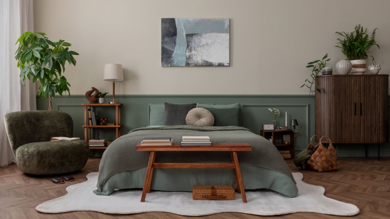
Image Credit: Shutterstock.
Recognizing these signs in other homes can sharpen your own design sensibilities. Look around your own space. Do your curtains hang high and wide to make the window appear larger? Are your lampshades clean and proportionate to their bases? Small adjustments can make a significant difference. Try tackling one area, like unifying the hardware in your kitchen or finding a rug that truly fits your living room. Cultivating a tasteful home is a process of making deliberate choices that create a feeling of harmony and personal expression.