Picking a color scheme for your home can feel like naming a child. The pressure is immense, and you just know your mother-in-law will have an opinion. Will that trendy terracotta make you cringe in six months? Do those pillows scream “you,” or do they just whisper “I was on sale”?
Maybe you should ditch the endless scrolling through perfectly staged, soulless rooms and look at a source of inspiration that’s already yours: your birth month color. It’s a built-in palette that tells a story. From January’s deep red to December’s bright turquoise, here are twelve ways to bring your personal color story home without having a full-blown identity crisis in the paint aisle.
1. January – Garnet (Deep Red)
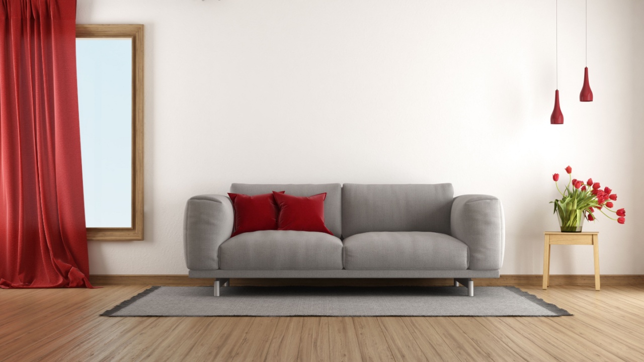
Image Credit: Shutterstock.
This rich, warm shade creates a sense of intimacy and comfort. Garnet is perfect for spaces where you want to encourage conversation and connection. Its deep, grounding presence can make a large room feel more inviting or a small room feel like a deliberate jewel box.
Use this shade for an accent wall in a dining room to set a warm backdrop for meals or in a living room to define a seating area. A statement armchair upholstered in garnet velvet adds a touch of luxury, while simple throw pillows can introduce the color without a major commitment. To keep the look balanced, pair garnet with neutrals like cream or charcoal gray. For a more opulent feel, mix in gold or brass metallic accents.
2. February – Amethyst (Soft Purple)
Image Credit: Deposit Photos.
Amethyst brings a calm and romantic quality to any room. It’s a serene shade of purple that feels elegant and soothing, making it a great choice for spaces dedicated to rest and relaxation. Unlike its more vibrant purple relatives, amethyst is subtle and sophisticated, creating a peaceful atmosphere.
This hue is ideal for bedrooms or quiet reading nooks. Consider introducing it through bedding, like a new duvet cover or a set of shams. Curtains in a soft amethyst can filter light beautifully, creating a gentle glow. You can also add smaller accessories like glass vases, a table lamp, or even artwork featuring the shade to infuse the room with its calming presence.
3. March – Aquamarine (Blue-Green)
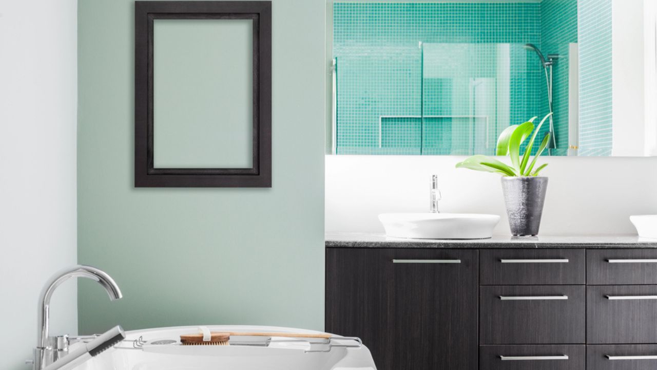
Image Credit: Deposit Photos.
This light and airy hue is like a breath of fresh air for your home. Aquamarine is associated with clarity and tranquility, making it a natural fit for spaces where you want to feel refreshed and calm. It’s a lighthearted color that opens up a room and gives it a breezy, coastal feeling.
It works beautifully in bathrooms, kitchens with a coastal style, or serene bedrooms. Use it on walls to create a light, open atmosphere or bring it in through textiles like towels and shower curtains. Glass décor pieces, such as vases or decorative bottles, are another great way to capture its watery essence. Pair aquamarine with soft whites and natural wood tones to complete a serene, clean look.
4. April – Diamond (Icy White/Silver)
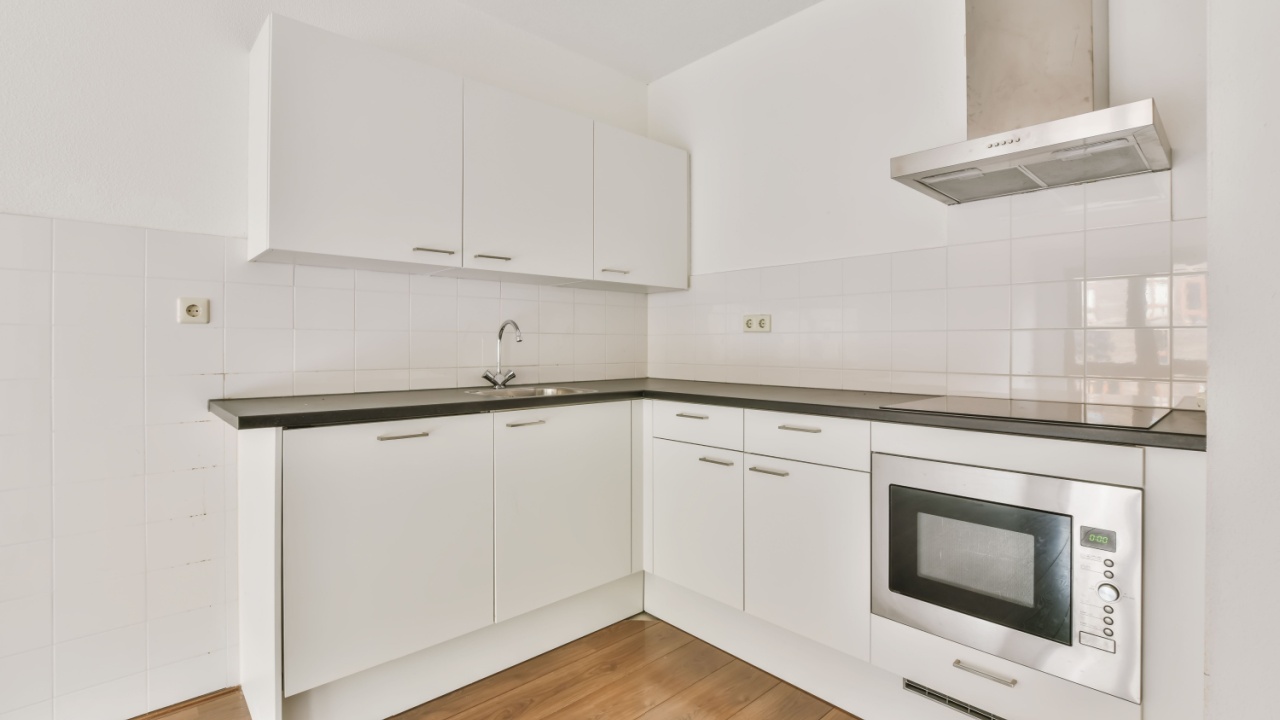
Image Credit: Shutterstock.
Reflecting clarity and strength, diamond-inspired tones create a clean, minimalist, and bright look. This isn’t just any white; it’s a crisp, icy white, often complemented by silver and metallic finishes. It’s perfect for making a space feel larger, brighter, and more open.
Diamond tones are exceptionally well-suited for kitchens and bathrooms, where cleanliness and light are priorities. Consider white cabinetry, crisp white walls, or silver metallic accents in the form of hardware, light fixtures, or a framed mirror. To prevent the space from feeling too stark or clinical, layer in different textures like a fluffy rug, linen curtains, or a marble countertop.
5. May – Emerald (Deep Green)
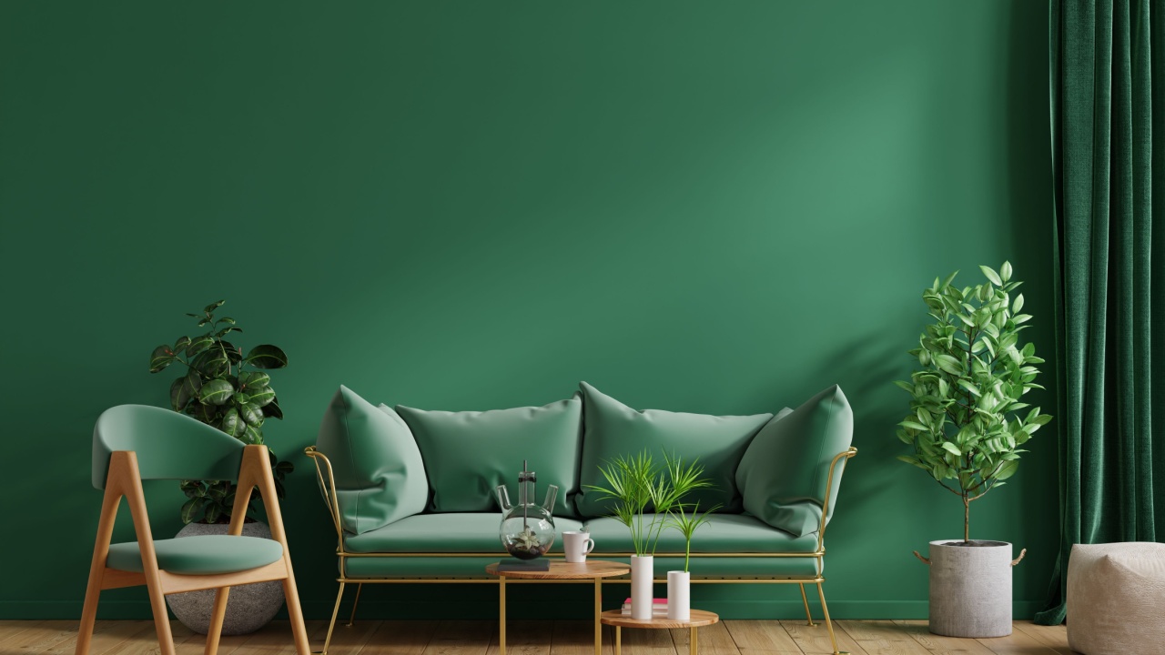
Image Credit: Shutterstock.
Emerald adds a dose of sophistication and lushness to a home. This deep, rich green is associated with nature and renewal, creating a feeling of balanced energy. It can be dramatic and grounding at the same time, making it a powerful choice for creating an elegant atmosphere.
This hue is ideal for living rooms, home offices, or even kitchen cabinets for a bold statement. Use it on a piece of statement furniture like a velvet sofa, paint an accent wall, or bring it in through smaller decorative pieces like lamps or cushions. Emerald pairs wonderfully with brass accents, which highlight its warmth. It also looks great with cream for contrast or rich wood tones for a natural, grounded palette.
6. June – Pearl (Soft White/Iridescent)
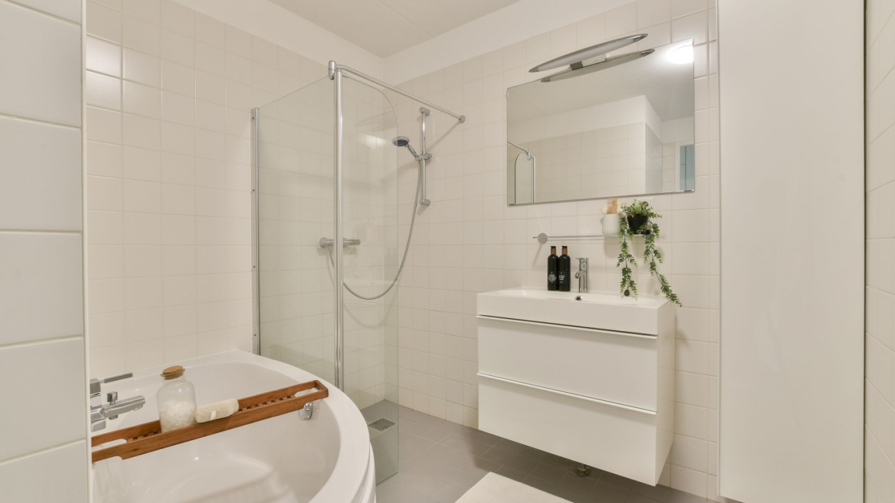
Image Credit: Shutterstock.
Pearl tones are gentle, serene, and subtly elegant. This isn’t a flat white but a soft, off-white with iridescent or shimmering qualities. It creates a calm, luminous effect, making a space feel peaceful and sophisticated. It’s perfect for creating a soft landing spot in your home.
This color is wonderful for bedrooms, bathrooms, and living areas where you want to cultivate a tranquil mood. Use it in bedding, flowing curtains, and decorative accessories that have a bit of sheen. Layering different textures is the best way to bring out pearls’ beauty; add satin, silk, linen, or iridescent glass.
7. July – Ruby (Vibrant Red)
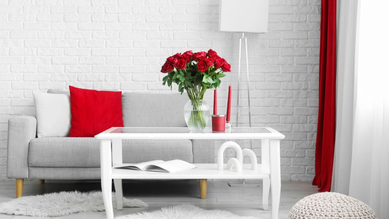
Image Credit: Deposit Photos.
Ruby is an energetic and passionate color that brings life to social spaces. This vibrant, true red is stimulating and bold, making it a fantastic choice for areas where you entertain and gather to wow your guests. It’s a color that commands attention and adds a sense of confidence to a room.
Use ruby in living rooms or dining rooms to spark conversation and energy. An accent wall, a set of bold cushions, a plush throw blanket, or even a single statement piece of furniture can do the trick. Because it’s such a strong color, pairing it with warm neutrals like beige or gray can keep the space feeling lively yet balanced. Metallic accents also help it feel sophisticated rather than overwhelming.
8. August – Peridot (Yellow-Green)
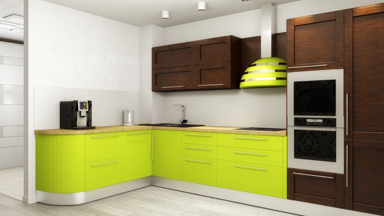
Image Credit: Deposit Photos.
Fresh, zesty, and uplifting, peridot is a fun-loving yellow-green that brings a cheerful energy. It’s the color of late summer and new growth, making it a great choice for brightening up a space and giving it a playful, modern feel.
This hue works well in kitchens, home offices, or sunny living areas. You can incorporate it through a painted accent wall, a scattering of cushions, or smaller décor items like vases or picture frames. It’s a lively color that pairs nicely with light grays, crisp whites, and natural materials like light-colored wood or rattan.
9. September – Sapphire (Deep Blue)
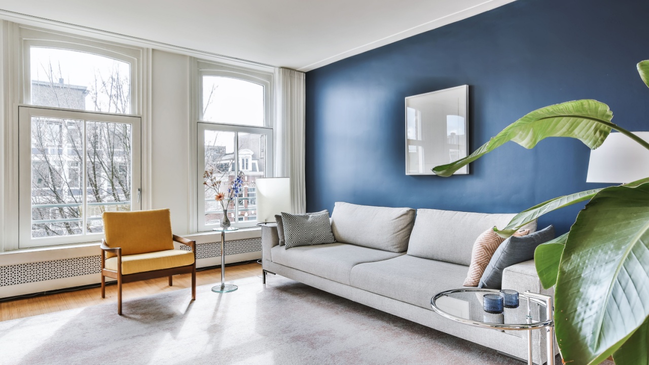
Image Credit: Shutterstock.
Sapphire is a classic, deep blue that creates a timeless and dramatic atmosphere. This shade is associated with wisdom and royalty, bringing a sense of depth and stability to a room. It’s perfect for creating a space that feels both important and comforting.
Use this rich blue in home offices, libraries, or formal living rooms. It looks stunning on walls, cabinetry, or a large piece of furniture like a sofa. To make the deep blue truly stand out, pair it with contrasting creams or golds. Warm woods also complement sapphire beautifully, preventing it from feeling too cold and enhancing its elegant nature.
10. October – Tourmaline (Rose Pink/Berry)

Image Credit: Shutterstock.
This warm and charming hue can range from a soft rose pink to a deeper berry shade. Tourmaline is inviting and comforting, making it perfect for creating spaces that feel personal and welcoming. It has a gentle strength that is both pretty and sophisticated.
It is a natural fit for bedrooms, dressing rooms, or a cozy corner in a living room. Use it in textiles like a chunky knit blanket or velvet pillows. An accent wall in a soft rose can create a beautiful feature, or you can bring it in through smaller decorative items. Pair tourmaline with soft neutrals like beige or off-white to highlight its warmth and create an inviting atmosphere.
11. November – Citrine (Golden Yellow)
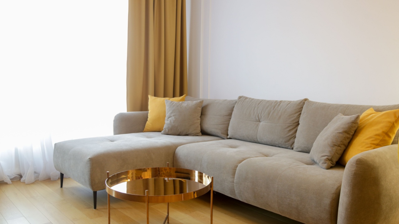
Image Credit: Shutterstock.
Citrine is a warm, cheerful golden yellow that brings a sunny disposition to any room. This shade is all about happiness and warmth, making it ideal for creating an optimistic and welcoming environment. It’s like a little dose of sunshine, even on a cloudy day.
Citrine is a great choice for dining rooms, kitchens, and living areas. Use it on an accent wall to brighten the entire space, or bring it in through cushions, throws, or décor accessories. Citrine combines well with warm neutrals and natural wood tones, which helps to create an earthy, inviting feel that is cheerful without being overwhelming.
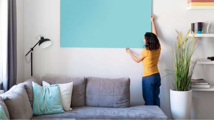
12. December – Turquoise (Blue-Green)
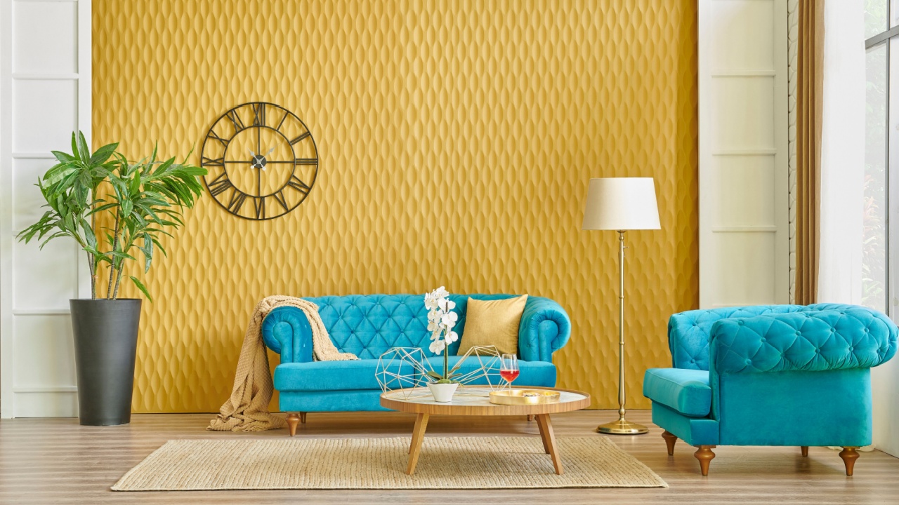
Image Credit: Shutterstock.
Turquoise is a vibrant blue-green that brings a sense of joy and personality to a space. It’s an energetic and refreshing color, often associated with creativity and emotional balance. It can be both bold and calming, making it a great choice for a variety of styles.
This fun color is perfect for bathrooms, eclectic living rooms, or even as a pop of color in a kitchen. Incorporate it through a painted piece of furniture, a bold accent wall, or accessories like lamps and dishware. Turquoise pairs beautifully with crisp whites and creams, which make it pop. Natural textures like jute or light wood also complement it well for a fresh, uplifting space.
Weaving Your Color Story
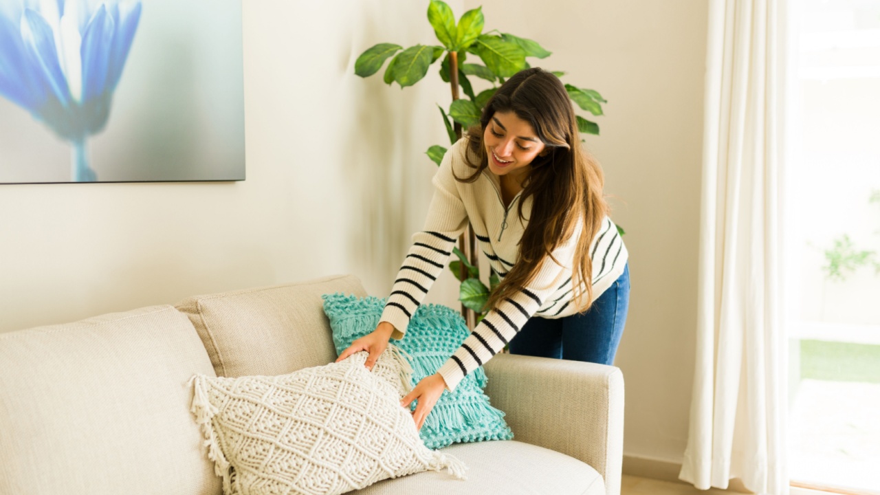
Image Credit: Shutterstock.
Using your birth month color is a framework for making personal choices. Now that you have some ideas, look around your own space. What room needs a little lift? Does a calming bedroom with amethyst tones call to you, or would a lively living room with a dash of ruby feel more like home? Pick a room and swap out some pillows, paint a small table, or buy a bouquet of flowers in your color. See how it feels. Your home should be a reflection of you, and this is one way to make sure it speaks your language.