
Decor trends change like seasons. One decade found us proudly installing chevron wallpaper in the summer, and the next, spending a weekend scraping it off with a mixture of fabric softener and regret. Our homes have seen it all, from the sensible to the truly baffling. Styles come and go, leaving behind a trail of family photos where the background is either a timeless classic or a source of future laughter.
This journey through the last century of home decor is a celebration of our collective design choices, both the brilliant and the “what were we thinking?” moments. We will look at the best and worst trends from each decade, exploring what made them so popular and why some have stood the test of time while others have been relegated to the thrift store pile.
1. The 2020s: Home Offices and Parchment Lighting

Image Credit: Shutterstock.
The most recent decade forced many of us to look at our homes in a new light, quite literally.
Best: The Dedicated Home Office
When the world suddenly started working from kitchen tables and bedroom corners, the value of a dedicated home office became crystal clear. A proper desk and an ergonomic chair can separate your professional life from your personal life, even when they happen under the same roof. It turns out that having a designated spot to close the door on at the end of the day is a wonderful thing.
Worst: Parchment Lighting Fixtures
These folded paper lanterns appeared on everyone’s social media feeds, looking like an ambitious origami project. While paper-shade pendants can be attractive, they collect dust. Authorities discourage open-flame sky lanterns for fire safety.
- 2020s Recap:
- Keep: A dedicated workspace that helps you mentally clock out.
- Leave: Lighting that looks like it was made in a middle school art class.
2. The 2010s: Open Shelving and Chevron Overload

Image Credit: Shutterstock.
This was the decade of Instagram-perfect interiors, bringing us both beautiful displays and dizzying patterns.
Best: Open Shelving
Swapping heavy upper cabinets for open shelves was a breath of fresh air for kitchens and living rooms. This trend encourages a more curated approach to what you own, as everything is on display. It’s a great way to showcase beautiful dishes, glassware, and favorite decor pieces. The look is airy, personalized, and makes a small space feel larger. It does, however, require you to be tidy (a reason many people dislike it despite its trend).
Worst: Chevron
For a moment there, the world was covered in a zigzag pattern. Chevron was on pillows, rugs, curtains, and even walls. While a geometric pattern can add energy to a room, the sheer volume of chevron was overwhelming. The high-contrast, repetitive design became tiresome quickly. Chevron’s wave of ubiquity in the 2010s rendered it a shorthand for a dated Pinterest era.
- 2010s Recap:
- Keep: Artfully arranged shelves that show off your personality.
- Leave: The zigzag pattern that took over the world and our eyeballs. Of course, unless you love it.
3. The 2000s: Stainless Steel and Edison Bulbs
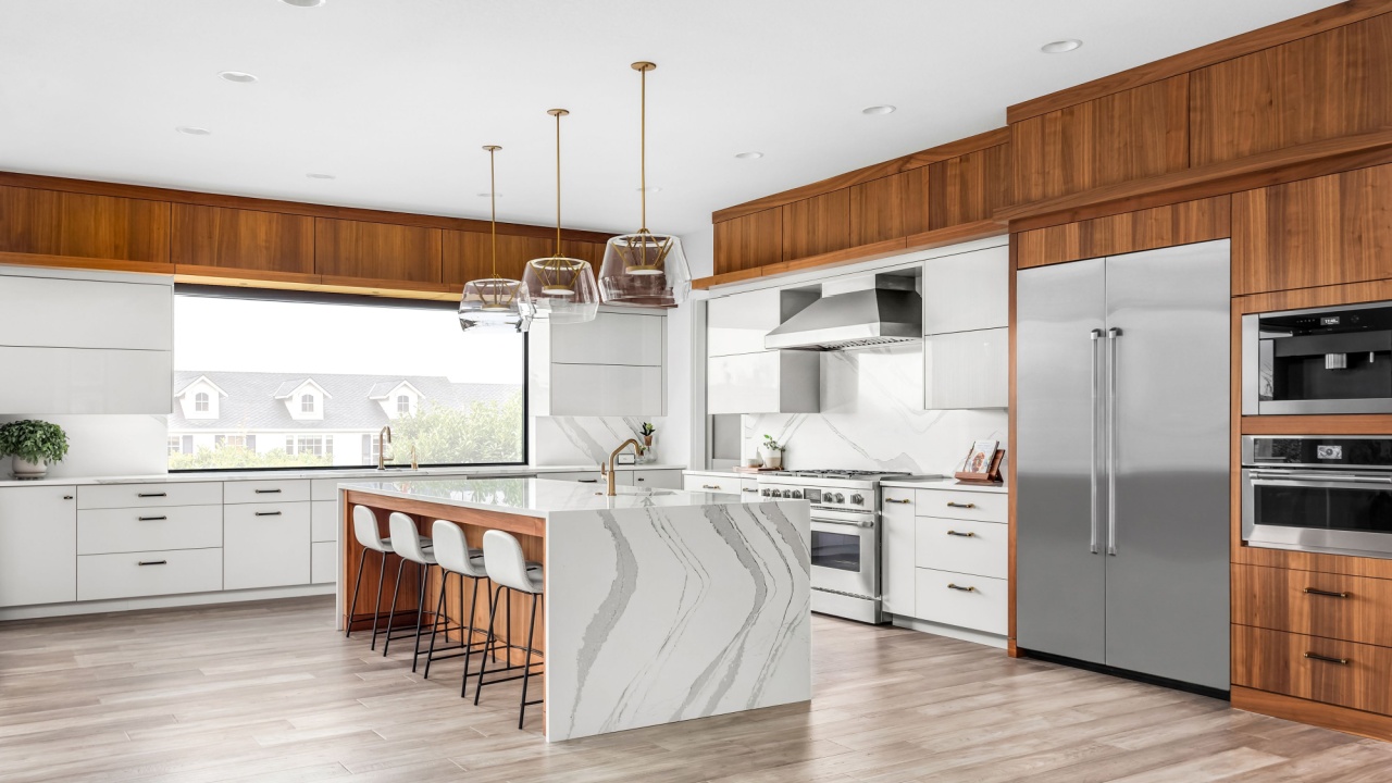
Image Credit: Shutterstock.
The new millennium brought a sleek, industrial look to our homes, but not all of it was practical.
Best: Stainless Steel Appliances
The shift from white or black appliances to stainless steel was a major upgrade for kitchens everywhere. Stainless steel offers a clean, professional look that works with nearly any cabinet color or design style. These appliances are durable, germ-resistant, and relatively easy to clean (fingerprints notwithstanding). They gave kitchens a modern and timeless foundation that still holds up today.
Worst: Edison Light Bulbs
The appeal of the Edison bulb was its vintage, industrial look. The warm, gentle glow from the intricate filament was supposed to create a cozy atmosphere. In reality, it created a dim, yellowish light that made it hard to see. Edison-style bulbs added ambience but are inefficient compared with LED technology and often don’t provide bright task lighting.
- 2000s Recap:
- Keep: Sleek appliances that make your kitchen look polished.
- Leave: Light bulbs that make you squint to read a book.
4. The 1990s: Minimalism and All the Beige
Image Credit: Shutterstock.
After the excesses of the ’80s, the ’90s offered a palate cleanser, for better or for worse.
Best: Minimalism
Minimalism was a reaction to the clutter of previous decades, a beloved style for millennials. It celebrated the idea that less is more, focusing on clean lines, uncluttered spaces, and intentionality. Every item in a minimalist home has a purpose and a place. This trend brought a sense of calm and order to interiors, promoting a more thoughtful way of living that many still embrace.
Worst: Earth Tones (Especially Beige)
In the pursuit of simplicity, design in the ’90s often leaned heavily into beige, brown, and taupe. These neutral tones offered a calming foundation, but when used without variation, they sometimes led to interiors that felt subdued rather than serene. While neutrals can be a beautiful starting point, the era occasionally missed opportunities to introduce contrast and character, leaving some spaces feeling more muted than memorable.
- 1990s Recap:
- Keep: The “less is more” philosophy of intentional living.
- Leave: The fifty shades of beige that put everyone to sleep.
5. The 1980s: Patterned Wallpaper and Dark Cherry Wood
Image Credit: chintankumar gajjar / Shutterstock.
The ’80s were a decade of “go big or go home,” and interior design was no exception.
Best: Patterned Wallpaper
Wallpaper in the ’80s was bold, expressive, and full of personality. From chintzy florals to geometric prints, it was a way to add drama and interest to a room in a way that paint alone could not. While some patterns were certainly over the top, the willingness to embrace patterns and colors was admirable. Used as an accent wall, a great wallpaper can still bring incredible depth and character to a space.
Worst: Dark Cherry Wood
The ’80s loved its dark, glossy cherry wood. It was used for everything: kitchen cabinets, dining sets, entertainment centers, and even toilet seats. The reddish-brown wood, often paired with shiny brass hardware, made rooms feel heavy, dark, and dated. There was just so much of it, turning potentially bright spaces into gloomy caves.
- 1980s Recap:
- Keep: A bold, beautiful wallpaper that makes a statement.
- Leave: Heavy, dark wood furniture that absorbs all the light in a room.
6. The 1970s: Rattan and Avocado Kitchens
Image Credit: Shutterstock.
The ’70s were defined by natural textures and some truly unforgettable color choices.
Best: Rattan and Macramé
The bohemian spirit of the ’70s introduced natural, earthy textures like rattan, wicker, and macramé into our homes (not just our patios). These materials add a relaxed, organic feel to a room. Rattan furniture is lightweight and versatile, and macramé wall hangings or plant holders bring a touch of handmade artistry. This trend has seen a huge resurgence, proving that natural textures are timeless.
Worst: Bizarre Colored Kitchens and Bathrooms
Harvest Gold, Avocado Green, and Burnt Orange. These colors were everywhere, and we mean everywhere. You could find matching refrigerators, ovens, sinks, and even toilets. A pop of color is one thing, but an entire kitchen suite in a shade reminiscent of guacamole is another. These colors instantly date a home and are incredibly difficult to design around.
- 1970s Recap:
- Keep: The natural, bohemian charm of rattan and macramé.
- Leave: Appliances colored like the contents of a 1970s salad bar.
7. The 1960s: Groovy Patterns and Wood Paneling
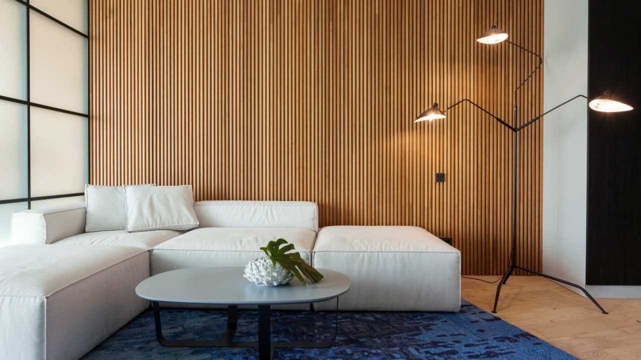
Image Credit: Shutterstock.
This decade was about liberation and bold self-expression, which was reflected in its decor.
Best: Groovy Colors and Patterns
The ’60s broke free from the buttoned-up ’50s with an explosion of vibrant color and psychedelic patterns. Bright oranges, hot pinks, and lime greens were paired with swirling, abstract prints. This look was all about energy, optimism, and fun. While a full room of it might be a bit much today, incorporating these bold colors and patterns as accents can add a wonderful retro flair.
Worst: Wood Paneling
What was intended to create a warm, cozy den often ended up creating a dark, dated basement feel. The thin, fake wood veneer that covered so many walls in the ’60s and ’70s made rooms feel smaller and gloomier. Removing it is a notoriously difficult task, often revealing nothing but studs and insulation behind it.
- 1960s Recap:
- Keep: A splash of vibrant, optimistic color.
- Leave: The fake wood walls of your grandparents’ basement. You can still try a wooden accent wall if you love wood (as pictured above).
8. The 1950s: Pastel Colors and Red Vinyl
Image Credit: Depositphotos.com.
Post-war optimism brought cheerful colors into the home, along with some diner-inspired materials.
Best: Pastel Colors
The ’50s are famous for their soft, cheerful pastel palettes. Mint green, baby pink, turquoise, and buttery yellow appeared on everything from appliances to bathroom tiles. When done right, these colors create a sweet, retro charm that feels both playful and nostalgic. The ’50s pastel palette endures in retro appliances and design revivals.
Worst: Red Vinyl
Nothing screams “diner booth” quite like red vinyl upholstery. While it’s a durable and easy-to-clean material, it doesn’t belong on the furniture in your living room. It has a distinctly commercial and somewhat cheap look that’s hard to shake. Making your guests sit on sticky plastic seating is not the most welcoming gesture.
- 1950s Recap:
- Keep: Cheerful pastel appliances and accents.
- Leave: Upholstery that belongs in a burger joint.
9. The 1940s: Floral Prints and Linoleum
Image Credit: Shutterstock.
Wartime austerity influenced design, but there was still room for beauty and practicality.
Best: Floral Textiles
During a difficult time, floral chintz fabrics brought a sense of cheer and tradition into the home. These patterns, used on curtains, sofas, and wallpaper, offered a touch of garden-inspired beauty and comfort. A classic floral print can feel timeless and elegant, providing a soft and romantic counterpoint to more modern elements.
Worst: Linoleum Flooring
Linoleum was marketed as a miracle floor: durable, water-resistant, and available in many colors. However, it was also prone to yellowing, cracking, and peeling over the years. The patterns often tried to imitate more expensive materials like tile or wood, but rarely succeeded convincingly. While it’s seeing a minor comeback as a “green” material, its past performance leaves much to be desired.
- 1940s Recap:
- Keep: Timeless, cheerful floral prints.
- Leave: Flooring that yellows and curls at the edges.
10. The 1930s: Art Deco and Dull Monochrome
Image Credit: Shutterstock.
The Great Depression shaped this era, with a focus on both escapist glamour and subdued palettes.
Best: Art Deco Details
Art Deco was all about glamour, sophistication, and modernity. It featured bold geometric shapes, symmetry, and luxurious materials. While a full Art Deco interior might be rare today, elements like sunburst mirrors, sleek chrome fixtures, and elegant console radios from this era remain coveted design pieces. They add a touch of timeless elegance and historical richness to any room.
Worst: Dull Monochrome
Perhaps as a reflection of the somber economic times, many interiors were decorated in single, muted color schemes. Rooms drenched in a flat, unvarying shade of brown or grey felt depressing and stark. Unlike modern monochrome looks that play with texture and tone, this trend was just plain dull.
- 1930s Recap:
- Keep: A glamorous Art Deco mirror or radio.
- Leave: A room painted entirely in one sad shade of brown.
11. The 1920s: Cocktail Carts and Baroque Overkill
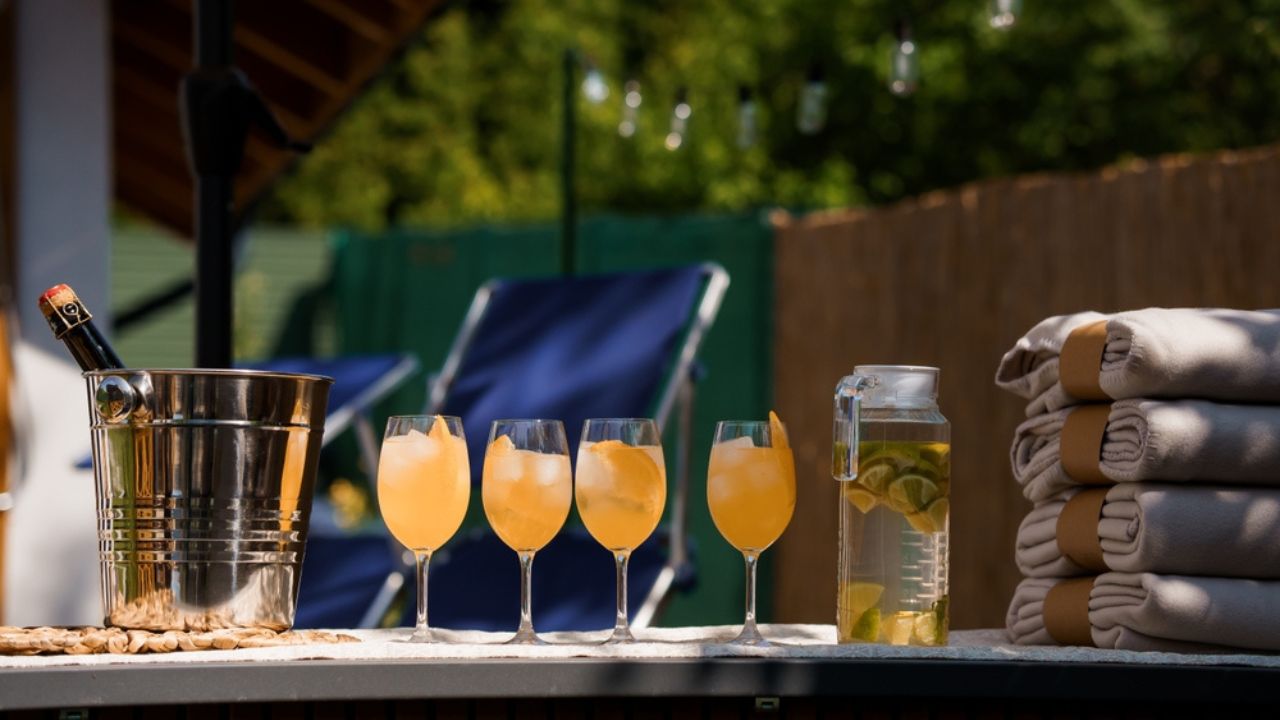
Image Credit: Shutterstock.
The Roaring Twenties were about living it up, and the decor reflected this newfound exuberance.
Best: The Cocktail Cart
As home entertaining became more popular, the bar cart or cocktail cart became a stylish and practical piece of furniture. It was a symbol of hospitality and sophistication, ready for an impromptu party at a moment’s notice. Still popular today, a well-styled bar cart is both a functional serving station and a chic decor accent.
Worst: The Baroque Aesthetic
Trying to replicate the opulence of a European palace in a suburban home is a tricky business. The 1920s saw a revival of the heavy, ornate Baroque style, with lots of velvet, intricate carvings, and gold leaf. When overdone, it looked less like old-world grandeur and more like a stuffy, theatrical set. Context is everything, and this style rarely fits its modern surroundings.
- 1920s Recap:
- Keep: The ever-stylish and always-ready-for-a-party bar cart.
- Leave: The desire to make your living room look like the Palace of Versailles.
What to Do with This Information
Image Credit: Shutterstock.
Looking back at these trends, it’s easy to judge the past. However, the goal is to understand that every design choice is a product of its time. The best way to create a home you love is to borrow what works for you, regardless of the decade it came from. Mix that ’70s rattan chair with your minimalist ’90s sofa. Add a bold ’80s wallpaper to an accent wall in your modern kitchen.
Your home should be a collection of things that bring you joy and comfort. Don’t worry too much about what’s “in” or “out.” If that avocado green appliance speaks to you, then go for it. The most timeless trend of all is creating a space that is authentically yours.