Ever chased a home upgrade that looked flawless online or in the store, only to step back after installation and wonder why the room suddenly feels like it’s trying too hard? Home upgrades usually begin with good intentions. The trouble starts when a trend looks bold on a screen, then lands awkwardly once installed. Some updates age fast, others clash with how a home is actually used.
Designers spot these frequent missteps and share simple adjustments to bring back the balance. Here are five home upgrades that may be leaning a little too hard on the tacky side.
1. Faux Finishes That Try Too Hard
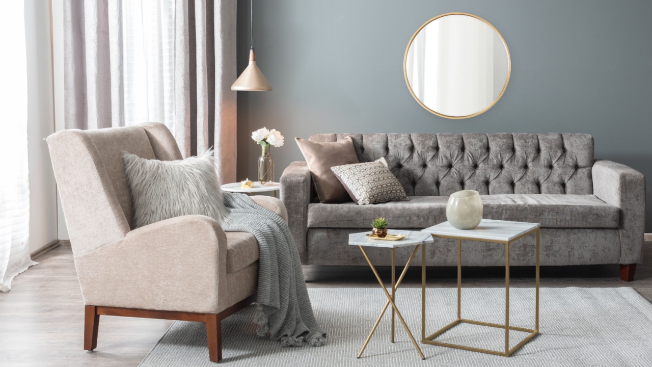
Image Credit: Shutterstock.
Faux finishes try to copy the look of stone, marble, or aged plaster using paint. From a distance, they can seem interesting, but close up, they often look flat and artificial. Natural light makes repeated patterns obvious, which draws attention for the wrong reason.
These finishes also lock a room into a very specific look. Once tastes change, the wall feels heavy and difficult to update. Soft paint colors paired with real textures like wood, fabric, or greenery usually feel calmer and easier to live with.
2. Accent Walls That Take Over
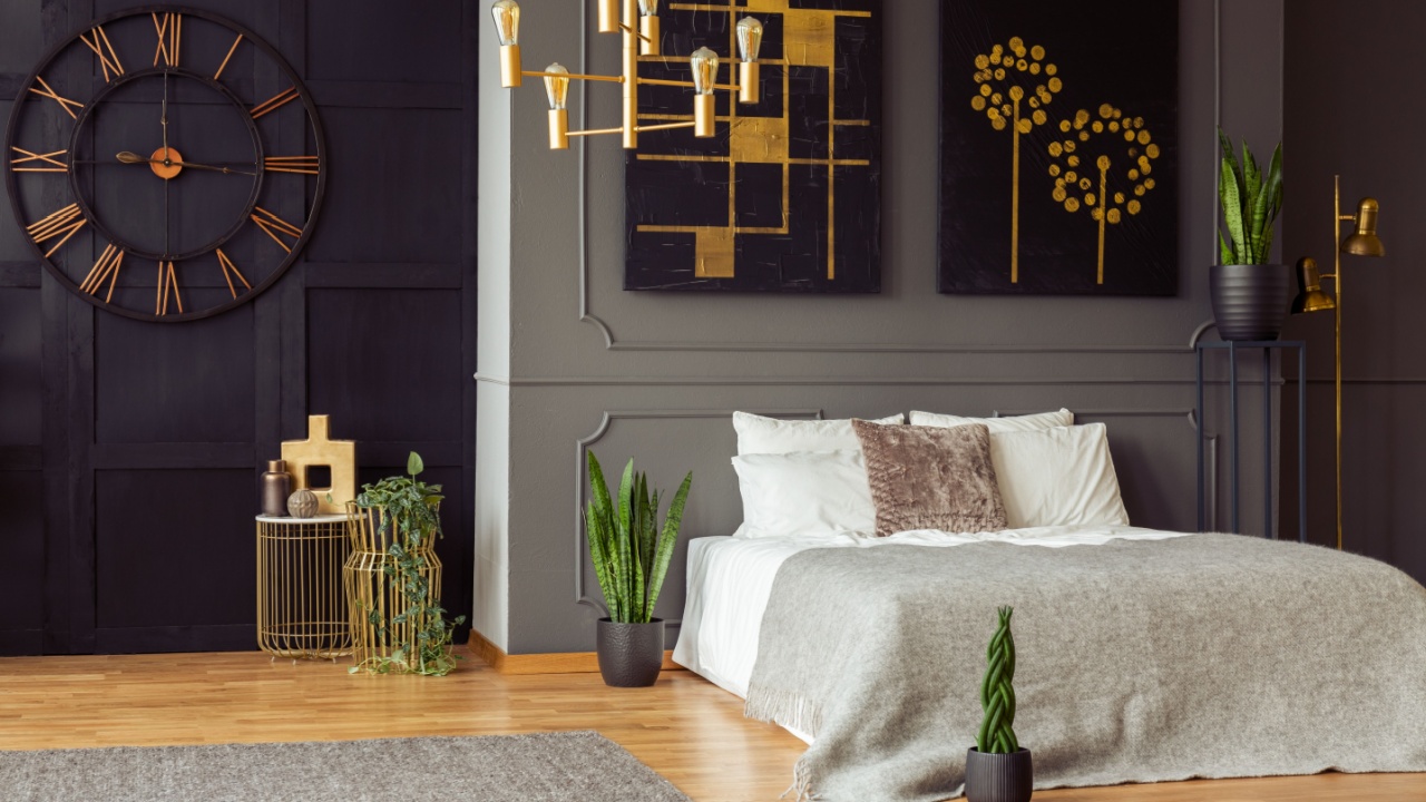
Image Credit: Shutterstock.
Accent walls promise instant personality, but they often demand too much attention. One strong wall can overpower the rest of the room and make everything else feel secondary. Instead of pulling the space together, it can split it visually.
Bold colors and busy patterns also age faster than expected. When styles shift, that wall can make the whole room feel dated. Color through pillows, rugs, or artwork gives flexibility without committing an entire wall to one idea.
3. Matching Furniture Sets

Image Credit: Shutterstock.
Matching furniture sets seem like a safe and easy decision, but most designers would not put them in their homes. Everything arrives coordinated, the colors line up, and the room looks finished right away. The problem is that this kind of setup often feels stiff and overly planned. When every piece matches exactly, the room loses depth and movement. The eye has nowhere to travel, and the space can start to feel flat or impersonal.
Homes usually feel more inviting when they reflect a mix of tastes, textures, and influences rather than a single boxed look. Blending different furniture pieces creates warmth and balance. Items can still relate through wood tones, shapes, or scale without being identical. This approach allows the space to feel relaxed, personal, and easier to adjust as needs and styles shift.
4. Too Much Open Shelving
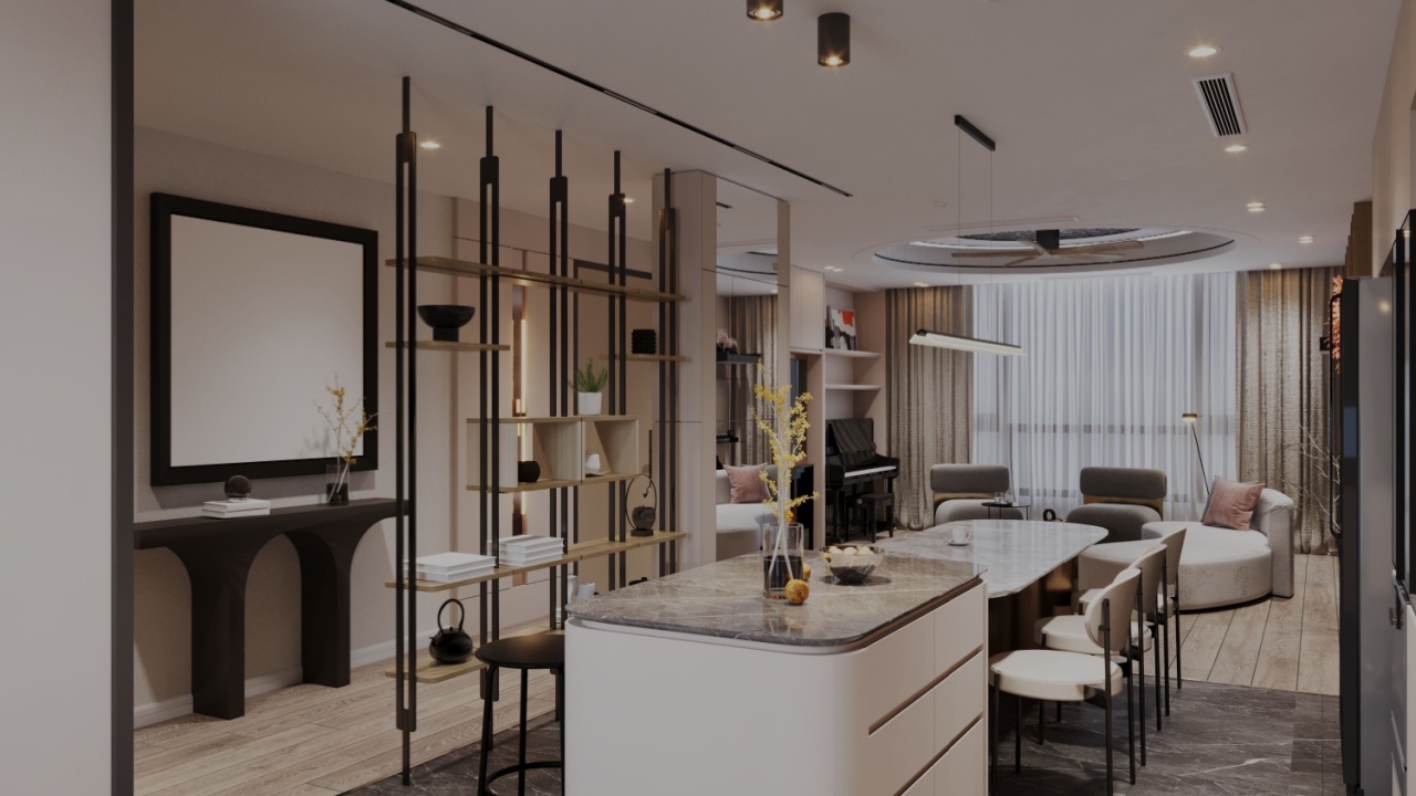
Image Credit: Shutterstock.
Open shelving is often chosen to make a room feel lighter and more open. In real daily use, those shelves quickly collect a mix of items that are not meant to be on display. What looked neat at first can start to feel busy and distracting. Everyday objects rarely stay arranged for long. Dishes, toiletries, and pantry items change constantly, which makes shelves look messy even when they are being used normally.
Dust also builds up fast, turning a simple design choice into extra work. Spaces function better when storage supports real habits. Closed cabinets handle the practical side of daily life, while a small amount of open shelving can hold items meant to be seen. This balance keeps rooms looking calm and intentional without constant effort.
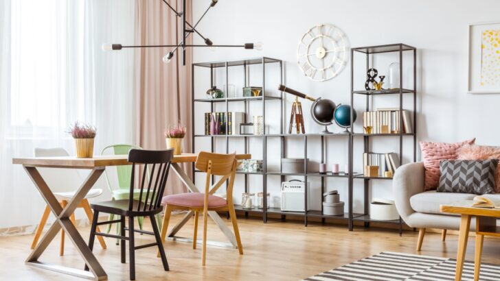
5. Oversized Statement Lighting
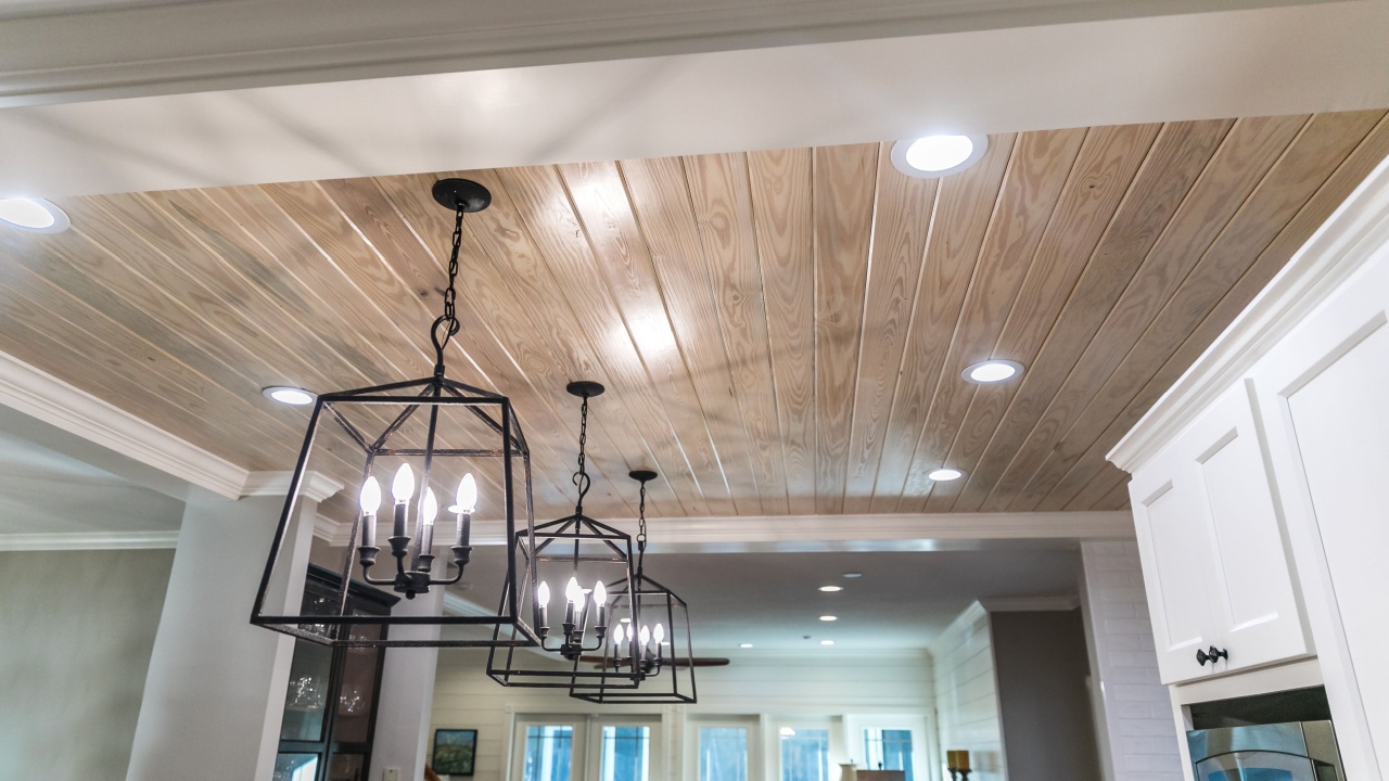
Image Credit: Shutterstock.
Oversized lighting fixtures are meant to stand out and make an impression. When they are too large or too bold, they can overpower the room instead of supporting it. The light becomes the first and only thing noticed, even when the space has other strong features. Scale plays a big role in how lighting feels. A fixture that hangs too low or spreads too wide can make ceilings feel shorter, and rooms feel crowded.
Trend-driven designs also lose appeal quickly, which makes a once-loved fixture feel out of place. Lighting works best when it feels balanced. Simple shapes, thoughtful proportions, and solid materials help fixtures blend into a room naturally. When lighting supports the space instead of dominating it, the entire room feels more comfortable and put together.
A Practical Way Forward
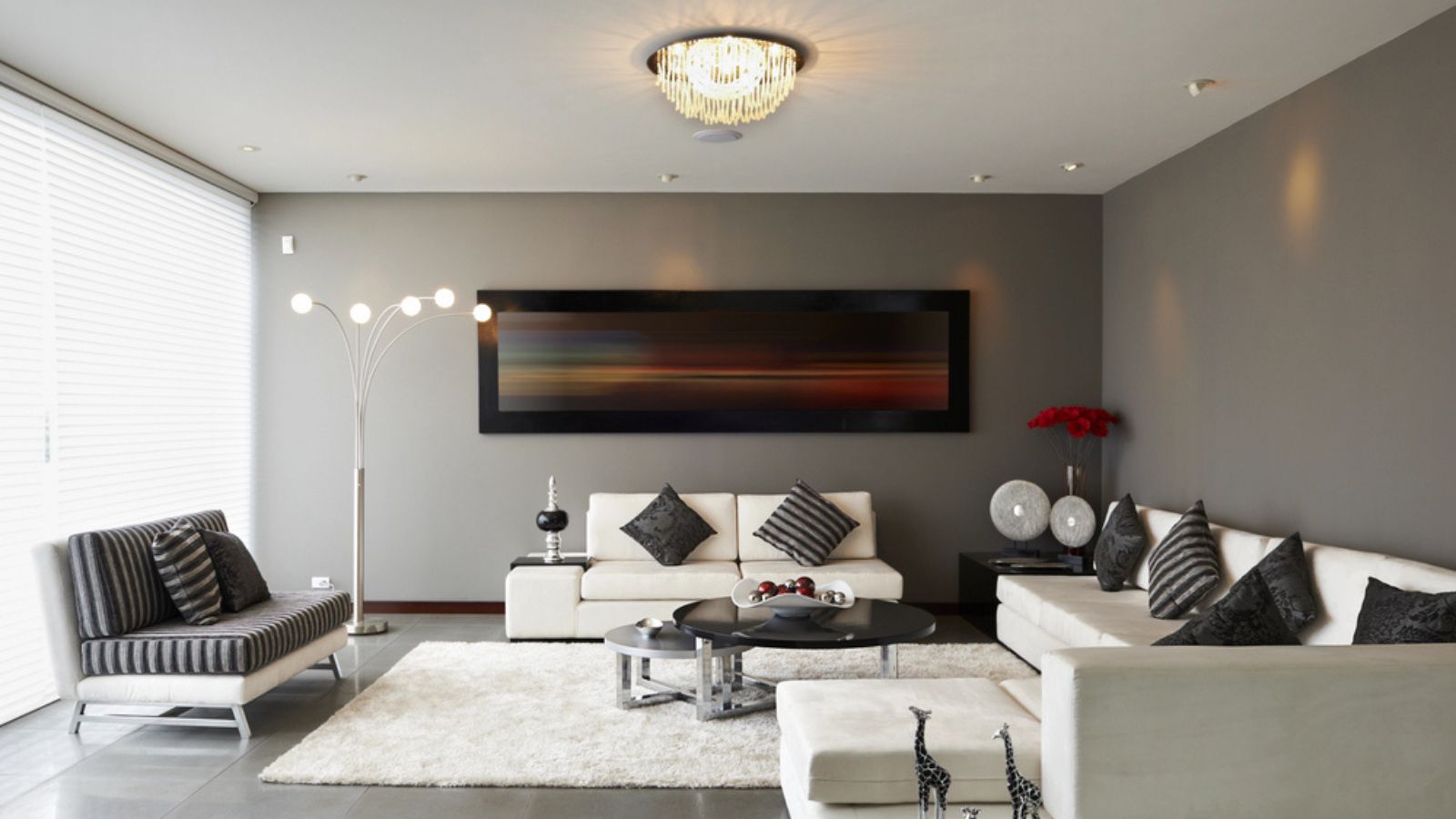
Image Credit: Deposit Photos.
Home upgrades tend to work best when they feel calm and thoughtful rather than bold for the sake of attention. Materials, colors, and layouts that support daily routines usually stay appealing longer than choices driven by trends alone. When a space feels easy to live in, it naturally feels more welcoming.
Before committing to a big change, it helps to pause and picture how the room will be used day after day. Small shifts in furniture, lighting, or storage often deliver more satisfaction than dramatic updates. A home that evolves with intention stays comfortable, flexible, and pleasant to spend time in.