Interior design trends are moving faster than ever. Back in the day, furniture and finishes stuck around for decades. Now, they barely survive a TikTok trend cycle. Thanks to fast furniture and social media, styles like gray floors or over-the-top farmhouse vibes can flood the market in weeks and feel outdated just as fast.
Jumping on every trend might seem fun, but it can leave your home looking like a time capsule instead of a cozy, timeless space. The trick? A little self-control and a good eye. You don’t need to renovate every time a new trend hits Pinterest (and shouldn’t), but spotting what screams “so last year” can help you make smart updates when you want to.
Let’s dive into the design choices that could be aging your home, and how to fix them.
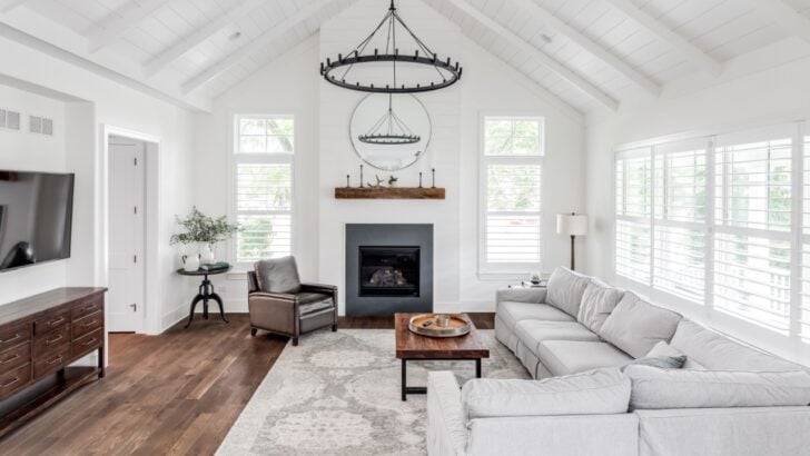
1. Shiplap Walls
Image Credit: Joseph Hendrickson / Shutterstock.
Shiplap had a massive run thanks to the farmhouse craze, and it was a great way to add texture without the headache of wallpaper. But because it was everywhere for a while, it’s started to feel a bit “mid-2010s.” Those thick horizontal boards can also make a room feel a little cramped and closed in.
If you aren’t ready to rip it all out (and risk ruining your drywall), you don’t have to resort to a full demo. The classic farmhouse look was all about bright white, so a fresh coat of paint can totally change the vibe. Try a moody charcoal, deep forest green, or navy. It turns the paneling into a cool architectural feature rather than a dated rustic callback.
2. Gray Interiors
Image Credit: Shutterstock.
For a long time, gray reigned supreme as the default neutral. It covered walls, carpets, and upholstery in an attempt to look sleek and clean. The issue arises when gray becomes the only note in the symphony. An entirely gray room often feels cold, sterile, and unwelcoming. It lacks the warmth that makes a house feel habitable.
You do not have to banish neutral tones, but shifting to warmer alternatives breathes life back into a room. Taupe, creamy off-whites, and warm beige tones offer the same versatility as gray without the clinical aftertaste. These shades reflect light beautifully and create a welcoming backdrop for art and furniture.
3. Sliding Barn Doors
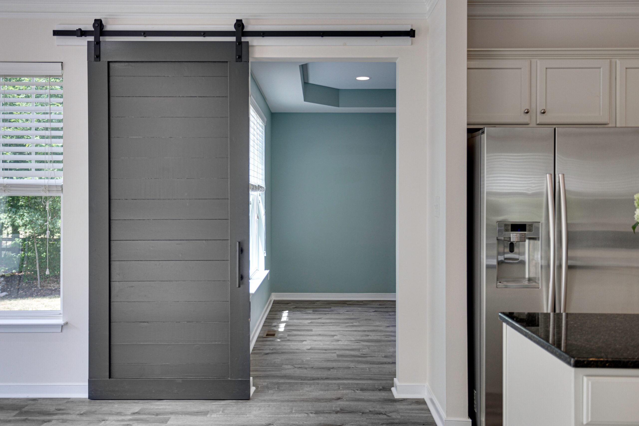
Image Credit: BryanChavezPhotography / Shutterstock
Sliding barn doors were all the rage during the rustic industrial trend, promising to save space and add charm. But in reality, they’re not great at blocking sound, light, or smells because of the gap between the door and the wall. Plus, they need a ton of free wall space to slide open, which means less room for hanging art.
The heavy, rustic hardware also locks you into a specific look that doesn’t work with more modern or traditional styles. If you need to save space, a pocket door is a much better option. And for regular spaces, traditional hinged doors are way better for privacy and keep things looking clean.
4. All-White Kitchens
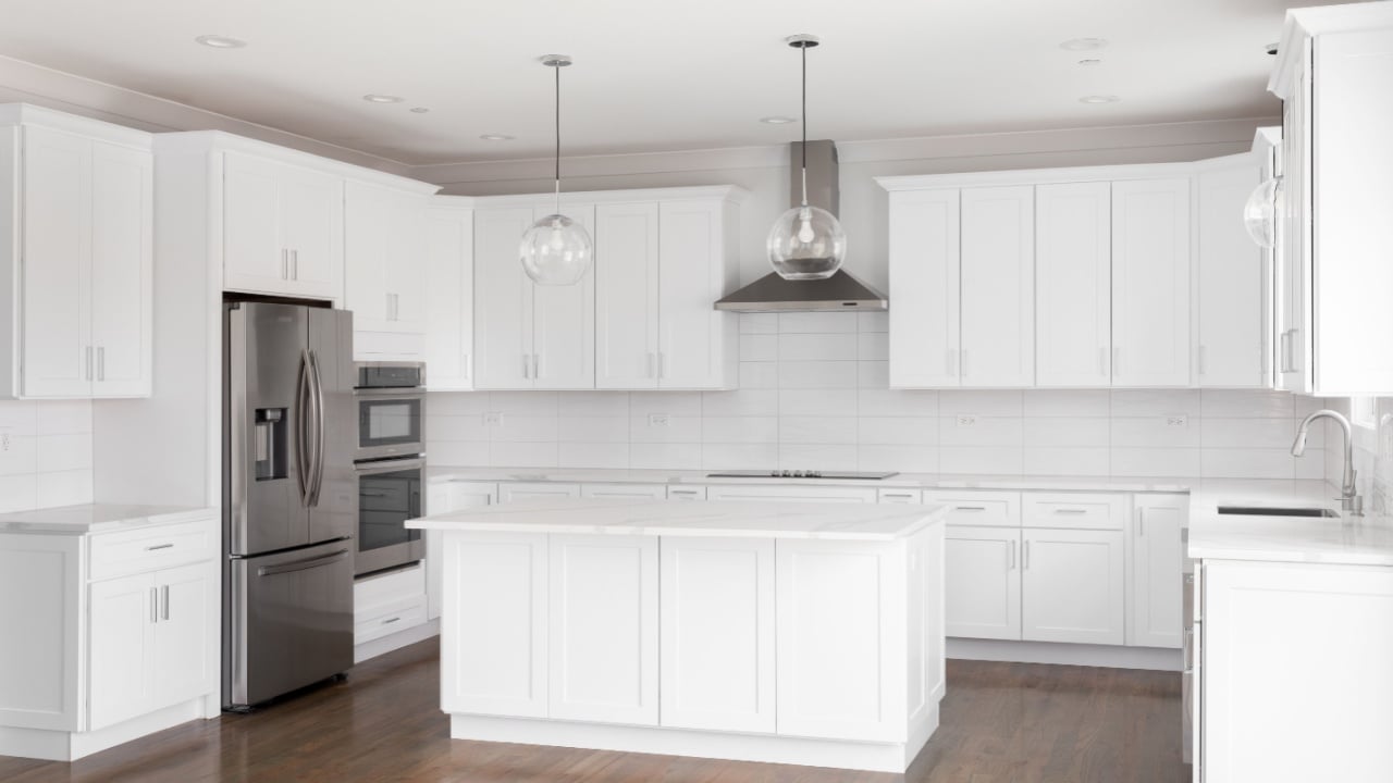
Image Credit: Joseph Hendrickson / Shutterstock.
All-white kitchens look great in photos, but in real life, they can feel a bit cold and sterile. They also create a ton of pressure to keep everything spotless since every single crumb and coffee spill is on full display. This can make the kitchen feel less like the heart of the home and more like a laboratory.
Instead, designers are now leaning towards kitchens with more character and depth. This doesn’t mean you have to rip out your cabinets. A simple fix is to paint your lower cabinets a different color while keeping the upper ones white. You can also add some texture with a handmade tile backsplash or wooden accessories to break up all that white.
5. Gray Wood-Look Flooring
Image Credit: Shutterstock.
Nothing dates a home faster than that gray laminate or vinyl plank flooring. It was marketed as a modern (and much cheaper) upgrade to oak, but let’s be honest: it often looks totally unnatural. Wood is organic, and when you strip away its warmth and dye it gray, you get a synthetic look that clashes with almost every furniture style.
If replacing your floors isn’t in the budget, your best bet is to go big with area rugs. Covering that gray surface with natural fibers like jute or wool hides those cold undertones and brings back the cozy vibes. When you’re finally ready to swap them out, stick with medium-tone wood finishes; they never go out of style.
6. Open Shelving
Image Credit: Shutterstock.
Open shelving was supposed to make kitchens feel bigger and more open. And yes, it looks amazing in a magazine, but living with it is another story. You have to dust constantly, and unless all your dishes match and you’re a super organized person, it just looks messy. Plus, all the grease and dust from cooking land right on your plates, so you have to wash them before you even use them.
If you like showing off your stuff but can’t deal with the cleaning, glass-front cabinets are a great compromise. They keep your dishes dust-free but still give you that open, airy feel. Or, just use your open shelves for things like cookbooks and plants instead of the dishes you eat off of every day.
7. Edison Bulbs
Image Credit: Shutterstock.
Edison bulbs were the ultimate industrial-cool look for a while, popping up in every trendy restaurant and living room. They give off a cozy, warm glow, but they’re actually pretty terrible for seeing what you’re doing. The amber tint makes everything look a bit orange, and if you accidentally catch a glimpse of the filament, it’s a total eyesore.
Lighting trends are shifting toward softer, layered vibes. Frosted bulbs or shaded fixtures give you much better light without the annoying glare. If you’re stuck with a fixture that needs exposed bulbs, try the newer LED versions that don’t have that intense orange glow, or just swap out clear glass for something opaque.e intense orange cast, or swap the glass shades for something opaque.
8. Mid-Century Modern Overload
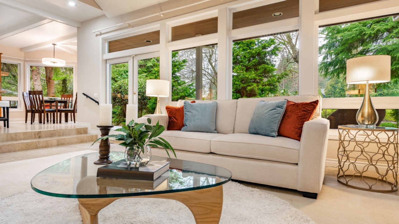
Image Credit: Shutterstock.
Mid-century modern (MCM) design is timeless, but turning your home into a Mad Men set can feel outdated. If every piece of furniture has tapered legs and walnut finishes, it starts looking like you bought a showroom display in one weekend instead of a home you’ve built over time.
The magic of MCM is how well it mixes with other styles. Pair a sleek mid-century credenza with a comfy, modern sofa or an antique rug to keep things interesting. It’s all about balance; let those MCM pieces be the anchors, not the whole look.
9. Farmhouse Sinks

Image Credit: Nelson Minar from San Francisco, USA – CC BY-SA 2.0/Wiki Commons.
The apron-front sink, specifically the white fireclay one with a matte black faucet, quickly became the “it” item for any fancy kitchen renovation. It’s great for washing big pots and pans, sure, but that specific combo is starting to look a little dated. Plus, fireclay can chip and crack over time, which isn’t just an eyesore; it can be a pain to keep clean.
You can get the same deep-sink benefits from stainless steel or stone sinks without the farmhouse-chic label. These materials fit better with a wider range of styles, whether you’re going for an industrial vibe or something more classic. Already have the white sink? No worries. Just switching out the faucet for a polished nickel or brass one can give it a quick, modern update.
10. Jewel-Toned Velvet Upholstery

Image Credit: Shutterstock.
Deep emerald and sapphire velvet sofas dominated social media feeds for several years. They provided a dramatic pop of color, but they are substantial commitments. A bright green sofa dictates the color palette for the entire room and can be difficult to work around if your tastes change. Velvet also wears in specific patterns, showing “bruises” or crushing over time.
Neutrals remain the safest bet for large investment pieces like sofas. You can get that fix of rich color through throws, pillows, or an accent chair. These smaller items are easier and cheaper to swap out when you want a fresh look. If you are stuck with a bold sofa, tone down the rest of the room to let it stand as the sole statement piece.
11. Open-Concept Layouts
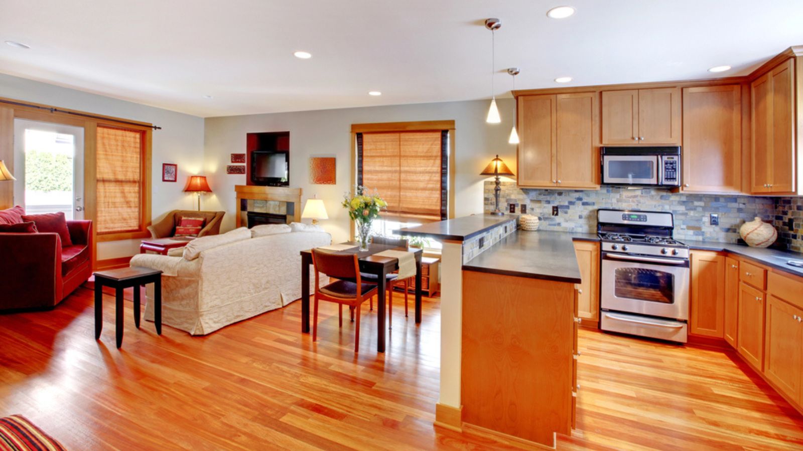
Image Credit: Deposit Photos.
Tearing down walls was the renovation standard for decades. The promise of better flow and sightlines appealed to families, but the reality involves noise pollution and cooking odors traveling throughout the house. The lack of defined spaces proved difficult during the recent shift toward working from home, where privacy became a premium commodity.
Totally rebuilding walls is expensive, but you can create visual and acoustic separation. Cased openings, where a wall exists but has a wide doorway, offer the best of both worlds. Furniture placement plays a huge role here. Using tall bookcases or room dividers can zone a large space into functional areas without requiring a contractor.
12. Painted Brick
Image Credit: Shutterstock.
Painting brick black or white was a quick way to modernize exteriors and fireplaces. Unfortunately, this trend is proving to be shortsighted. Painted brick requires maintenance as it peels and chips, and it traps moisture, which can damage the masonry over time. Visually, it flattens the texture and removes the natural character of the material.
Removing paint from brick is labor-intensive and difficult. If you have natural brick, embrace the variation. If the red tone clashes with your style, consider a limewash or a masonry stain rather than an opaque paint. These allow the brick to breathe and maintain some tonal variation, looking more like an old-world finish than a flip-house update.
13. Light Oak Monotony
Image Credit: Shutterstock.
Light, “Scandinavian” oak finishes flooded the market to replace the dark espresso woods of the early 2000s. While lovely in moderation, a home filled with pale floors, pale cabinets, and pale furniture looks washed out. It lacks contrast and depth. It also tends to show scuffs and dirt more readily than mid-tone woods.
Contrast is vital for a dynamic interior. Darker woods like walnut or rich mahogany are returning because they provide visual weight. You do not need to refinish your floors, but you should mix in darker wood furniture or painted pieces to ground the space. The eye needs a place to rest, and contrast points provide that.
14. Word Art and Typography Signs
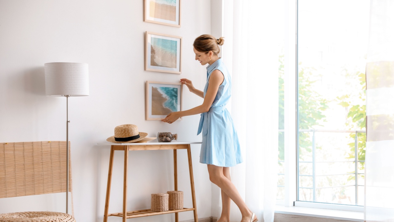
Image Credit: Shutterstock.
Signs demanding that you “Eat” in the kitchen or “Gather” in the living room have had their day. This literal approach to decorating leaves little to the imagination and often looks mass-produced. It tends to clutter walls without adding any aesthetic value or personal connection to the homeowner.
Art should evoke a feeling, not read like an instruction manual. Replacing typography with landscape paintings, abstract prints, or personal photography instantly elevates the sophistication of a room. It allows you to express personality through color and composition rather than text.
15. Rose Gold Hardware
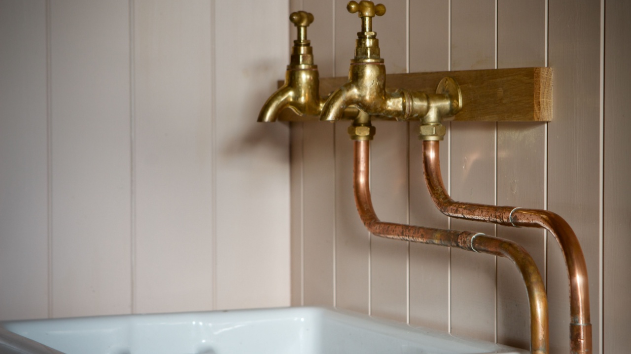
Image Credit: Shutterstock.
Rose gold had a serious moment, showing up on everything from iPhones to kitchen faucets. However, that specific pink undertone makes it a nightmare to mix with other metals. It also tends to scream “2016,” making your kitchen or bathroom feel dated rather than timeless.
If you want a look that lasts, go for unlacquered brass, polished nickel, or matte black. These finishes play well with others and fit almost any style. If you’re currently rocking rose gold cabinet pulls, don’t sweat it; swapping them out is a quick weekend DIY that will instantly refresh your space.
Making Your Home Timeless
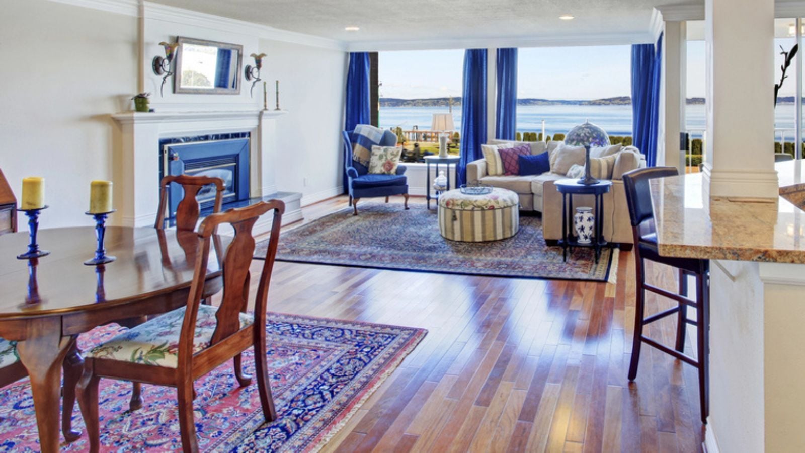
Image Credit: Deposit Photos.
Trends are useful for inspiration, but they should never dictate how you live (just like this list, they’re only ideas after all).
The homes that age the best are those that prioritize functionality and personal joy over the current algorithm. If you look around and see three or four of these items in your living room, do not panic. Small tweaks often make the biggest difference.