Some design choices seem brilliant at first. They pop up in magazines and fill our social media feeds, promising a stylish and modern home.
But what happens when the dust settles, and we have to live with these trends? Sometimes, what looked good on paper becomes a daily inconvenience.
Here is a look at some of those design decisions that didn’t quite stand the test of time, leaving many homeowners with a touch of buyer’s remorse.
1. Barn Doors Where They Don’t Belong
Image Credit: Shutterstock.
The sliding barn door became a hallmark of the modern farmhouse aesthetic. It offered a rustic, space-saving alternative to the traditional swinging door. They appeared on everything from pantries to primary bathrooms. The problem arose when they were used in places requiring privacy. Their design inherently leaves gaps on the sides, top, and bottom, making them poor barriers for sound and light.
Using one for a bathroom or a bedroom often leads to awkward situations. While they save floor space compared to a swinging door, the wall space they require to slide open is substantial, limiting where you can place furniture or art. Their popularity faded as people realized their practical limitations often outweigh their visual appeal in many applications. Use barn doors for spaces where privacy is not a major concern, such as a pantry, laundry room, or home office entrance.
2. All-Black Modern Farmhouses in Hot Climates
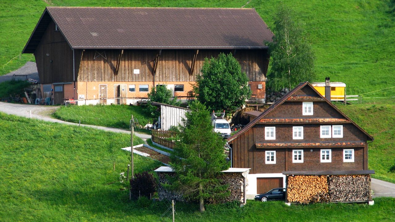
Image Credit: Roland zh – Own work – CC BY-SA 3.0/Wiki Commons.
Dark, moody exteriors can make a strong architectural statement. The all-black modern farmhouse look is certainly dramatic and eye-catching. However, applying this trend in a region with intense sun and high temperatures can create a few problems. Dark colors absorb significantly more solar heat than light colors. This can lead to a much hotter house.
A black exterior forces the air conditioning system to work much harder to maintain a comfortable indoor temperature, resulting in higher energy bills. It can also cause the exterior siding and paint to degrade faster due to increased heat and UV exposure. In hot climates, opt for lighter exterior colors like whites, beiges, or light grays that reflect heat. If you love the dark look, consider using it as an accent color on trim, shutters, or a front door instead of for the entire house.
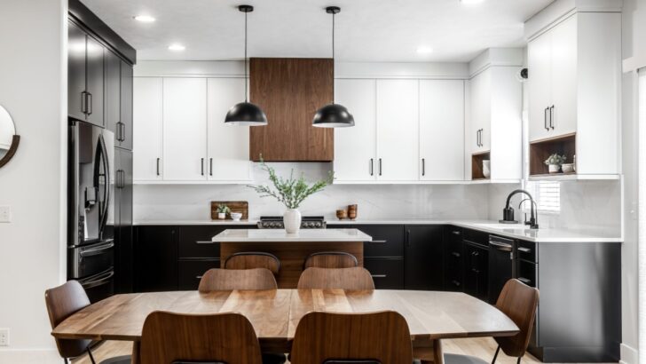
3. Rough-Textured Kitchen Backsplash Tiles

Image Credit: Shutterstock.
A textured backsplash can add depth and a handcrafted feel to a kitchen. Materials like split-face stone or rough-hewn tiles became popular for adding a rustic, organic element. The reality of cooking in a kitchen, however, soon revealed the downside. Grease splatters, sauce splashes, and general grime get trapped in the nooks, crannies, and uneven surfaces of these tiles.
A kitchen backsplash area needs to be easy to wipe down. This trend sacrificed cleanability for a specific look, and many have found the trade-off isn’t worth it. Choose a backsplash material with a smooth, non-porous surface. Glass, ceramic, or porcelain tiles are easy to wipe clean. If you want texture, look for tiles with a sealed, smooth finish or a subtle, rather than deep, texture.
4. Shower Rooms with the Tub Inside
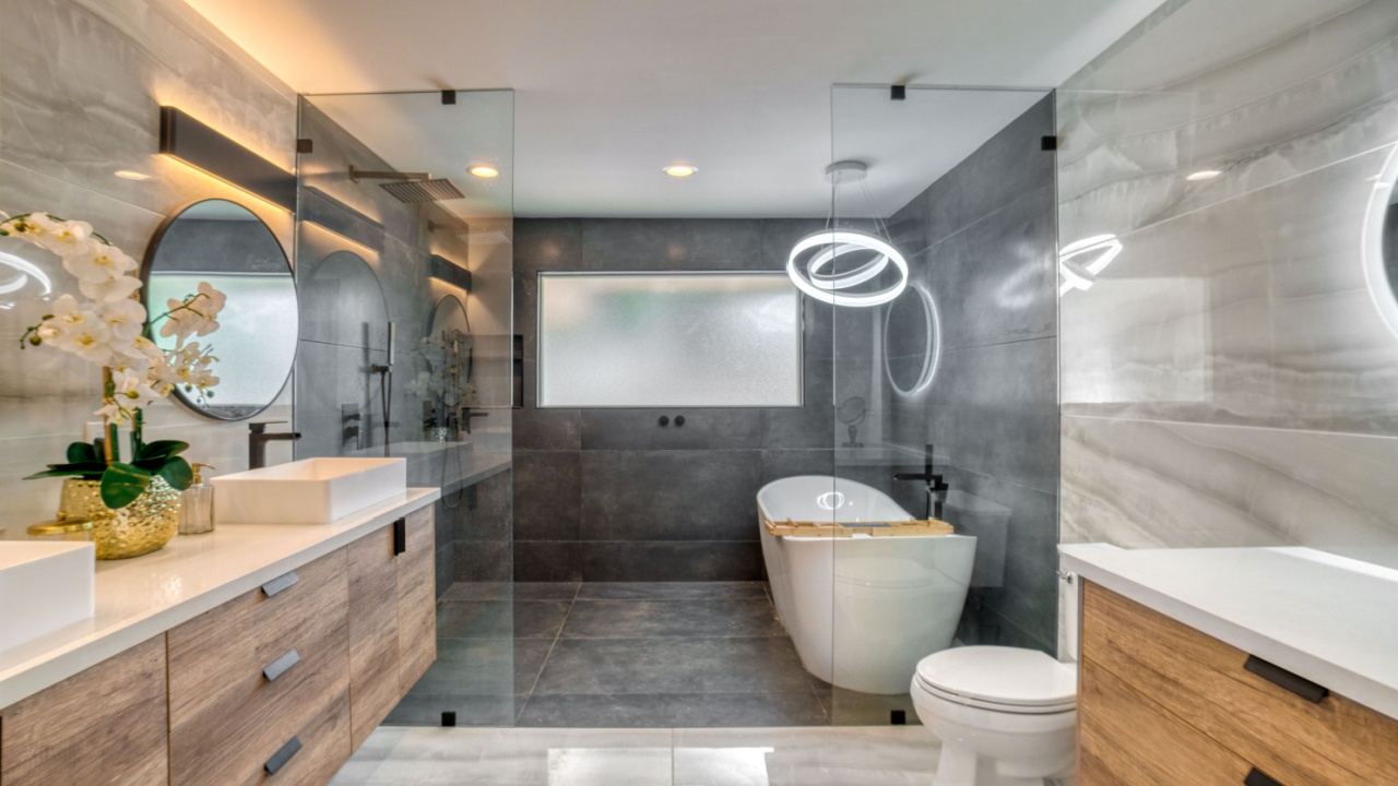
Image Credit: Shutterstock.
The “wet room” concept, where the bathtub is situated within a large, glass-enclosed shower area, appears sleek and spa-like in photos. The idea is to create a spacious, open bathing zone. In practice, it creates a cleaning headache. The entire area, including the tub, gets wet every time someone showers.
This means you are constantly wiping down not just the shower walls but also the entire tub and its fixtures to prevent water spots and soap scum buildup. The perceived luxury often gives way to the daily chore of managing a perpetually damp space. If you really want a tub, keep the tub and shower separate. This traditional layout is more practical for daily use and cleaning.
5. Gray Flooring That Feels Dated
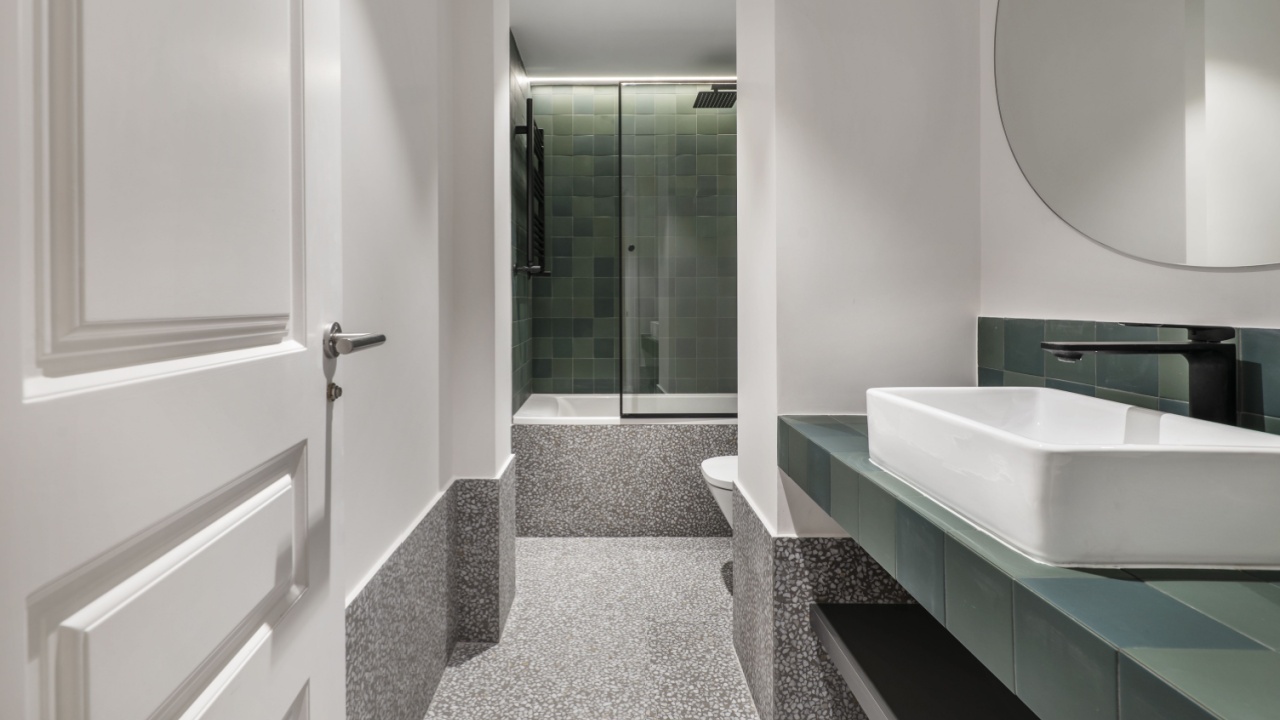
Image Credit: Shutterstock.
For several years, gray was the go-to neutral. Gray wood-look laminate, vinyl, and tile flooring took over homes, promoted as a modern and sophisticated choice. But its ubiquity has caused it to lose its appeal. The cool tones of many gray floors can make a space feel cold, sterile, or even gloomy, especially if not balanced with warm colors in furniture and decor.
Because it was so heavily used, the all-gray look is now strongly associated with a specific period, causing it to feel dated more quickly than timeless wood tones. Homeowners are now leaning back toward warmer, more natural wood finishes that provide a more welcoming and enduring foundation for a room’s design.
6. Fireplace “Chimneys” for Fake Fireplaces
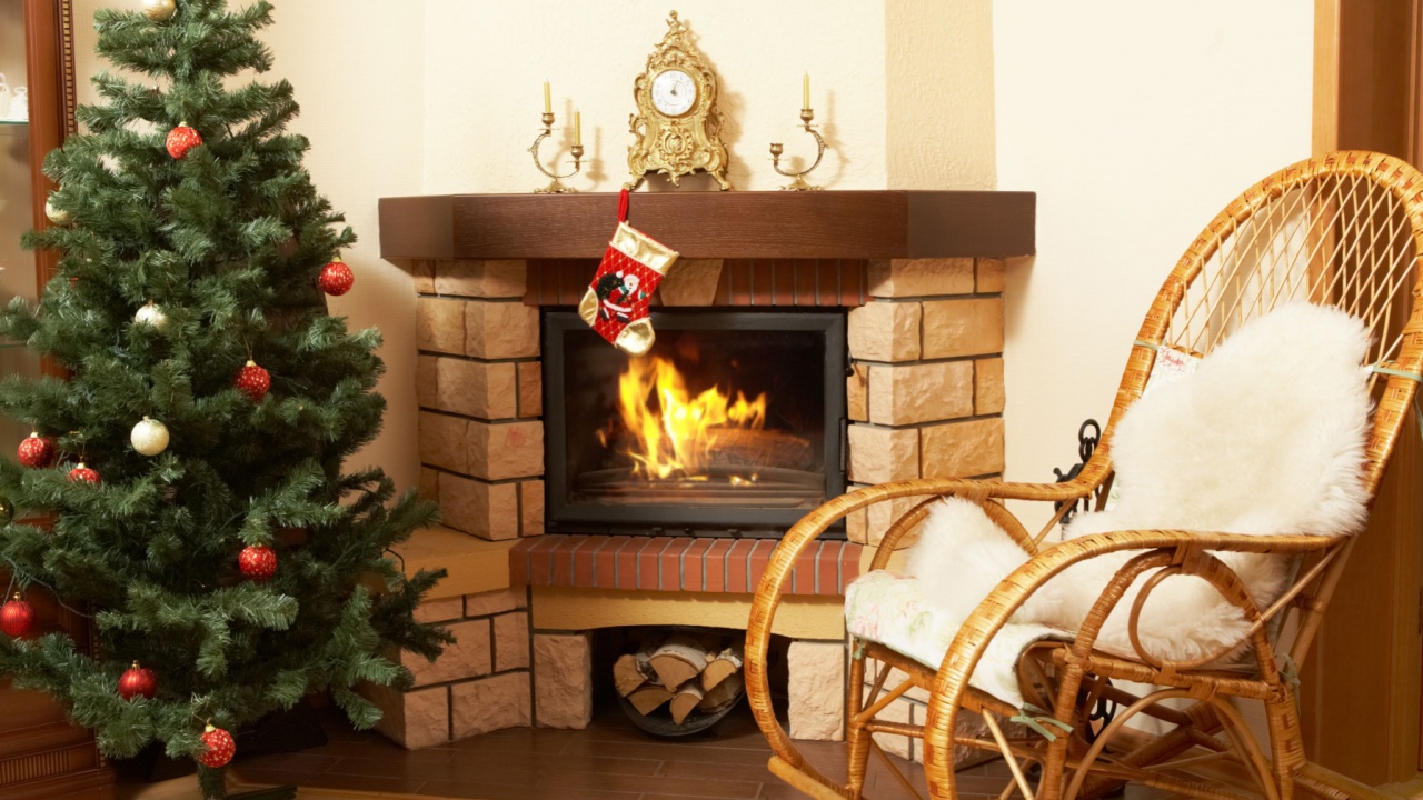
Image Credit: Shutterstock.
Electric fireplaces offer the ambiance of a fire without the need for a real chimney. They are a great addition to many homes. The design misstep occurs when a large, fake chimney structure is built above an electric unit to mimic a traditional wood-burning fireplace. This bulky drywall construction often looks out of place and disproportionate, especially in rooms with standard ceiling heights.
It consumes valuable wall space without serving any structural purpose. The faux chimney can dwarf the fireplace unit itself and create an awkward focal point. People have realized that a simpler, more streamlined installation, like a built-in unit within a media wall or a stylish console, is a more honest and aesthetically pleasing approach.
7. Open Floor Plan Trend
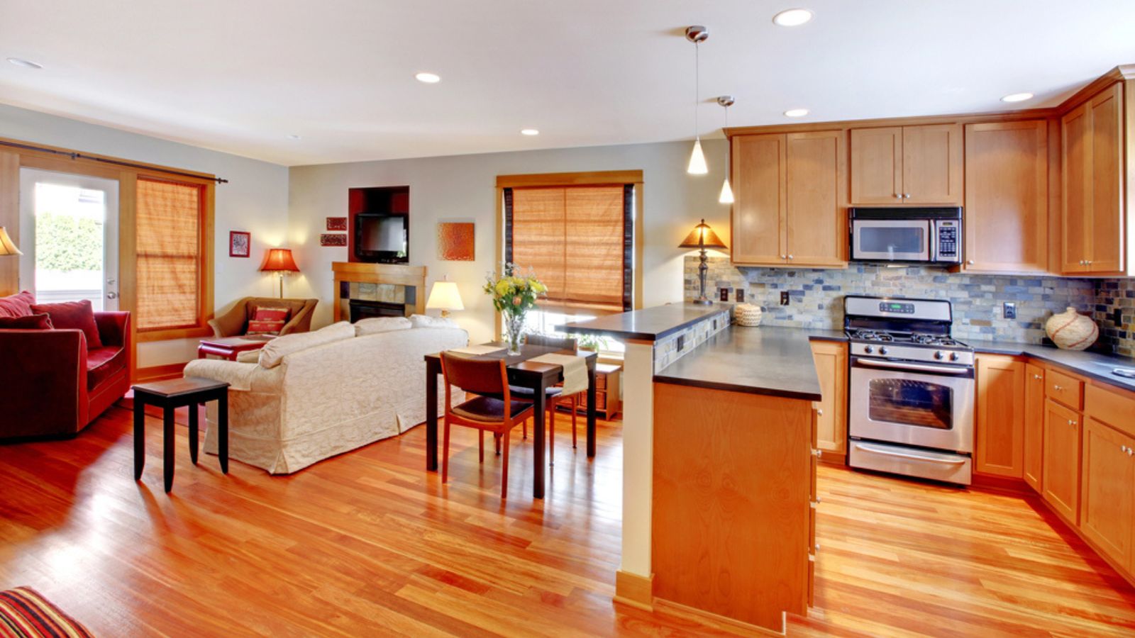
Image Credit: Deposit Photos.
The open floor plan, which combines the kitchen, living, and dining areas into a single, spacious area, has dominated home design for decades. It promised connection and a sense of spaciousness. However, many are discovering the downsides. A lack of walls means a lack of privacy. Sounds travel easily, so a noisy kitchen activity can disrupt someone trying to watch TV or read in the living area.
Cooking smells also permeate the entire space, lingering on furniture and textiles. Defining distinct functional zones without walls can be a challenge. If you want to move away from this, consider a “broken-plan” layout, which uses partial walls, bookcases, or glass partitions to create separation without fully closing off rooms.
8. Two-Toned Kitchens
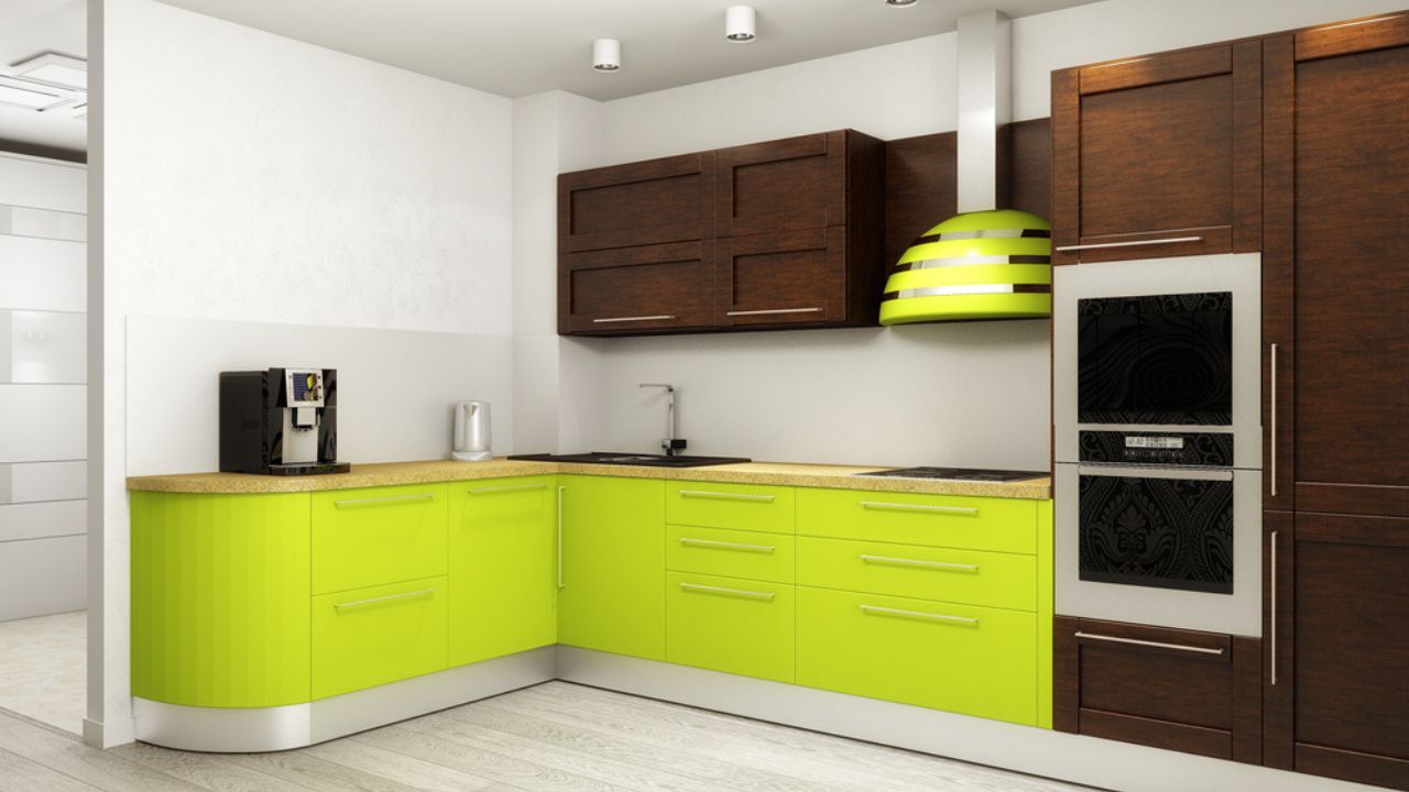
Image Credit: Deposit Photos.
The trend of having upper cabinets in one color (usually white) and lower cabinets in another (often a darker shade or wood) was a popular way to add visual interest to a kitchen. It can break up the monotony of a single color and make a space feel lighter by keeping the darker color grounded.
The issue is not that it is a bad idea, but that certain combinations have become so common that they now feel generic. The trend has lost its custom, designer feel, and homeowners may not like it. If you like the two-tone concept, choose a more personal color combination. You could also use different materials, such as wood for the lower cabinets and a painted finish for the uppers, to create a more timeless contrast.
9. Painting Brick on Mid-Century Homes White
Image Credit: Shutterstock.
Mid-century modern homes often feature beautiful, high-quality brickwork as a key architectural element. A recent trend involved painting this brick, usually white or gray, to “update” the exterior. While paint can certainly freshen up a facade, it fundamentally alters the character of these homes and creates a long-term maintenance commitment.
Brick is a low-maintenance material, but painted brick is not. It can chip, peel, and fade over time, requiring regular repainting. Paint also traps moisture, which can damage the brick and mortar underneath, especially in climates with freeze-thaw cycles. Instead of painting, consider updating other exterior elements, such as trim, landscaping, or the front door. If the brick is in poor condition, professional cleaning or staining may be better options than opaque paint.
10. Microwaves Built Into Lower Cabinets
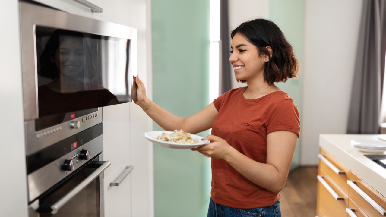
Image Credit: Shutterstock.
Putting a microwave in a lower cabinet seemed like a clever way to clear countertops and streamline kitchen design. Having an appliance neatly tucked away looked sleek, letting upper cabinets take center stage. But the drawbacks quickly became obvious. Crouching down to reheat leftovers gets old, especially while balancing a hot bowl and dealing with an awkward door. Additionally, kids and pets have easy access, which can lead to spills and burned fingers.
For anyone with knee or back issues, bending to reach the microwave is a daily nuisance, not an upgrade. What felt modern on a design board sometimes didn’t work for those who were cooking and reheating on repeat. The height isn’t ergonomic, making cleaning up spills more tedious. If building or renovating, consider a microwave at a comfortable chest or eye level within tall cabinetry or a microwave shelf.
11. Pot Lights All Over the Ceiling

Image Credit: Shutterstock.
Recessed lights, also known as pot lights, are useful for providing general, ambient illumination. The trend that went too far was installing them in a grid pattern across the entire ceiling of a room, creating what some call the “airport runway” look. This approach can make a ceiling look cluttered, and the light it produces is often flat and harsh.
A well-lit room utilizes layers of light, including ambient (general), task (focused), and accent (decorative) lighting. Relying solely on a grid of pot lights overlooks the importance of task lighting over a kitchen counter or a reading chair, as well as accent lighting, such as lamps or sconces, which add warmth and character.
12. Monster Houses on Tiny Lots
Image Credit: Shutterstock.
This trend involves maximizing a home’s square footage on a small piece of property. The result is a massive house that looms over its neighbors, with minimal yard space and windows that look directly into the house next door. These “monster houses” sacrifice outdoor living space, natural light, and privacy for more interior rooms.
The lack of space between homes can make a neighborhood feel cramped and overdeveloped. Yards are too small for trees to grow, and the sheer scale of the house can block sunlight to its own yard and to its neighbors’. When buying or building, consider the balance between indoor and outdoor space. A slightly smaller home on a larger lot often provides a better quality of life than a massive house with no yard.
Moving Forward with Your Design
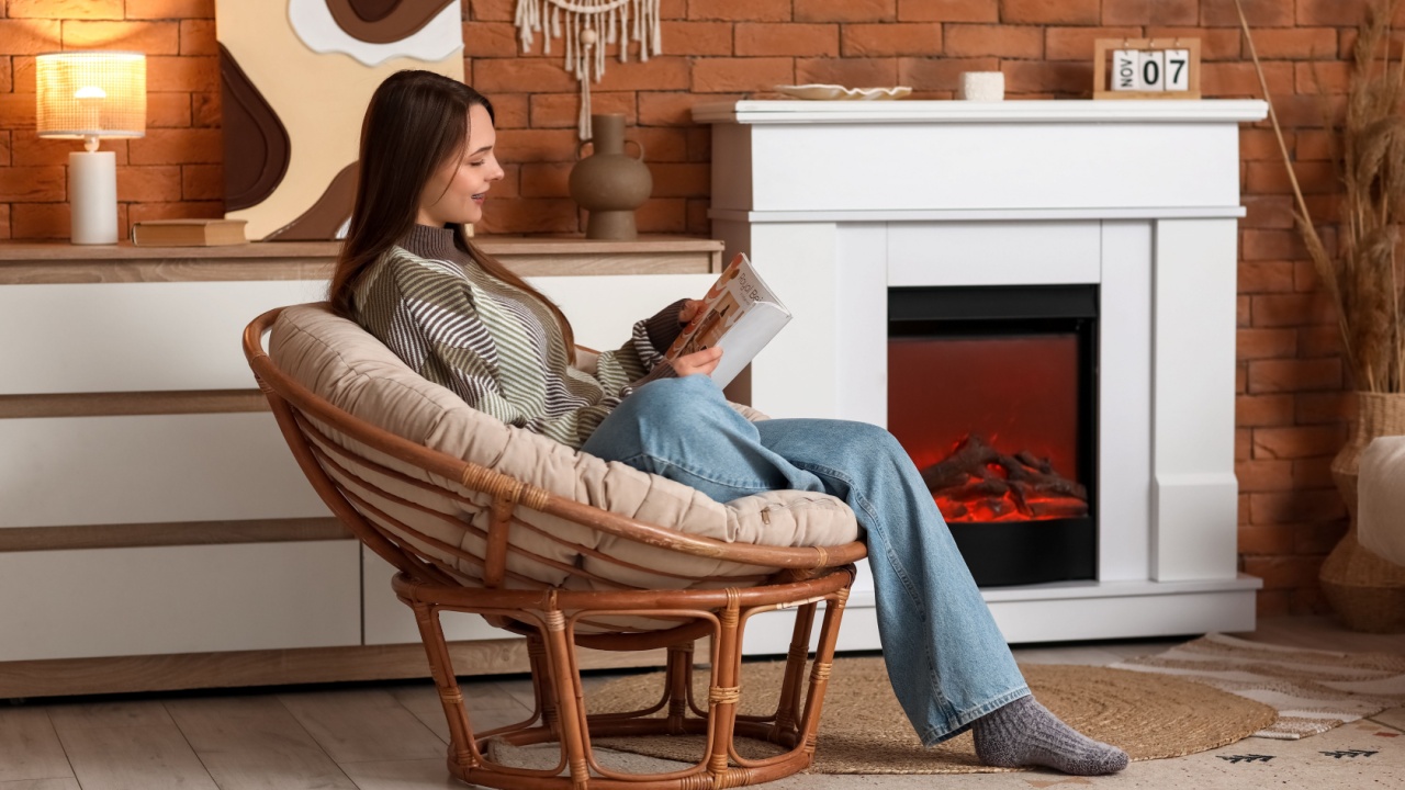
Image Credit: Shutterstock.
Home design is always evolving, and it is easy to get swept up in the latest look. The key to creating a home you will love for years is to look past the initial “wow” factor and consider the practical side of every decision. Ask yourself: How will this be to clean? Will it be functional for my family’s daily life? Does this choice create a future maintenance burden?
By prioritizing function and livability alongside aesthetics, you can avoid these common design regrets. A truly successful home is one that not only looks good on day one but also works beautifully for all the days that follow. Think about creating a space that serves you, rather than one that requires constant service from you.