
Choosing a new paint color is one of the most exciting parts of a home refresh. It’s a chance to inject personality into a space, whether it’s your living room, bedroom, or even the garden shed. But a can of paint that looks perfect on a small swatch in the hardware store can quickly become a source of major regret once it’s covering all four walls. The wrong shade can make a room feel smaller, darker, or just plain agitating.
To help you avoid the hassle and cost of a do-over, we’ve compiled a list of paint colors that homeowners often end up disliking. We’ll explore why these shades can be so challenging to live with and offer beautiful alternatives that will give you the look you want without the buyer’s remorse. Let’s make sure your next paint project is a complete success from the first brush stroke.
Note: Ultimately, there is no right or wrong paint color for your home. These are meant to help you think through what works best for you to avoid potential regret later. If you love it, go for it!
1. Bright Red

Image Credit: Joseph Hendrickson / Shutterstock.com.
Bright, true red is a color of passion, energy, and bold statements. While it might seem like a great way to create a dynamic and exciting room, it often has the opposite effect in a living space. Red can be visually aggressive and overwhelming, promoting restlessness and even tension rather than relaxation. In rooms meant for unwinding, like a bedroom or family room, this high-octane hue can make it difficult to feel at ease. It’s a color that demands attention, which can make decorating around it a significant challenge.
A better approach is to use red as a powerful accent. Think of a beautifully painted front door, a statement piece of furniture, or vibrant cushions and throws. If you have your heart set on red walls, consider deeper, more muted tones like burgundy, wine, or maroon. These shades bring warmth and sophistication without the jarring intensity of a fire-engine red.
Quick Guide:
- Why it’s regrettable: Overly stimulating, it can create a sense of tension, and is difficult to coordinate with decor.
- Better alternatives: Burgundy, cranberry, or rich maroon for a more sophisticated feel.
- Best use: As an accent on a single feature wall, a front door, or through home accessories.
- Care tip: Red paints, especially dark ones, can require more coats for even coverage. Always use a high-quality, tinted primer first to achieve a true, rich color.
2. Rusty Orange
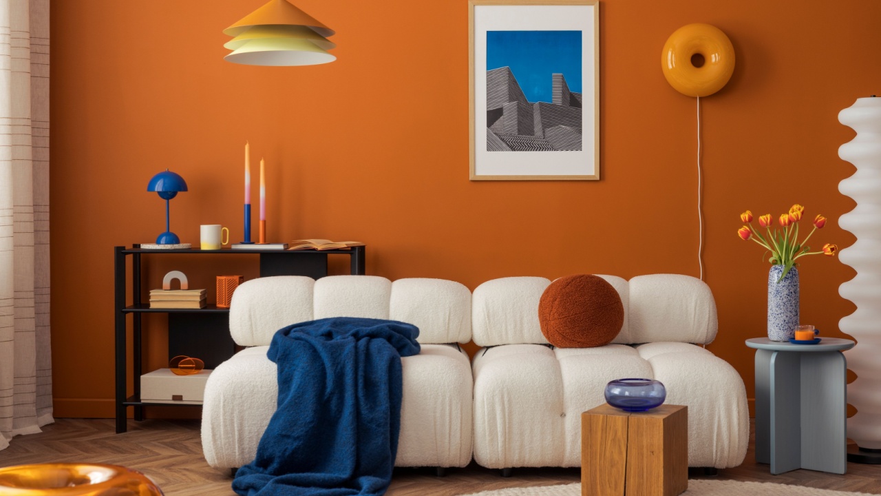
Image Credit: Shutterstock.
Earthy tones are a wonderful way to bring the grounding feeling of the outdoors inside. However, rusty orange often misses the mark. While it promises the warmth of a terracotta pot or an autumn sunset, it can quickly make a room feel heavy, dated, and surprisingly dark. Instead of feeling cozy and inviting, a room painted in rusty orange can feel closed-in and difficult to furnish. Its strong, specific undertones can clash with woods, fabrics, and other colors, limiting your design choices.
If you’re drawn to the warmth of orange, look for softer, more subtle variations. A gentle terracotta, a soft apricot, or a light peachy neutral can provide that desired warmth without overpowering the space. These hues are more versatile and create a welcoming atmosphere that feels both modern and timeless.
Quick Guide:
- Why it’s regrettable: It can look dated, absorbs light, and makes spaces feel smaller and heavier.
- Better alternatives: Soft terracotta, muted apricot, or light peach tones.
- Best use: In small doses, like a painted plant pot, outdoor cushions, or an accent in a patterned rug.
- Next steps: Test large paint swatches on different walls to see how the color interacts with natural and artificial light throughout the day before committing.
3. Pure Black
Image Credit: Shutterstock.
There’s no denying the dramatic, high-fashion appeal of a black wall in a design magazine. It can look incredibly chic and sophisticated. In reality, though, living with black walls is often more trouble than it’s worth. Black absorbs a massive amount of light, which can make even a well-lit room feel cave-like and cramped. It also shows every single scuff, handprint, and speck of dust, making it a high-maintenance choice for busy households.
For a dramatic look that’s easier to live with, consider dark charcoal gray, deep navy blue, or rich forest green. These colors offer a similar sense of depth and moodiness but are far more forgiving. They don’t absorb as much light and are better at hiding minor imperfections, giving you that bold aesthetic with less upkeep. If you still want to use true black, reserve it for a small powder room or a single, impactful accent wall in a room with abundant natural light.
Quick Guide:
- Why it’s regrettable: Makes rooms feel small and dark, shows every fingerprint and scuff mark.
- Better alternatives: Charcoal gray, navy blue, or deep forest green.
- Best use: In a small, well-defined space like a powder room or as a trim color for windows and doors.
- Care tip: If you paint with black, choose a matte or eggshell finish. High-gloss black will amplify every single surface imperfection.
4. Sunshine Yellow
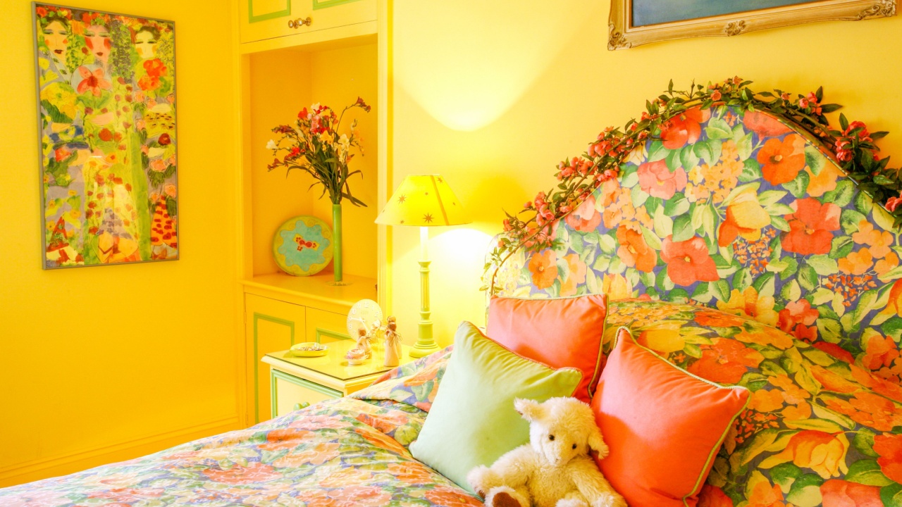
Image Credit: Ian Luck / Shutterstock.com
Yellow is the color of happiness, energy, and cheerfulness, making it a popular choice for kitchens and playrooms. However, a bright, sunshine yellow can quickly become overstimulating. The intensity of this color can cause eye fatigue and has even been shown to create feelings of agitation in some people. In a bedroom, where the goal is to relax and sleep, a vibrant yellow can keep your brain in an active state, making it harder to wind down.
To capture the happy feeling of yellow without the intensity, opt for softer, more muted shades. A creamy buttercream, a pale straw color, or a warm gold can bring a sense of sunshine and warmth into a room in a much more calming way. These shades are easier on the eyes and create a gentle, uplifting environment that’s perfect for any room in the house.
Quick Guide:
- Why it’s regrettable: Can be overstimulating and cause eye fatigue; not conducive to relaxation.
- Better alternatives: Buttercream, soft gold, or pale lemon.
- Best use: As an accent color in kitchens or on accessories like pillows, vases, or artwork.
- Next steps: Pair softer yellows with crisp white trim to keep the look fresh and bright, not dull.
5. Neon and Overly Bright Colors
Image Credit: Shutterstock.
Neon pink, electric lime green, and vibrant fuchsia might seem like a fun, expressive way to design a space, especially for a child’s room or a creative studio. Unfortunately, these colors rarely translate well from a swatch to a full wall. Their extreme intensity can make a room feel chaotic and loud, creating a visually stressful environment. What starts as a fun idea often ends up being overwhelming and difficult to live with on a daily basis.
If you or a family member loves these vibrant hues, try using them in a more controlled and thoughtful way. A toned-down version of the same color family, like a dusty rose instead of hot pink, or a sage green instead of lim,e can provide a similar personality without the sensory overload. You can also use true neon shades for small, impactful details like a single picture frame, a lamp base, or a piece of abstract art.
Quick Guide:
- Why it’s regrettable: Visually agitating and can make a room feel chaotic and stressful.
- Better alternatives: Muted or dusty versions of the same color, such as sage green or dusty rose.
- Best use: In very small, deliberate accents on decor items.
- Care tip: Neon paints are notoriously difficult to cover. If you’re painting over a neon wall, use a high-quality primer specifically designed to block bold colors.
6. Builder’s Beige
Image Credit: Shutterstock.com.
This isn’t about all beige, but one specific type: the flat, uninspired “builder’s beige” that often comes standard in new homes and rentals. This shade lacks the warmth and character needed to make a house feel like a home. It often has dull, muddy undertones that can make a space feel listless and uninspired rather than neutral and calming. It’s the color of compromise, chosen because it offends no one, but it also excites no one.
A great neutral should serve as a beautiful, subtle backdrop for your life and decor. Instead of settling for a flat beige, explore more complex neutrals. Colors like “greige” (a mix of gray and beige), warm off-whites, or soft taupes have richer undertones that shift beautifully with the light. These sophisticated neutrals create a canvas that feels intentional and elegant, providing a perfect foundation for any style of furnishing.
Quick Guide:
- Why it’s regrettable: It can look muddy, dated, and devoid of personality.
- Better alternatives: Greige, warm off-white, or a soft taupe with interesting undertones.
- Best use: As a color to paint over as soon as you move in.
- Next steps: When choosing a neutral, get samples with different undertones (pink, green, yellow) and see how they look in your space before deciding.
7. Mint Green
Photo Credit: Depositphotos.com.
Inspired by vintage aesthetics, mint green has had its moments in home decor. However, on four walls, it can quickly start to feel like a doctor’s office or a 1950s bathroom, and not in a charming, retro way. Mint green often carries cool, sterile undertones that can make a room feel clinical and unwelcoming. It can be a difficult color to warm up, and it often clashes with contemporary furniture and wood tones, making it surprisingly hard to decorate around.
For a fresh, green look that feels more connected to nature, consider greens with more depth and earthiness. Sage green, olive green, or a muted eucalyptus shade bring the calming qualities of green into your home without the institutional feel. These colors work beautifully with natural materials like wood, linen, and stone, creating a space that feels both serene and stylish.
Quick Guide:
- Why it’s regrettable: Can feel sterile, clinical, and dated.
- Better alternatives: Sage green, olive green, or muted eucalyptus.
- Best use: For small retro accessories, like a classic stand mixer or a decorative vase.
- Care tip: Greens are heavily influenced by light. A sage green can look gray in the morning and vibrantly green in the afternoon, so be sure to test it in all lighting conditions.
8. Stark “Contractor” White
Image Credit: Shutterstock.
White paint is a classic for a reason, but not all whites are created equal. The stark, sterile white often used by contractors to give a space a “clean” look can be a major source of regret. This type of white has no colored undertones, which can make it feel cold, glaring, and devoid of character. In a room with a lot of natural light, it can be blindingly bright, and in a darker room, it can look dull and shadowy. It’s the absence of color, rather than a thoughtful color choice.
The secret to a beautiful white room is choosing a white with the right undertones. For a cozy, inviting space, select a warm white with hints of cream or yellow. For a crisp, modern look that isn’t sterile, choose a white with subtle gray or blue undertones. These off-whites have a depth and softness that stark white lacks, creating a sophisticated and welcoming atmosphere that feels anything but generic.
Quick Guide:
- Why it’s regrettable: Can feel cold, sterile, and glaringly bright.
- Better alternatives: Warm off-whites with creamy undertones or cool off-whites with soft gray undertones.
- Best use: For ceilings or as a base for custom-tinting.
- Next steps: Paint large sample boards with your top three white choices and move them around the room for a few days. Notice how they change with the light and how they look next to your floors and furniture.
Finding a Paint Color You’ll Enjoy for Years to Come

Image Credit: Depositphotos.com.
Painting is a journey, and choosing the right color is the most important step. Before you commit, buy sample pots of your top choices and paint large swatches on your walls. Live with them for a few days to see how they look in different light and at different times of the day. A color you love in the morning might feel completely different at night.
By avoiding these common paint pitfalls and opting for more thoughtful, nuanced shades, you’re setting yourself up for a result you’ll love for years to come. Your home is your sanctuary, and the right colors will help make it a place where you truly feel comfortable and happy.