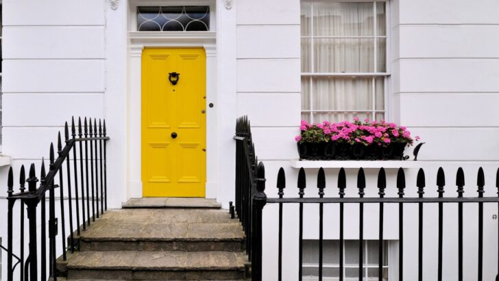
Choosing a front door color can be a big commitment. It’s the greeting your home gives to visitors and the last thing you see as you leave. While a bold choice grabs attention, some colors land on the wrong side of memorable. A paint color that misses the mark can take away from your home’s curb appeal and even affect how you feel heading inside.
Before picking up a brush, take a look at a few colors that often fall flat for homeowners.
Where We Got This Information
Image Credit: Shutterstock.
The recommendations are based on guidance from expert interior design and real estate sources. These authorities highlight certain paint choices for front doors that often appear visually unappealing, clash with typical home exteriors, or diminish curb appeal. The guidance draws on observed trends in homeowner preferences, design evaluations, and general aesthetic principles widely accepted within the design community.
1. Pea Green
Image Credit: Shutterstock.
This particular shade of green brings to mind something from a 1970s kitchen appliance catalog, and maybe it should have stayed there. Pea green is a tricky color. It’s a yellowish-green that can look sickly or dated, especially in certain lighting. It lacks the freshness of a brighter Kelly green or the sophisticated depth of a forest green. Instead of your entrance wowing your guests, it can make it appear drab and uninspired, blending into the landscape in an unflattering way.
Quick Guide:
- Potential Perception: Can appear dated, dull, or washed out.
- Design Challenge: Clashes with many brick and stone exteriors.
- Better Alternatives: Consider emerald, forest, or olive green for a more timeless look.
2. All Shades of Purple
Image Credit: Shutterstock.
Purple is a color often associated with royalty and creativity, but it rarely translates well to a front door. Lighter shades like lavender can appear too sweet or juvenile, while deep, rich purples can look overly somber and imposing. Purple has strong undertones that can clash unexpectedly with exterior materials like brick, siding, and roofing. It’s a very personal color, and what one person finds expressive, another might find unwelcoming.
Quick Guide:
- Potential Perception: Can seem overly personal, dramatic, or gloomy.
- Design Challenge: Difficult to coordinate with common exterior finishes.
- Better Alternatives: A deep navy blue or a rich burgundy can offer a similar sense of depth without the polarizing effect.
3. Pastel Yellow

Image Credit: Shutterstock.
A soft, buttery yellow might seem like a cheerful and welcoming choice, but it often gets lost. Pastel yellow lacks the saturation to make a strong, positive statement from the street. Instead of looking sunny, it can appear faded, washed-out, or even a bit dingy, especially on homes with light-colored siding. It simply doesn’t have the punch needed to stand out and can give the impression that the color was once much brighter but has since faded over time.
Quick Guide:
- Potential Perception: Looks faded, weak, or indecisive.
- Design Challenge: Lacks contrast against white or cream-colored homes.
- Better Alternatives: A bolder, sunnier yellow can be great, or try a warm beige for a subtle, welcoming feel.
4. Earthy or Muddy Brown
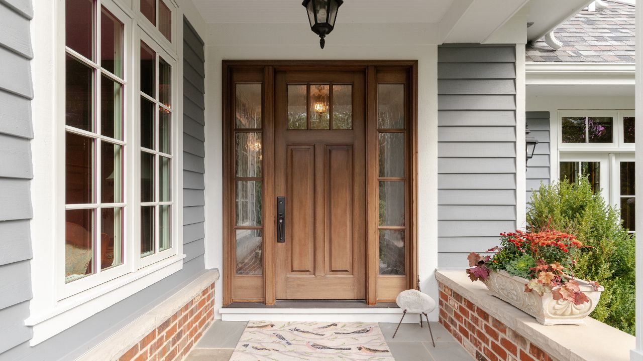
Image Credit: Shutterstock.
Brown can be a grounding and stable color, but on a front door, it frequently fails to impress. These shades tend to absorb light and can blend in too much with natural surroundings, making the door disappear rather than pop. For homes that already have brown siding or brick, a brown door creates a monotonous look that lacks definition and personality.
Quick Guide:
- Potential Perception: Appears boring, heavy, or uninspired.
- Design Challenge: Can make the entryway look dark and lack a clear focal point.
- Better Alternatives: A rich wood stain provides the warmth of brown with more character, or a dark bronze can add metallic sophistication.
5. Warm Oranges
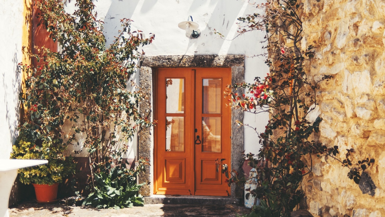
Image Credit: Shutterstock.
An energetic orange can be fun, but warmer, burnt orange shades are difficult to pull off. These hues can be overwhelming and may not age well with changing trends. While a bright, clear orange can be a playful pop of color, the muddier, warmer versions can look dated and may evoke feelings of rust rather than welcome.
Quick Guide:
- Potential Perception: Can look aggressive, dated, or mismatched.
- Design Challenge: Clashes with red or orange-toned brick.
- Better Alternatives: A vibrant coral or a deep red offers energy without the harshness.
6. Neon Hues
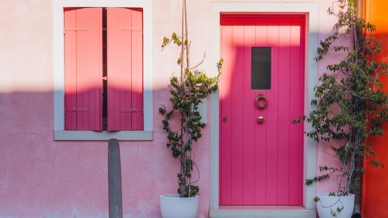
Image Credit: Shutterstock.
Neon colors are designed to grab attention, and they certainly do. However, a front door is usually not the place for highlighter-yellow or electric-pink. These ultra-bright pigments can look out of place in a residential setting, creating a jarring contrast with the rest of the home and the neighborhood. While fun for a fleeting moment, they lack the staying power and sophistication for great curb appeal.
Quick Guide:
- Potential Perception: Can appear tacky, temporary, or overwhelming.
- Design Challenge: Fades quickly and clashes with nearly all traditional building materials.
- Better Alternatives: If you want a bright color, choose a saturated primary color like a classic red or a bold cobalt blue.
Final Thoughts
Image Credit: Shutterstock.
Choosing a door color is ultimately a personal decision, but it’s helpful to understand why some shades may bring instant regret. The goal is to select a color that complements your home’s architecture and makes you happy every time you see it. Before committing, test a few samples directly on the door. View them at different times of day to see how the light changes their appearance. A little preparation can help you find a color that looks great and creates the welcoming entrance your home deserves.