We all love a bit of nostalgia. Whether it’s a vintage rug or a mid-century modern chair, adding a touch of the past can give a home character and soul. However, there is a fine line between “vintage charm” and “dated and drab.” Certain retro design habits, often ones we’ve become “clutter blind” to over the years, can instantly lower the perceived value of your property.
When a home feels stuck in a past decade, it doesn’t just look tired; it often feels smaller, darker, and less functional. For homeowners looking to refresh their space or prepare for a sale, identifying these specific pitfalls is the first step toward a modern, high-value aesthetic. By addressing these six common mistakes, you can breathe new life into your rooms without necessarily needing a full-scale renovation.
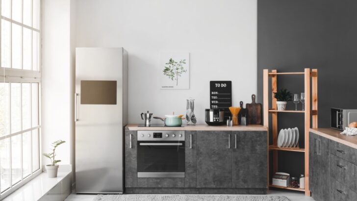
1. The “Countertop Parking Lot.”
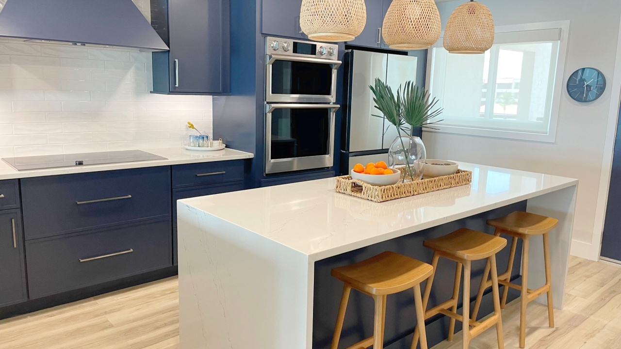
Image Credit: Shutterstock.
The biggest offender in many older homes isn’t necessarily the architecture itself, but how we use the surfaces within it. In past decades, it was common to display every gadget, cookbook, and canister set right on the counter. Today, this “countertop parking lot” effect reads as visual noise. When every square inch of your workspace is covered, it signals a lack of storage and makes even a spacious kitchen feel cramped and low-end.
As noted by real estate experts, a countertop buried in gadgets kills both function and first impressions. It flattens the room into a jumble of objects rather than highlighting the expensive elements that actually add value, like stone surfaces or backsplashes. Clearing the decks is the fastest way to make a room feel larger and more polished.
2. One-Dimensional “Big Light” Energy
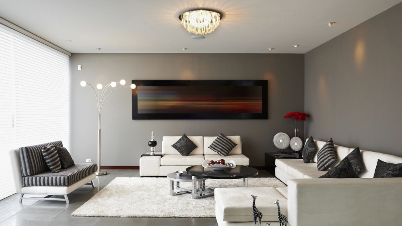
Image Credit: Deposit Photos.
Lighting schemes in older homes often rely on a single, central ceiling fixture to illuminate the entire room. While efficient, this retro approach creates harsh shadows and dim corners, making finishes look dingier and cheaper than they actually are. When a room is lit only from above, it lacks depth and ambiance, often highlighting dust or wear rather than the room’s best features.
Modern design relies on layered lighting. By failing to introduce task or accent lighting, you miss the opportunity to smooth out those dark pockets. Designers frequently note that poor lighting is a “sneaky” design choice that ages a home instantly. Correcting this doesn’t require rewiring your house; it just requires a shift in strategy.
Layered lighting adds warmth and dimension, making standard finishes look custom and expensive.
3. The “Time Capsule” Surfaces
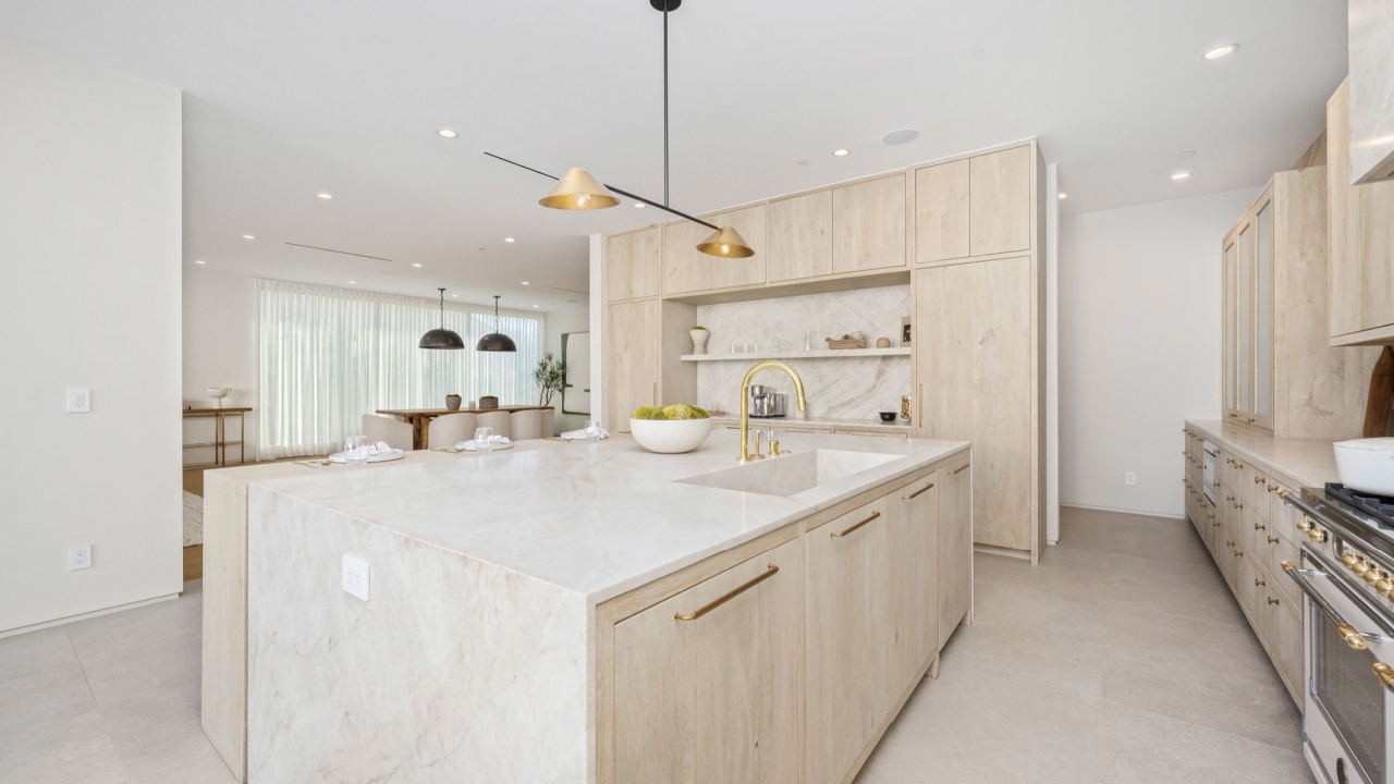
Image Credit: Shutterstock.
Nothing dates a home faster than materials that were highly trend-specific to a short window of time. Think busy, speckled granite countertops from the early 2000s, heavy Tuscan-style tile patterns, or high-gloss laminates. When these dominant surfaces are left as-is, the entire room reads as a time capsule. This can spook potential buyers or guests, who subconsciously tally up the cost of “fixing” the room the moment they walk in.
Highly personalized or busy stone patterns compete with everything else in the room. If your countertops are loud, they limit what you can do with wall color and décor, boxing you into a specific look that may no longer be in style.
Neutral surfaces act as a canvas, allowing you to update the style of the room with accessories rather than construction.
4. Keeping Old Appliances on Display

Image Credit: Shutterstock.
In the same vein as countertop clutter, the condition of your appliances tells a story about the home’s maintenance. Visibly worn, yellowing, or mismatched appliances that sit out on the counter (like an old microwave or toaster oven) suggest the kitchen hasn’t been updated in decades. Even if your major appliances like the fridge and stove are relatively new, that one stained coffee maker from 1998 can drag down the whole aesthetic.
Real estate stagers often point out that older appliances make a house look outdated and “dirty,” even if it’s perfectly clean. It signals to a viewer that the home is a “project” rather than a move-in-ready sanctuary. A streamlined look suggests modern efficiency and cleanliness.
Bringing Your Home into the Present

Image Credit: Shutterstock.
Updating your home doesn’t always mean knocking down walls. Often, it is simply a matter of removing the “retro” layers that are blocking your home’s true potential. By clearing the clutter, fixing the lighting, and simplifying your finishes, you can create a space that feels fresh, intentional, and inviting.