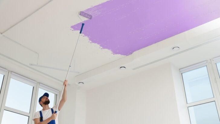
Walking into a room with low ceilings often feels like stepping into a box. That lack of vertical space can make even large rooms feel cramped or squat. While structural renovations to raise the roof are usually out of the question (and budget), paint offers a powerful alternative.
By choosing the right hue, homeowners can trick the eye and create an optical illusion of height, expanding the visual field upwards. Here are six paint colors that help low ceilings soar, along with tips on how to apply them for maximum effect.
1. Sky Blue
Image Credit: Shutterstock.
Mimicking the outdoors is one of the oldest tricks in the design book for a reason. A light, airy blue overhead triggers an instinctual response, reminding the brain of the open sky. This association causes the ceiling to visually recede, creating a “no-ceiling” effect that feels limitless. Designers often use this shade in cramped attics or basements to counteract the feeling of being enclosed.
To get this look right, select a pale blue with cool undertones rather than a vibrant turquoise. The goal is softness. A shade like Benjamin Moore’s “Breath of Fresh Air” or similar misty blues works well because it feels atmospheric rather than heavy. Keep the finish matte.
2. Butter Yellow
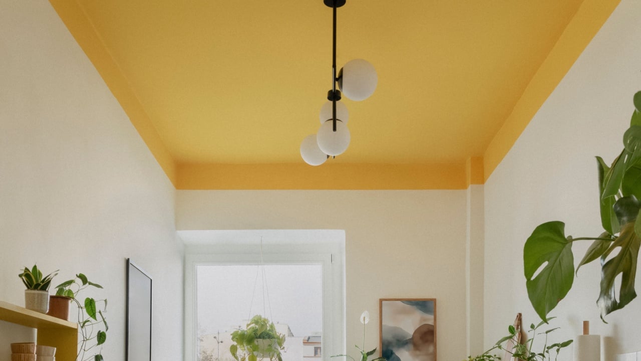
Image Credit: Shutterstock.
Rooms lacking natural light often suffer the most from feeling low and heavy. A soft butter yellow works to counter this by acting as a secondary light source. This hue has a high Light Reflectance Value (LRV), meaning it bounces available light around the room rather than absorbing it. This luminosity makes the ceiling appear further away and bathes the room in a warm, sunny glow.
This color works particularly well in kitchens or breakfast nooks where energy and brightness are desirable. Pair a butter yellow ceiling with crisp white walls to draw the eye up. Avoid yellows that lean too far into neon or mustard territory, as those can feel oppressive. A pale, creamy yellow offers just enough color to lift the spirits without shrinking the room.
3. Putty Pink

Image Credit: Shutterstock.
While pink might seem like a bold choice, a muted putty or “setting plaster” shade acts as a sophisticated neutral. Unlike stark white, which can create a harsh line where the wall meets the ceiling, a soft pink blends gently with warm wall tones. This blurring of boundaries encourages the eye to travel upward without interruption, making the walls appear taller than they actually are.
Interior designers frequently use this hue to add warmth to a space without closing it in. It creates a cozy atmosphere that still feels spacious. When working with putty pink, consider painting the crown molding the same shade or a slightly lighter version of the wall color. This technique, known as color drenching, removes visual stops and allows the vertical lines of the room to extend continuously.
4. Icy Mint
Image Credit: Shutterstock.
Cool colors naturally recede, while warm colors advance. An icy mint green takes full advantage of this principle. By applying a cool, pale green to the ceiling, the surface appears to move away from the viewer. This shade creates a refreshing, breezy atmosphere that counteracts the stifling feeling sometimes associated with low heights.
Icy mint is a fantastic option for bathrooms or bedrooms where relaxation is the priority. It pairs beautifully with white or light gray walls. To maintain the lifting effect, ensure the green is extremely pale, almost white, with just a whisper of pigment. A heavy green will have the opposite effect and bring the ceiling down, so always test swatches to see how the color reads in different lighting conditions throughout the day.
5. Soft Lavender
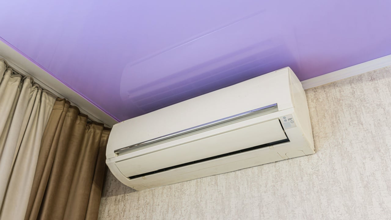
Image Credit: Shutterstock.
For those willing to experiment, a pale lavender offers a unique way to expand a room. Like blue and green, violet is a receding color. A misty lavender adds depth and a touch of whimsy without overwhelming the space. It adds a layer of complexity that a standard white simply cannot match, drawing the eye up in appreciation rather than judgment of the height.
This shade works wonders in nurseries or creative spaces. The trick is to find a gray-based lavender rather than a sugary purple. The gray grounding keeps the color sophisticated and prevents it from feeling juvenile. Pair it with soft gray or charcoal walls for a chic, monochromatic look that stretches the room’s dimensions vertically.
Transforming Your Perspective
Image Credit: Shutterstock.
Paint is the most accessible tool for changing how a home feels. By strategically selecting colors that recede, reflect light, or blur boundaries, any low ceiling can feel significantly higher. The process begins with grabbing a few samples and seeing how they react to the specific lighting in the room.
Test a few patches on the ceiling and observe them at different times of day before committing to a full gallon. Once the perfect shade is selected, grab a roller and start that transformation. A more spacious-feeling home is just a coat of paint away.