
The entryway is more than just a transition space; it’s the first impression your home makes. It sets the mood and offers a sneak peek into your personal style. But even the most stunning living room or kitchen can feel overshadowed if your foyer is messy, poorly lit, or overlooked. A cheap-looking entryway is about small, avoidable mistakes.
Cluttered shoe piles, mismatched lighting, and awkward layouts can quickly turn this space into an afterthought. With a few smart updates, like sleek storage solutions, warm lighting, and thoughtful design choices, you can transform your entryway into a tidy, inviting space that feels intentional and elevated.
Here are the most common design mistakes and how to fix them.
1. Letting Daily Clutter Take Over
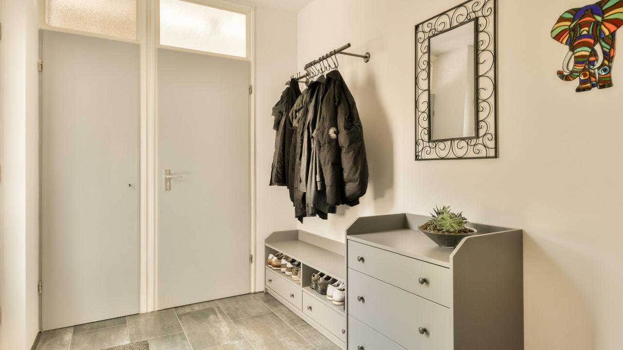
Image Credit: Shutterstock.
Nothing lowers the perceived value of a home faster than a visual assault of mail, keys, sunglasses, and loose change scattered across surfaces. Without a designated spot for these daily essentials, the entryway becomes a chaotic dumping ground. This lack of organization suggests the space is an afterthought rather than a designed room.
The Fix: Incorporate a console table with drawers to keep small items out of sight. If drawers are not an option, place a stylish tray or decorative bowl on the surface. This creates a specific “home” for loose items, maintaining a tidy appearance while keeping essentials accessible.
2. Forgetting a Place to Perch

Image Credit: Shutterstock.
Watching a guest hop on one foot while trying to remove a boot is an awkward experience that screams “unwelcoming.” Omitting a seating area makes the space feel purely utilitarian and transient. A lack of seating also encourages people to lean against walls for balance, leading to scuffs and handprints that degrade the look of the paint over time.
The Fix: Add a bench, a slender chair, or even a small ottoman tucked under a console table. This simple addition invites guests to pause and comfortably transition from outdoors to indoors. It creates a focal point and signals that the home is designed for comfort.
3. Relying on Builder-Grade White Walls

Image Credit: Shutterstock.
While white paint is often used to make small spaces appear larger, in an entryway, it can feel sterile and devoid of character. Without architectural details or abundant natural light, plain white walls often resemble a rental property or a construction zone that was never quite finished. This lack of personality makes the area feel cold and disconnected from the rest of the home’s design narrative.
The Fix: Treat the entryway as a jewel box. Since it is a smaller, transitional space, it can handle bold design choices that might overwhelm a living room. Experiment with moody paint colors, patterned wallpaper, or wainscoting to add depth and sophistication.
4. Leaving Shoes in a Visible Pile
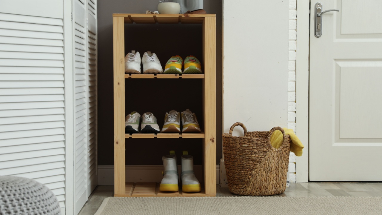
Image Credit: Shutterstock.
A mountain of sneakers and boots by the door is a fast track to a messy aesthetic. It blocks the flow of traffic and creates a visual stumbling block immediately upon entering. While it is practical to take shoes off at the door, storing them in plain sight ruins the clean lines of the room and makes the home feel smaller and more cluttered than it actually is.
The Fix: If closet space is unavailable, invest in a dedicated shoe cabinet with closed doors. Slim, tilt-out shoe storage units are excellent for narrow hallways, keeping footwear organized and completely hidden from view.
5. Settling for Dim, Single-Source Lighting
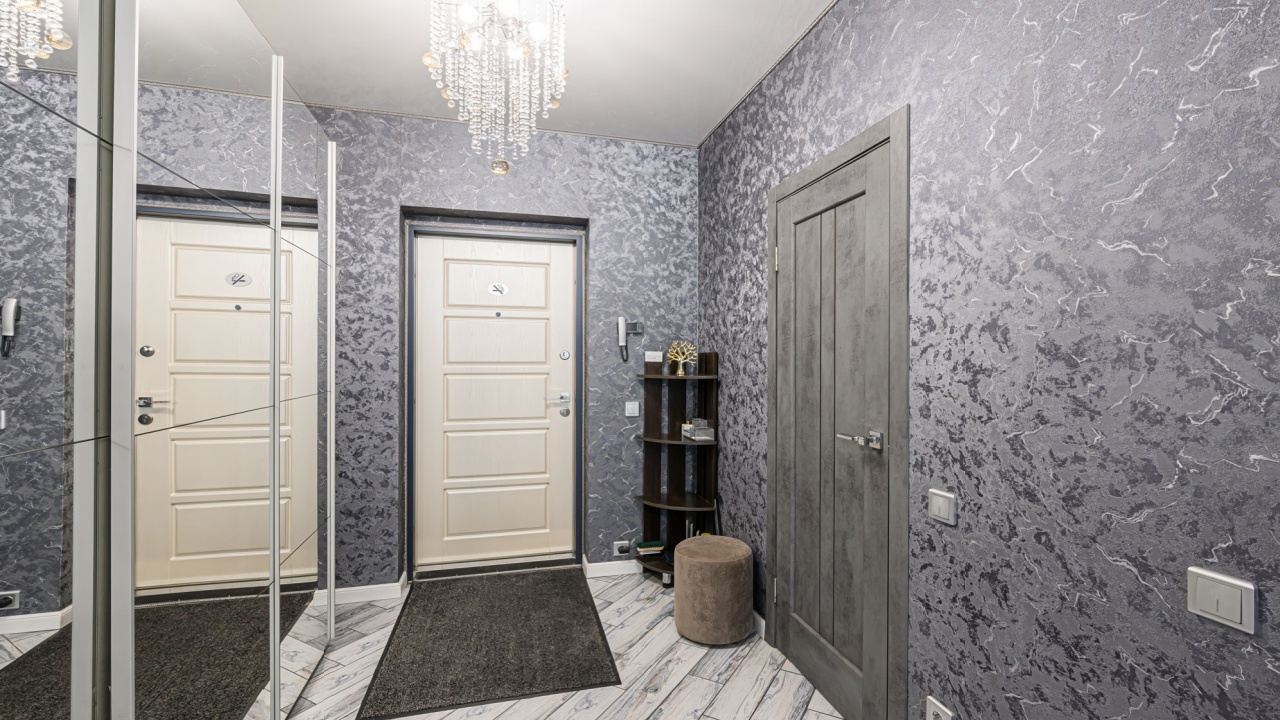
Image Credit: Shutterstock.
A dark entryway feels uninviting and small. Relying solely on a single, builder-grade overhead fixture creates harsh shadows and fails to highlight the design elements of the space. It also makes practical tasks, like checking one’s reflection or finding keys, difficult. Gloomy lighting is a hallmark of dated or neglected interiors.
The Fix: Layer the lighting to create warmth and dimension. Combine a statement overhead fixture with a table lamp or wall sconces. This multi-source approach brightens corners and adds a soft, ambient glow that feels luxurious and welcoming.
6. Using a Postage-Stamp Rug
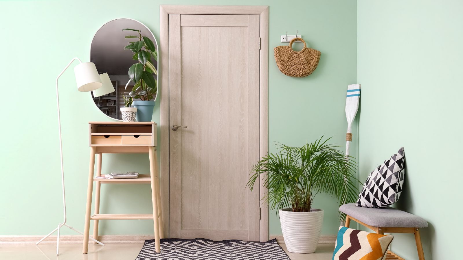
Image Credit: Deposit Photos.
A common error is placing a tiny doormat just inside the door and calling it a day. A rug that is too small for the space floats aimlessly on the floor, making the area feel disjointed and cheap. It visually shrinks the floor plan and fails to anchor the furniture or define the entry zone properly.
The Fix: Choose a rug that fills the space appropriately. A long runner works wonders in narrow hallways, drawing the eye forward, while a larger area rug can define a foyer. The rug should be large enough that furniture legs can sit on it, or it should leave just a consistent border of flooring around the edges.
Elevating the Entryway Experience
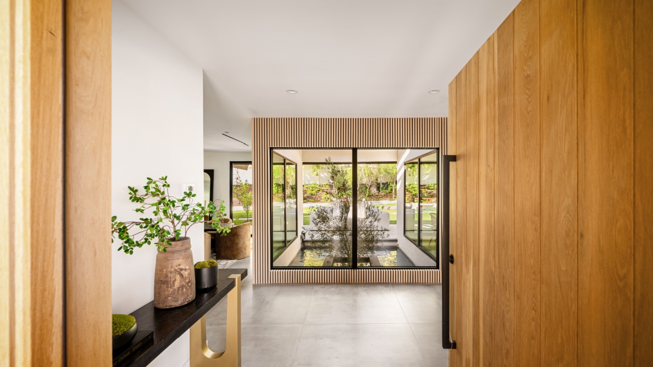
Image Credit: Shutterstock.
Transforming an entryway from cheap to chic does not require a full renovation. It requires a shift in perspective, viewing the space not just as a passageway but as a room deserving of attention. By implementing these changes, the home will greet everyone with style and order.