Every December, the design world holds its breath for a single announcement: Pantone’s Color of the Year. This decision sets an important tone for fashion, interior design, and graphic arts for the coming year. For the oncoming year of 2026, the color authority has spoken, but instead of a vibrant hue, they’ve delivered something far more unexpected: Cloud Dancer, a simple shade of…white. The reaction has been a collective wince, with many feeling both surprised and distinctly underwhelmed by the choice.
A History of Bold Choices
For over two decades, the Pantone Color Institute has selected a color that reflects the global cultural moment. From the serene Cerulean Blue in 2000 to the optimistic Viva Magenta of 2023, these choices have always aimed to capture the zeitgeist. The selected color typically sparks conversation and inspires creativity across industries. That’s why the selection of Cloud Dancer feels so jarring. It’s the first time in the program’s history that such a neutral, almost non-color, has taken the top spot. While Pantone describes it as “a symbol of new beginnings,” many see it as simply boring.
A Sign of the Times?
In the absence of vibrant color, people are reading between the lines, and the interpretations are far from cheerful. Many onlookers are connecting the stark choice to growing economic uncertainty, with some going so far as to call the underwhelming choice “a recession indicator”. The idea is that in times of financial caution, people gravitate towards safe, practical, and enduring choices. Lavish, bold colors feel frivolous when budgets are tight. As people prepare to pull back on spending, Cloud Dancer feels less like a blank canvas for creativity and more like a sign of austerity. The choice has sparked a wave of commentary, with some calling it a bellwether for tough economic times ahead.
A Viral Reaction
The public sentiment was perfectly captured in a now-viral TikTok video from House Beautiful. The clip shows the magazine’s design team gathered in anticipation for the big reveal. The excitement is visible on their faces, but as the underwhelming color appears on screen, their expressions shift to a mix of shock, confusion, and even disgust. The video, which has garnered over 35,000 likes, struck a chord with viewers.
@housebeautiful Replying to @Andie 🇺🇲☹️ the team was shocked by the #pantone news to say the least… #coloroftheyear #clouddancer ♬ original sound – House Beautiful
The comment section became a forum for shared disappointment. One user wryly noted, “Economy so bad we can’t afford color,” a sentiment that was widely echoed. Another popular comment summed it up perfectly: “The color of the year is…primer.” The consensus is clear: the world was ready for a splash of inspiration, but instead, it got a base coat.
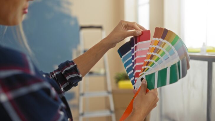
Despite the widespread disappointment, perhaps there’s a different way to look at it. Cloud Dancer pushes us away from dictated trends and back toward personal choice. It reminds us of the simple joy of standing in front of the paint display at the local hardware store, fanning out a deck of colorful paper chips. In a world of expert opinions, maybe the best color of the year is the one you choose for yourself.